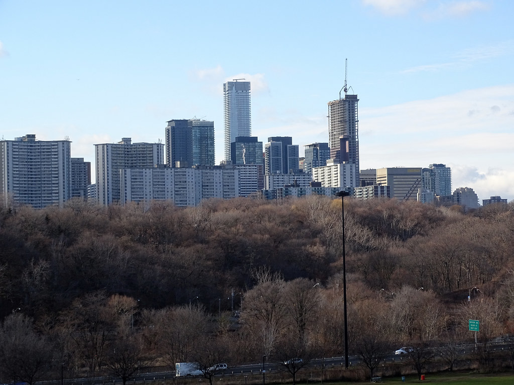
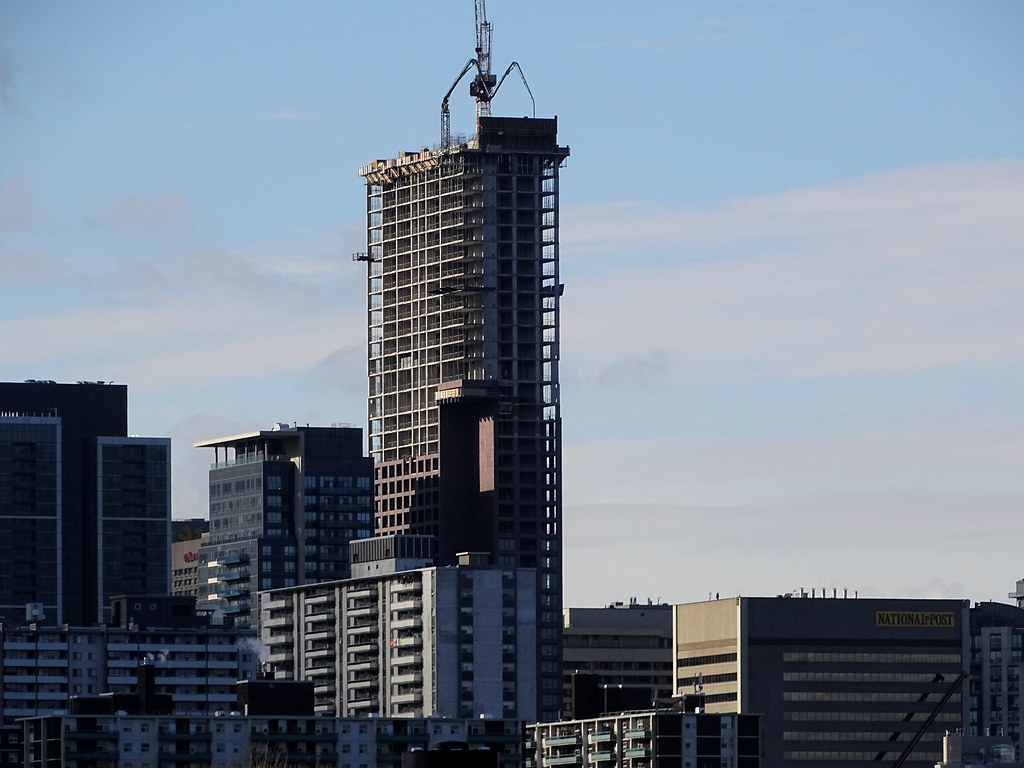
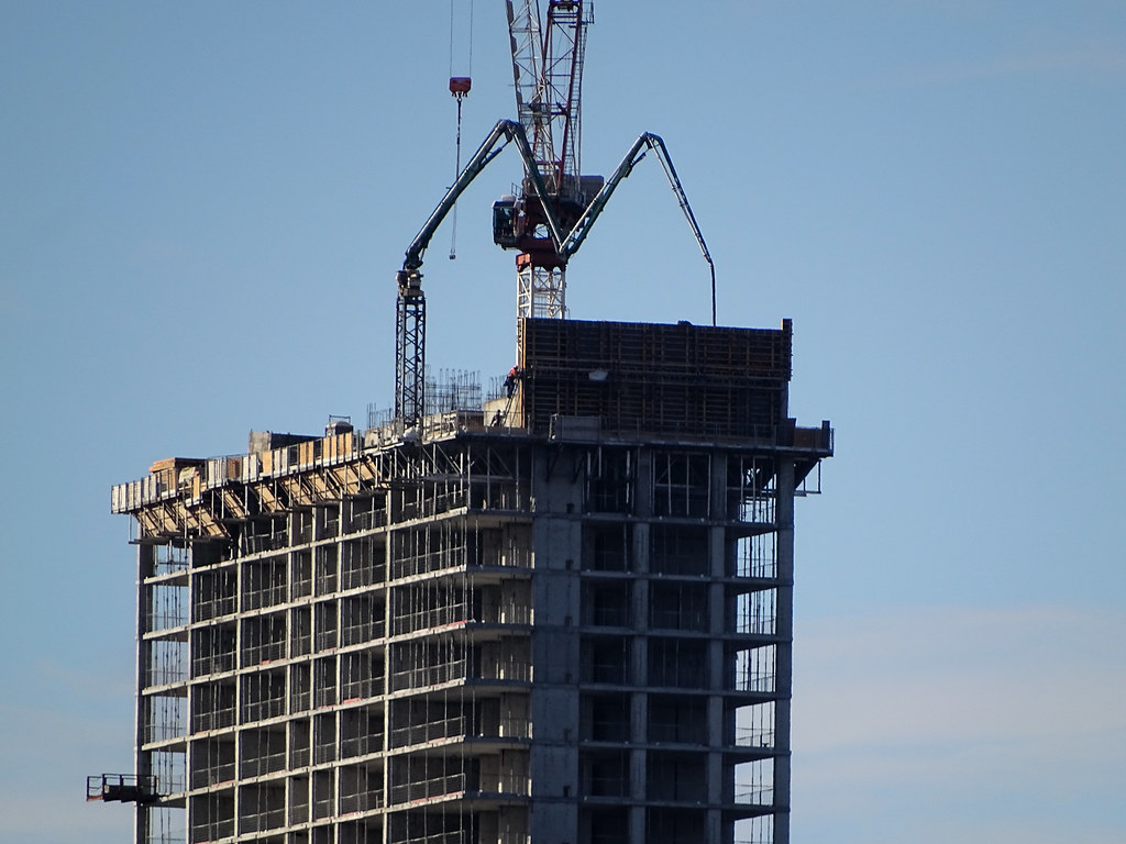
yes, the grey-blue spandrel stands out way too much and doesn't seem to go with anything. Black would've been much nicer.
The red brick looks nice in direct sunlight, but other times it looks like a muted shade of plum or almost grey. The original cladding was supposed to be red glazed terracotta rainscreen panel system, though may be too bright and shocking compared to the other subdued grey condo towers in our city, and it was definitely an expensive material that was in no surprise the first to be axed in its value engineering process.
A natural deep red (not orange) brick, instead of this reddish-brown ironspot brick, would have look so much nicer here.


