You are using an out of date browser. It may not display this or other websites correctly.
You should upgrade or use an alternative browser.
You should upgrade or use an alternative browser.
Toronto The Selby | 165.5m | 50s | Tricon | bKL Architecture
- Thread starter khris
- Start date
steveve
Senior Member
Today:
The views south from the upper floors of Selby will be commanding and among the best in the city.
Edit: one more:
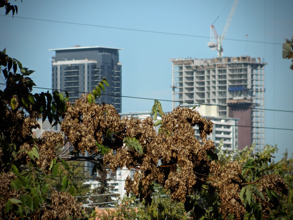
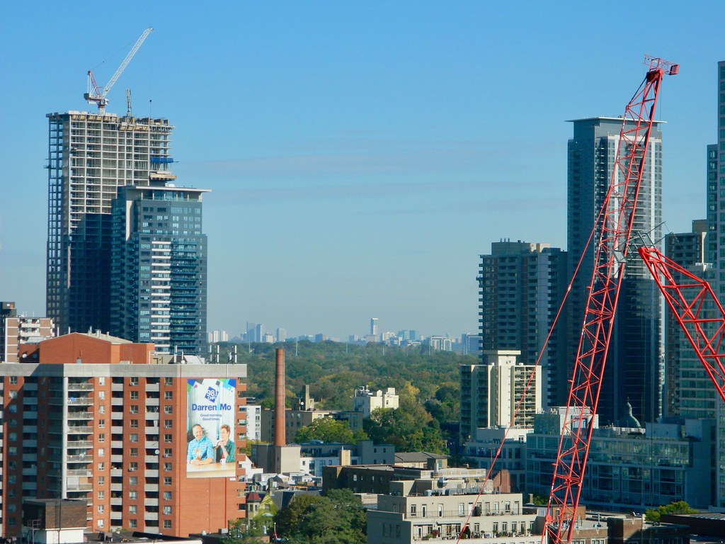
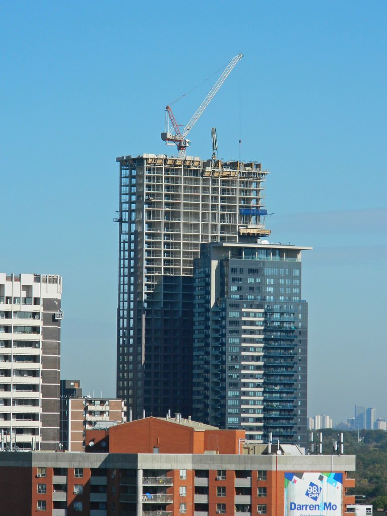
and a visualization of what should be left:
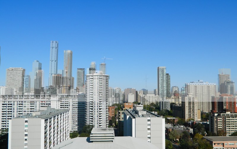
The views south from the upper floors of Selby will be commanding and among the best in the city.
Edit: one more:


and a visualization of what should be left:

Last edited:
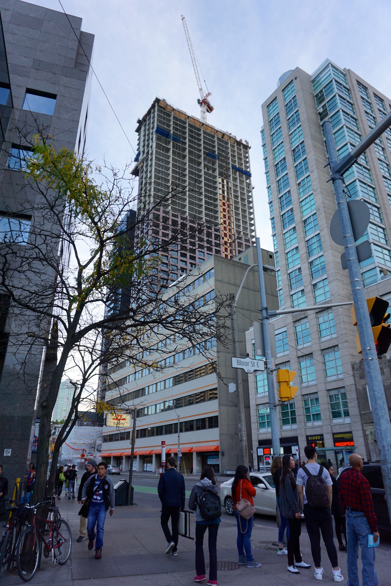
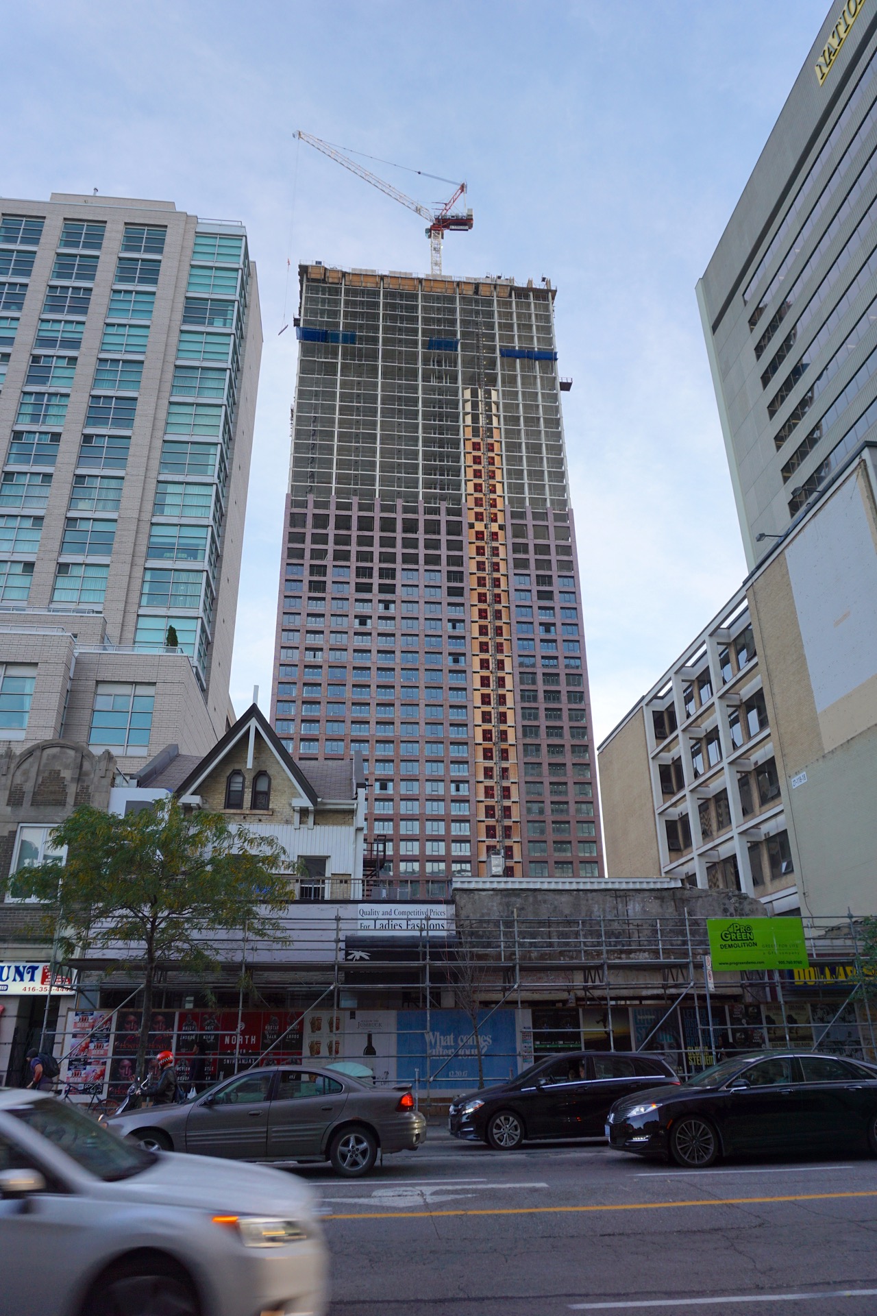
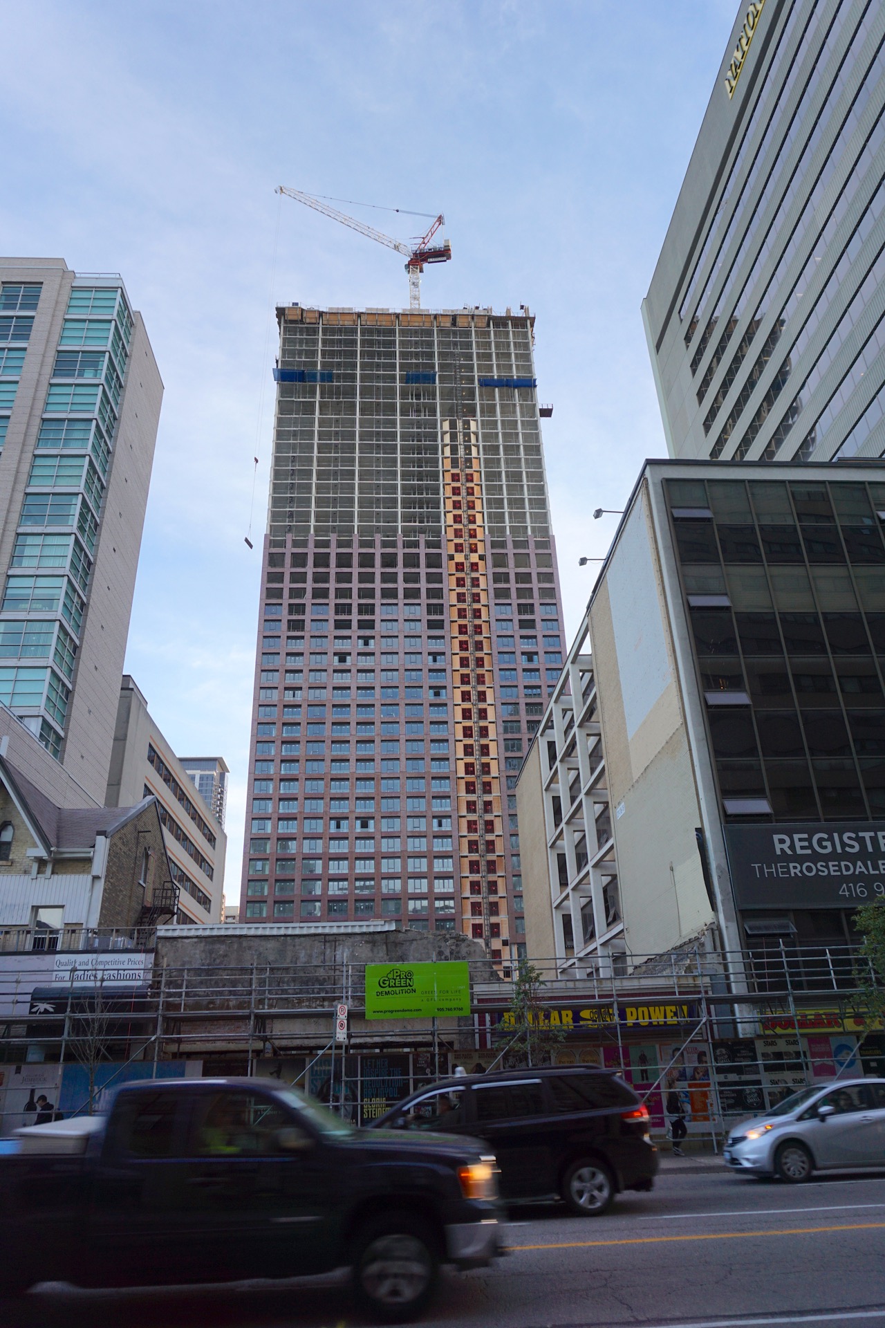
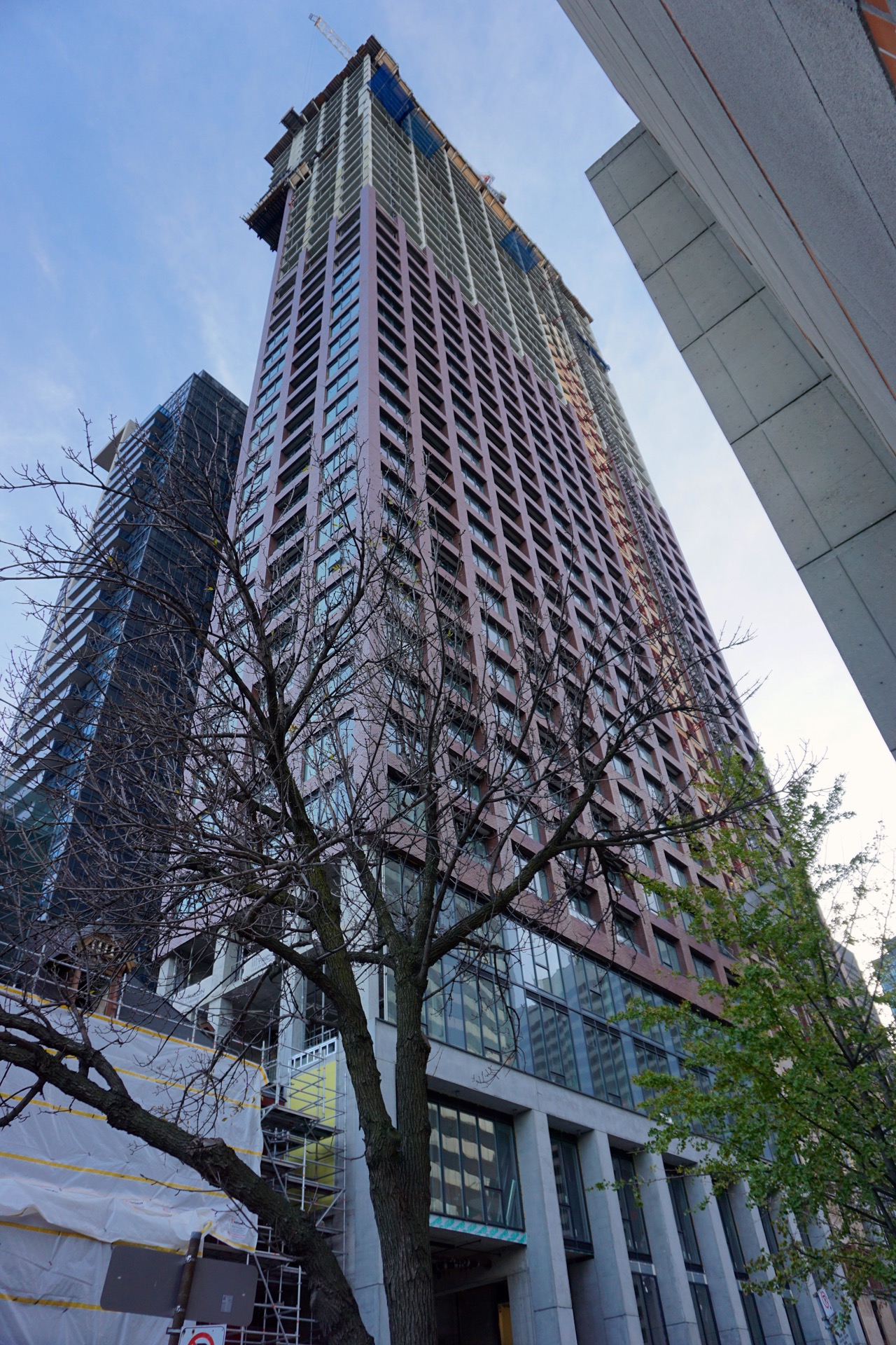
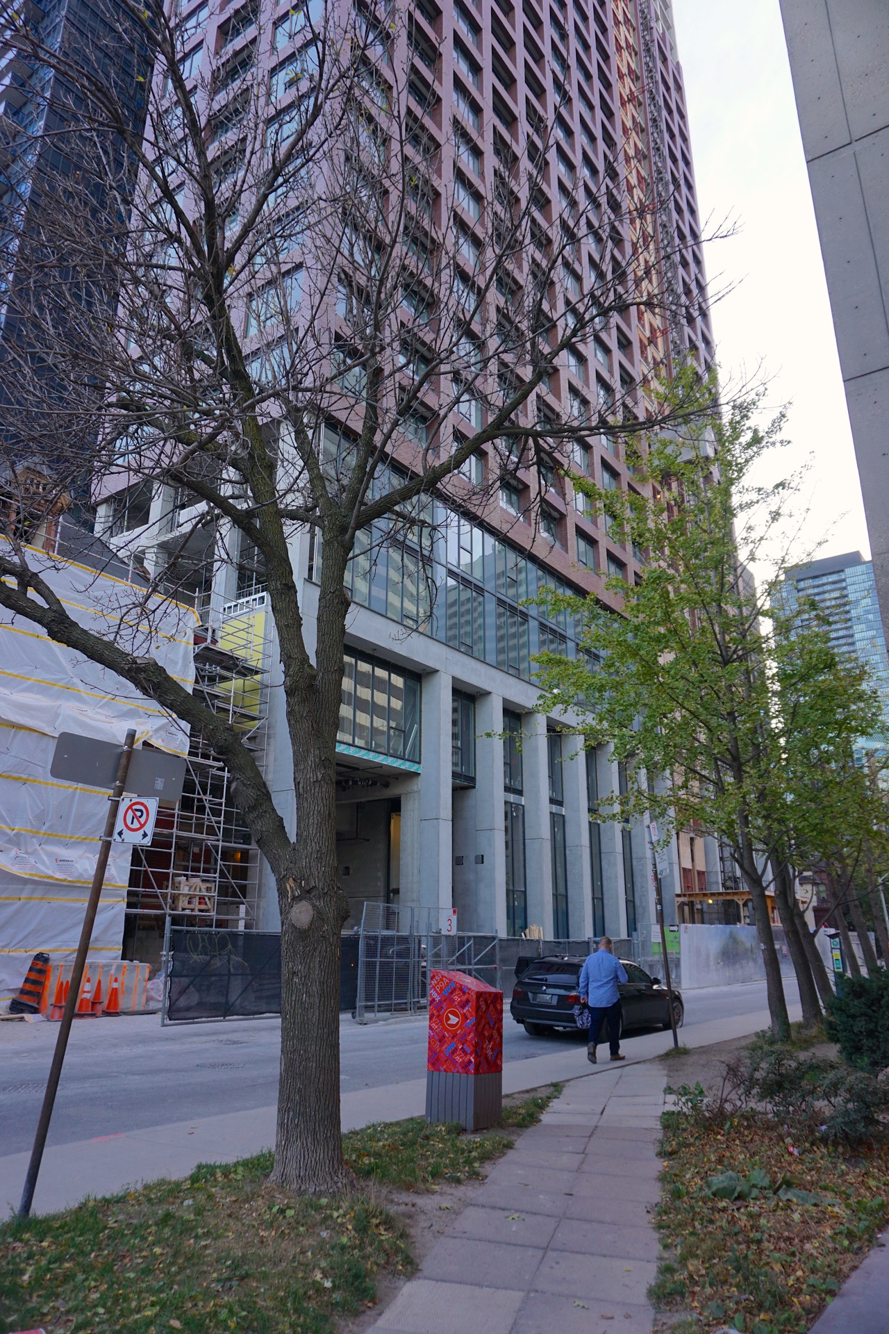
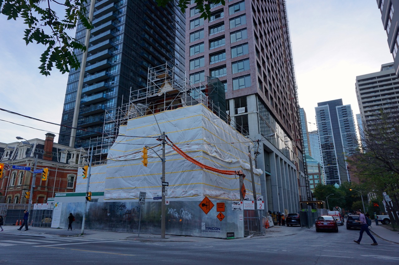
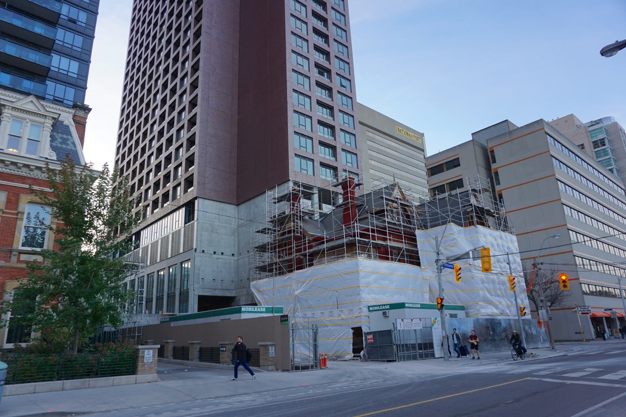
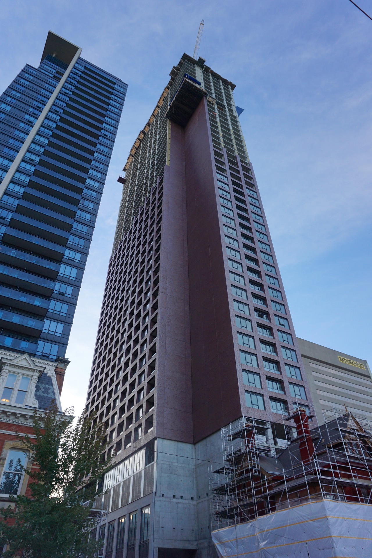
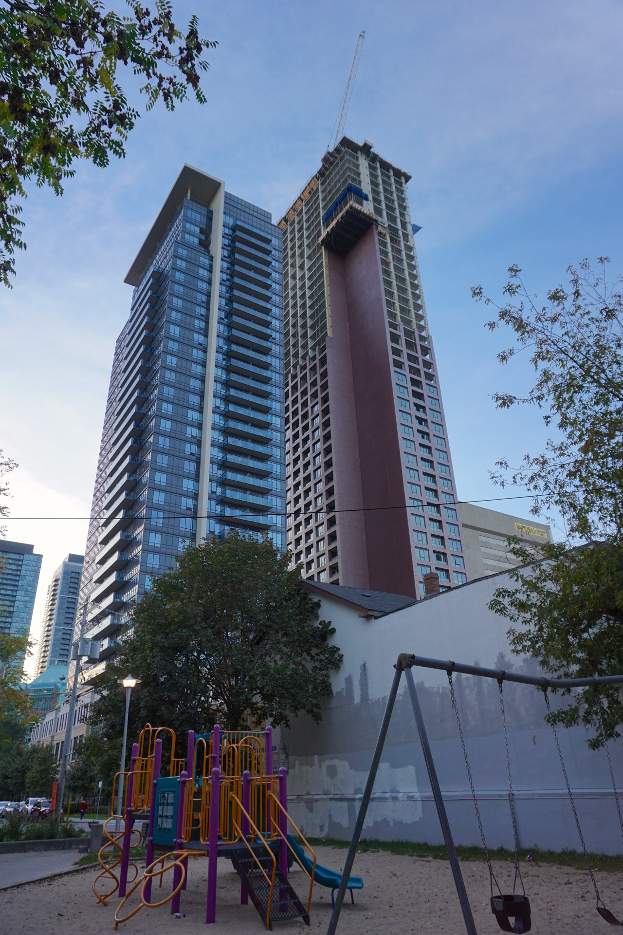
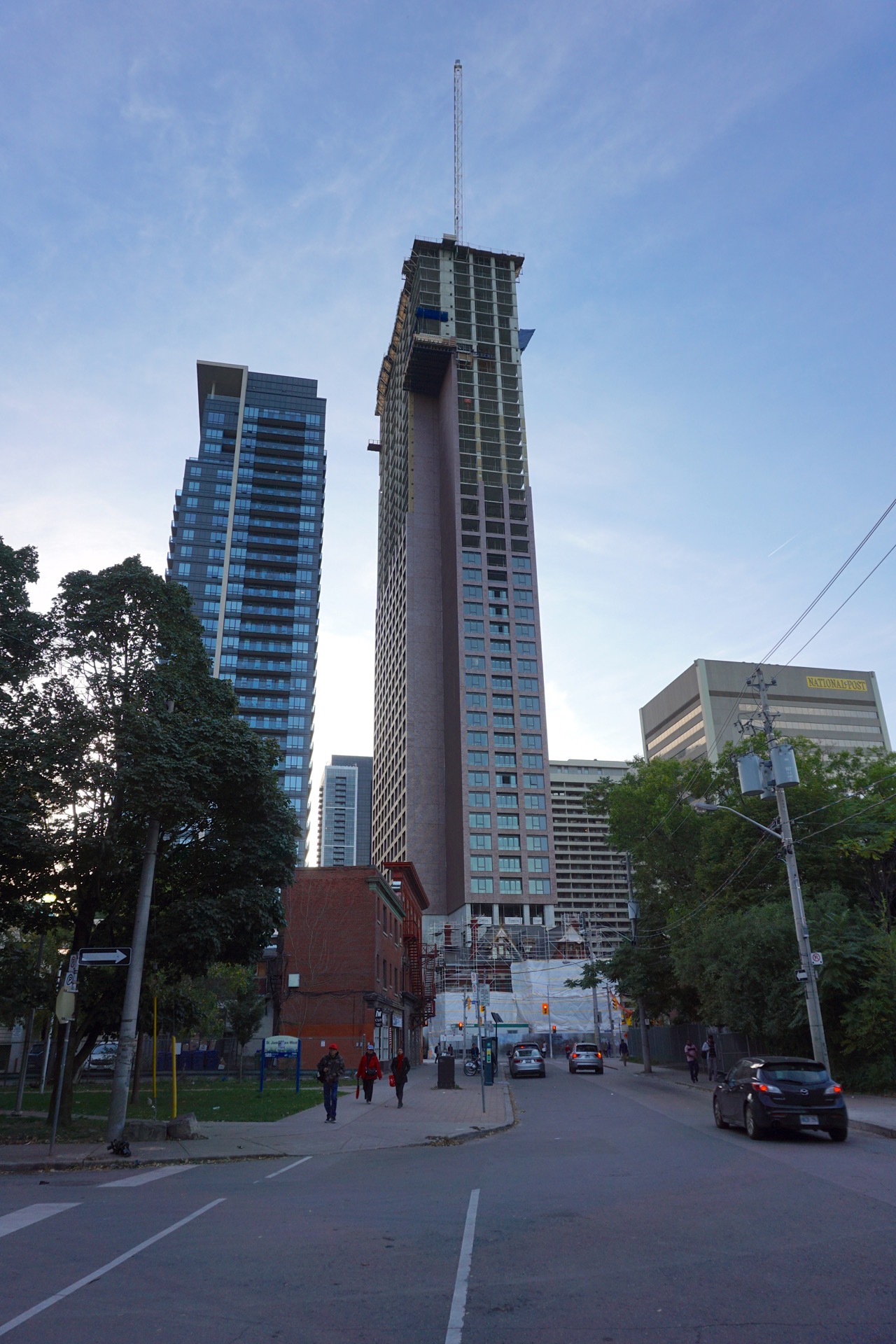
I took a walk around north and east of the Selby site yesterday evening:
42
42
Attachments
-
 DSC04836.jpg787.7 KB · Views: 603
 -
 DSC04839.jpg656.9 KB · Views: 545
 -
 DSC04841.jpg604.3 KB · Views: 570
 -
 DSC04842.jpg856.2 KB · Views: 531
 -
 DSC04843.jpg951 KB · Views: 625
 -
 DSC04845.jpg357.9 KB · Views: 549
 -
 DSC04847.jpg340.6 KB · Views: 529
 -
 DSC04848.jpg663.1 KB · Views: 520
 -
 DSC04849.jpg708.5 KB · Views: 508
 -
 DSC04851.jpg533.2 KB · Views: 569
AlbertC
Superstar
We could use a couple of buildings like this in the Entertainment District.
A lot more than a couple. Imagine City Place with a bunch of these?
LUVIT!
Senior Member
Bloor and Sherbourne is looking rather mature I must say.
stjames2queenwest
Senior Member
Logan
Active Member
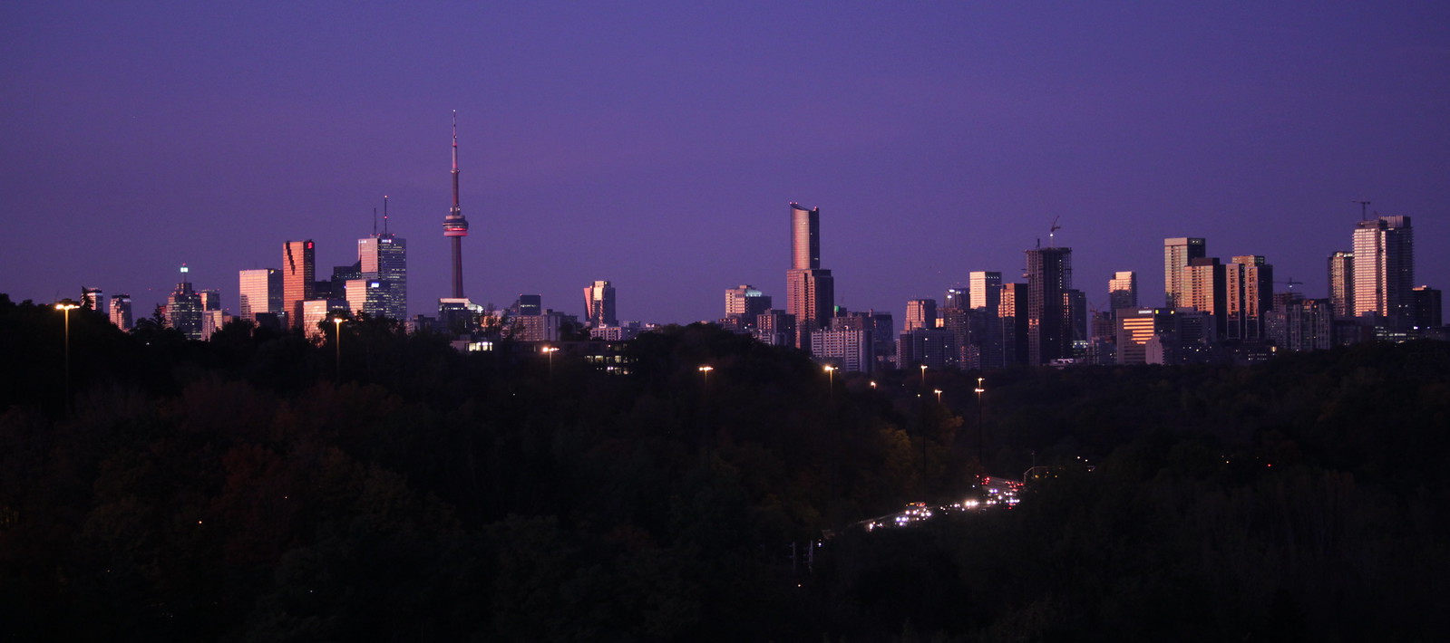 Toronto CBD from the Leaside Bridge by Russell Sutherland, on Flickr
Rascacielo
Senior Member
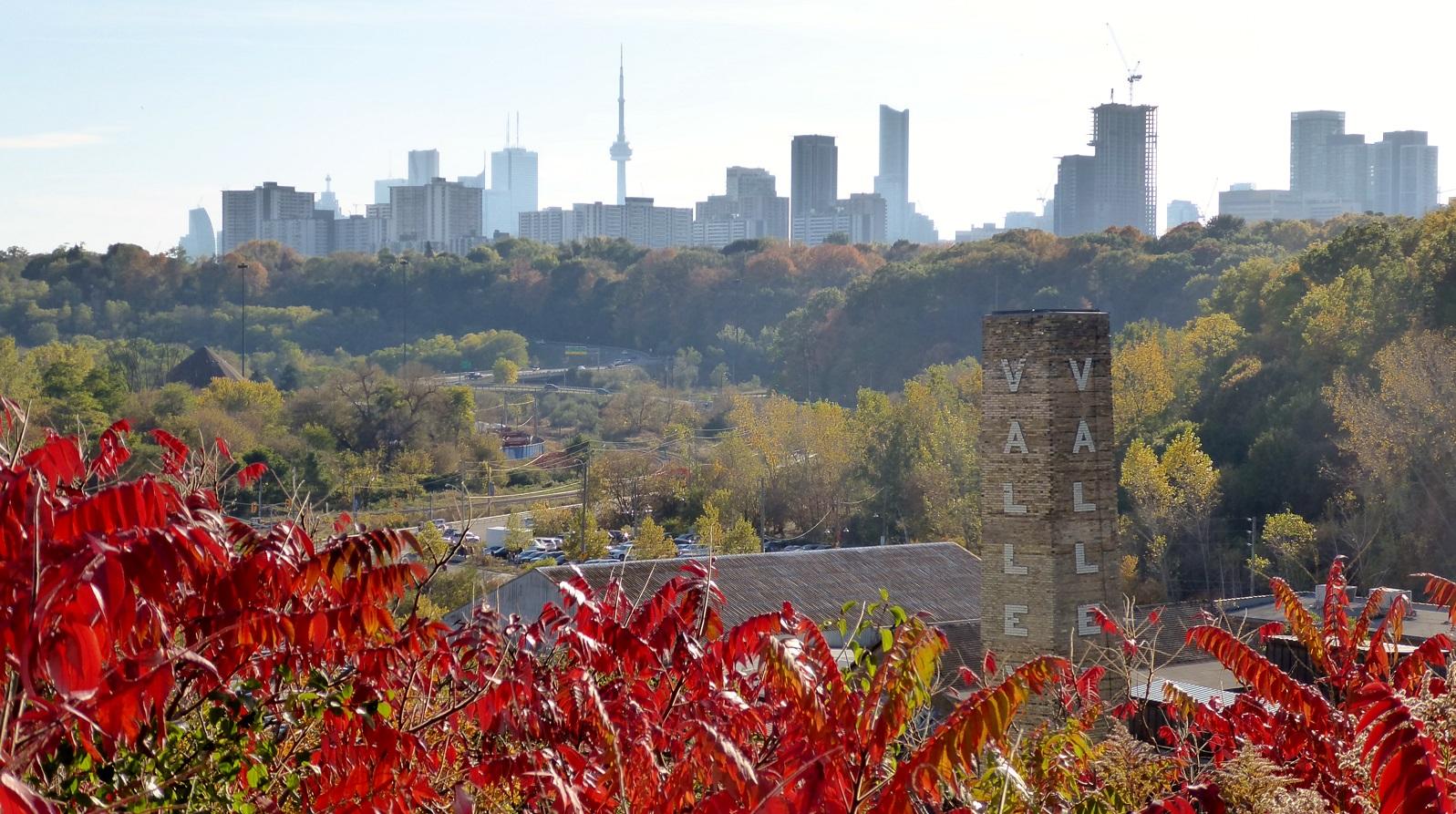
Prominent from the ravines


ando
New Member
this building looks incredible in the skyline driving south on the dvp, especially with that notch
Transportfan
Senior Member
Is that demo site the location for Rosedale on Bloor?
Edit: Never mind. I see it.
Edit: Never mind. I see it.
steveve
Senior Member
Prominent from the ravines

Central Park?
--
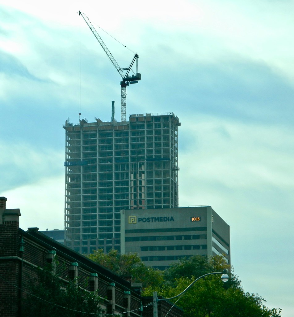
While I don't think screams 'amazing', The Selby is refreshing with its choice of colour and materials, and its slab-like profile really makes this stand out from the majority of buildings built in recent years that gravitate toward slender. Not to mention, its location so far east and north from the majority of high-rises downtown makes its impact more felt.
ChesterCopperpot
Senior Member
From the air yesterday


The fact they used brick and isn't another green/blue glass tower makes all the difference. A simple classy design. I also, for the most part, hate balconies so the fact they are recessed makes it all that much better to me.


