You are using an out of date browser. It may not display this or other websites correctly.
You should upgrade or use an alternative browser.
You should upgrade or use an alternative browser.
Toronto The Selby | 165.5m | 50s | Tricon | bKL Architecture
- Thread starter khris
- Start date
Irishmonk
Senior Member
^I'm digging your Dutch tilt! Reminds me of "Battlefield Earth"--in a good way.
Benito
Senior Member
skycandy
Senior Member
111
Active Member
Ha, ha. Thanks Irishmonk! So nice of you to say.^I'm digging your Dutch tilt! Reminds me of "Battlefield Earth"--in a good way.
...a non-Dutch tilt from Jarvis and Wellesley:
(Tangential observation about the Petro-Canada / A&W building in the foreground: I was initially disappointed they were simply building a new gas station. But if it had to be, I think they did a good job. The placement of the building right up to the corner gives a much more urban feel to the intersection, and the use of brick connects it well to its surroundings. And it appears to be regularly busy, so adds some life. The gas pumps seem dangerously close to the Keg, though.)
Attachments
steveve
Senior Member
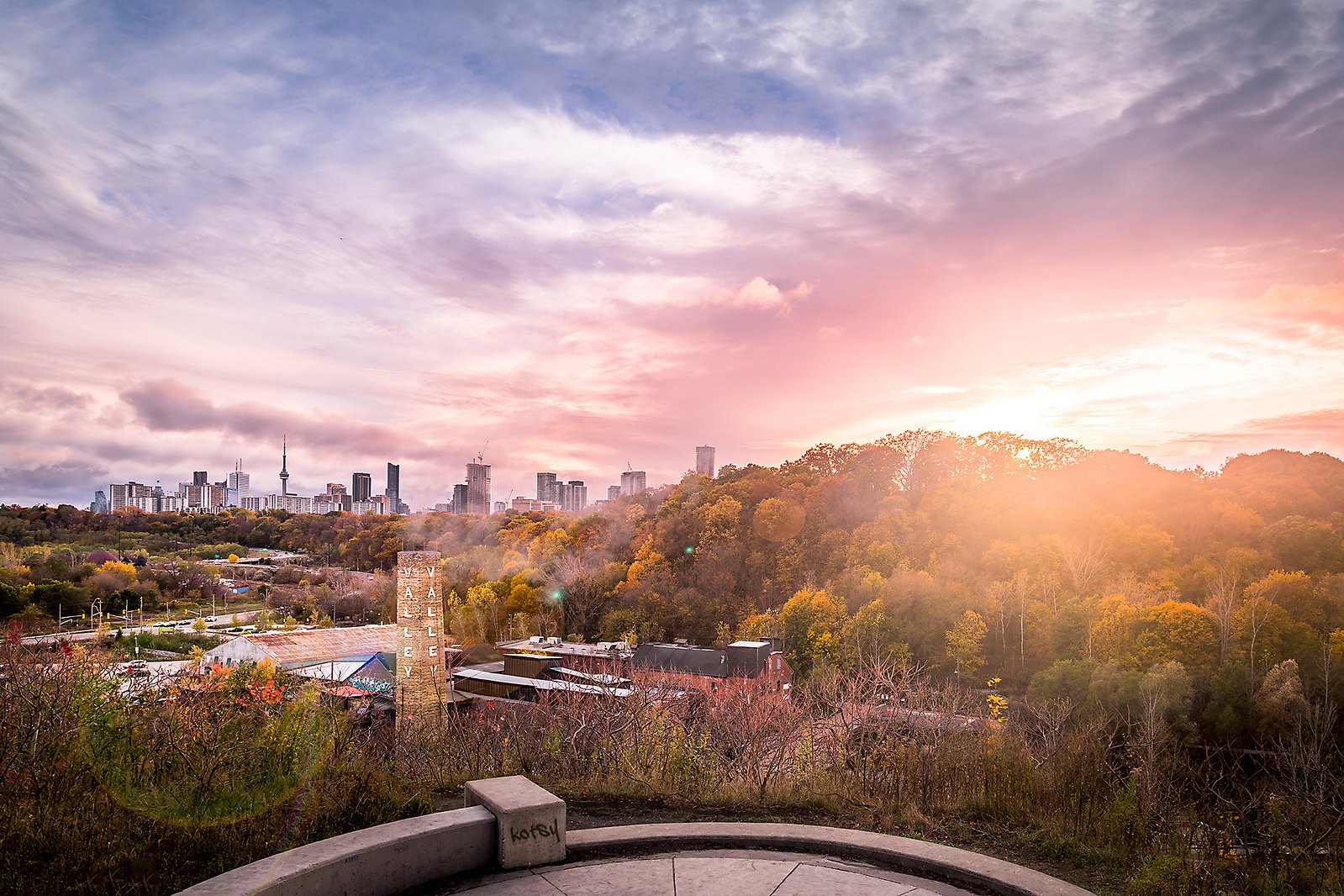
The visually-unimpeded tree canopy going from downtown to as-far-as-the-eye-can-see impresses! The contrasting fall-colours really emphasize just how many we have, great capture.
Automation Gallery
Superstar
Exactly.
jje1000
Senior Member
The visually-unimpeded tree canopy going from downtown to as-far-as-the-eye-can-see impresses! The contrasting fall-colours really emphasize just how many we have, great capture.
A reminder that this canopy is the legacy of the past- and needs to be maintained and replenished to stay beautiful.
ProjectEnd
Superstar
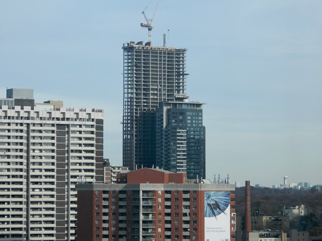
Hmm?..Its looking a bit like Leaside Towers that were built in the late 60s
Can't argue with great precedent!
junctionist
Senior Member
I'm also getting a Manulife Centre vibe in terms of proportions and the rigid and heavy yet tasteful geometry.
kotsy
Senior Member

At The Lookout by kotsy, on Flickr
Jasonzed
Senior Member
steveve
Senior Member
This morning:


