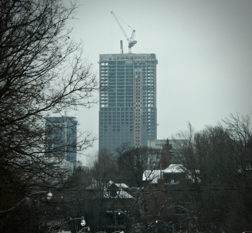
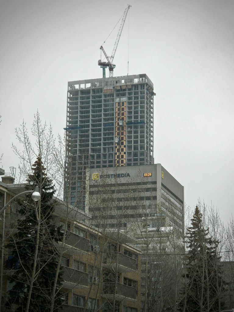
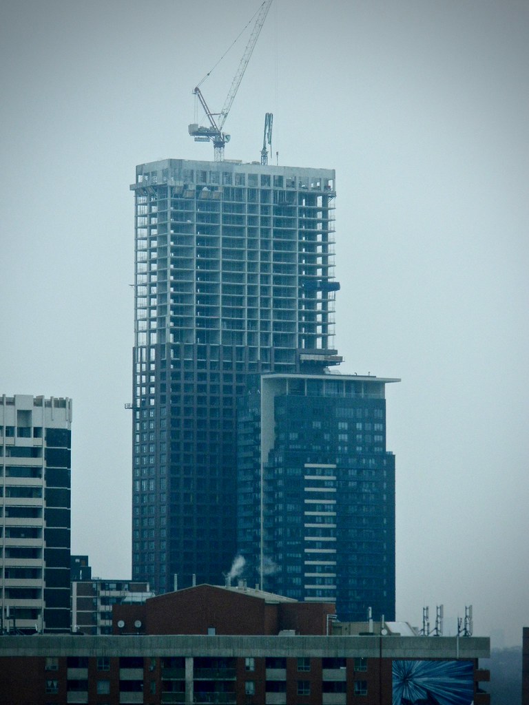
Toronto The Selby | 165.5m | 50s | Tricon | bKL Architecture

yes, the grey-blue spandrel stands out way too much and doesn't seem to go with anything. Black would've been much nicer.

Such an easy improvement too. I assume there must be a reason for the grey... even a first year design student could have told them that black would look better. Sometimes I wonder who makes these decisions :confused:
 
This morning. Almost there.
P1060110.JPG
P1060111.JPG
 

Attachments

  • P1060110.JPG
    P1060110.JPG
    285.2 KB · Views: 662
  • P1060111.JPG
    P1060111.JPG
    429.6 KB · Views: 641
Man, James Cooper Mansion is one terrible tower. It's well done at street level and the lobby is nice and all that. But Tridel gave no effs when they designed that tower portion.

It just makes The Selby look that much better. I will go as far to say that the rental will look more like a condo than the condo (JCM) when all is said and done.

I quite like James Cooper Mansion as a "filler" tower. The colour of the spandrels, window framing, and the tinted balcony railings is a tasteful charcoal. The contrasting off-white notch gives it character as it rises along the entire length of the facade to the distinctive columned penthouse level. Could it be improved? Yes, for instance, with fewer spandrel panels. But the tower and mansion at James Cooper Mansion and the Selby look good together.
 

Back
Top