T.E.C.II
Active Member
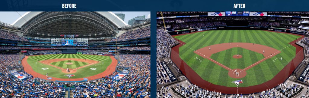
If I have a criticism of the renovations, it's that it doesn't look as warm and bright as it did in the renderings.
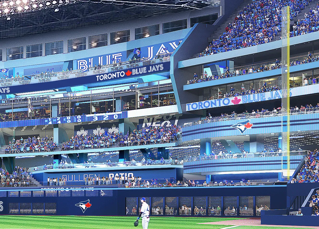
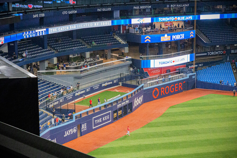
I'm not sure why they left the bullpen patio grey, it kind of stands out, but in a bad way. I also wish there were more baby blue accents on some of the panelling like in the render. And I really hope they haven't decided against the screen in right field just so they can keep the Rogers logo intact. That would be really misguided.
I'm not sure why they left the bullpen patio grey, it kind of stands out, but in a bad way. I also wish there were more baby blue accents on some of the panelling like in the render. And I really hope they haven't decided against the screen in right field just so they can keep the Rogers logo intact. That would be really misguided.