Toronto Union Station Revitalization | ?m | ?s | City of Toronto | NORR

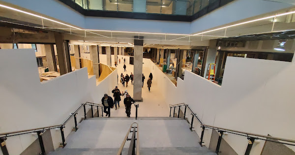
Passing through i noticed that a portion of the south part of the concourse is open from the old ford (blue) route. You can see it (the rest of the concourse) taking shape through the construction fencing
 
Last edited:
^ So would you like to see the lights follow the same pattern as the Bay Concourse where they follow the ceiling rectangular pattern?
 
^ So would you like to see the lights follow the same pattern as the Bay Concourse where they follow the ceiling rectangular pattern?

My chief complaint is about the quality of the lighting in the VIA. In the new Bay and York concourses the lighting is nice and bright and also has good daylight colour with a nice white balance... the lights are probably close to 5200K in both Bay and York concourses. Meanwhile the Great Hall lighting is extremely warm (a.k.a. amber) and is probably somewhere closer to 2500K although this will likely change once the new lighting is installed in the Great Hall.

Meanwhile the lighting in the now completely renovated VIA concourse is extremely dim for the size of the space and has the colour profile similar to the inside of a Walmart at around 3500K. This lighting is terrible on account of it providing absolutely zero architectural highlighting and zero ambiance.

They could have done much better and actually used the lighting in VIA to emphasize the architectural elements and improve ambiance in the waiting areas, instead they went for the bare minimum and chose to use budget-basics task lighting for the whole thing.
 
Though I agree that the VIA Rail concourse is not as good as it could/should be, it is a bit unrealistic to expect that an area with a rather low ceiling height can ever look as 'elegant' as areas like the Bay concourse with lofty ones. I also suspect that VIA is a City tenant so any fixes will depend on the City's Real Estate Services and it is probably best they work on getting the whole damn place finished before thinking about an update to the VIA area - which is really not TOO bad.
 
Though I agree that the VIA Rail concourse is not as good as it could/should be, it is a bit unrealistic to expect that an area with a rather low ceiling height can ever look as 'elegant' as areas like the Bay concourse with lofty ones. I also suspect that VIA is a City tenant so any fixes will depend on the City's Real Estate Services and it is probably best they work on getting the whole damn place finished before thinking about an update to the VIA area - which is really not TOO bad.

I think it is a VIA thing. When I walked past the baggage area, the belt was in disrepair. It needed to be repaired or replaced with all the chunks out of it.

That, plus the cheapo renovation makes me think VIA cheaped out on things hence the bad lighting,
 
I think it is a VIA thing. When I walked past the baggage area, the belt was in disrepair. It needed to be repaired or replaced with all the chunks out of it.

That, plus the cheapo renovation makes me think VIA cheaped out on things hence the bad lighting,
I am sure the equipment (like the baggage belt) belong to the tenant (VIA) but suspect the actual building is not their responsibility. The belt was working about 10 days ago but it does look old and the view through the window of it coming down from above with the old cardboard box lying there amid the dust is not a good sign!.
 
Though I agree that the VIA Rail concourse is not as good as it could/should be, it is a bit unrealistic to expect that an area with a rather low ceiling height can ever look as 'elegant' as areas like the Bay concourse with lofty ones.

Incorrect. There are plenty of public spaces with low ceilings that look beautiful. This comes down to an utter lack of qualifications and talent from those put in charge of redeveloping the VIA concourse. It's that simple: they don't know WTF they're doing and that somebody got the contract without any merit. It went to the lowest bidder or to someone who knew someone.

There is no lighting plan here. None whatsoever. They didn't take into consideration what they'd be lighting. They had this long space and they just filled it with lights. So you get these harsh lights pointing people in the eyes as they walk down the ramp and through the space. Meanwhile, the areas under the pillared portion get no light, other than residual light bounced off the yellow floor giving people this garish yellow skin tone.

The surfaces are poorly built. You can see that they're undulating and patched up. They painted everything with this varnish like paint that emphasizes that poor craftsmanship. The lighting makes it even worse.

All this not to talk about how the damn place is an echo chamber which is terrible because VIA employees have to shout to be heard. There's no PA system in there.

The quick fix: build soffits along the edges of the ceiling and add strips of LED lights hidden along those sides to create ambient light. Replace the light saber fixtures with pot lights falling through a false ceiling. Clad the ceiling with reflective metal panels to give an illusion of height. Use perforated panels to dampen the echo in the space. Add lamp fixtures to the pillars. Sand and polish the floors, or better, replace them with white flooring with a bit of a reflective property, to again give an illusion of more vertical space. Add a damn PA system exclusive to the VIA concourse so employees don't have to shout.
 
I think it is a VIA thing. When I walked past the baggage area, the belt was in disrepair. It needed to be repaired or replaced with all the chunks out of it.

That, plus the cheapo renovation makes me think VIA cheaped out on things hence the bad lighting,
I don't think that's going to happen given that VIA is phasing out checked baggage in the corridor with its new fleet.
 
What a contrast with the shit job ViaRail did with their ceilings.

View attachment 222361

I still have a hard time believing that this is the finished renovation of the ViaRail boarding lounge.

This space looks and feels as if there was never a renovation in the first place.

Out of curiosity, does anyone have pictures from before the construction that I can compare to?
 
This space looks and feels as if there was never a renovation in the first place.
It may not have been the best renovation job but it really is MUCH better than before. It was ghastly!'
.
VIA.jpg
 
I tend to disagree. As someone who travels through Union daily it is a welcome addition to have the covered moat. Covering a section would not have done much for weatherproofing but covering the whole thing keeps everyone climate controlled.

Now that we're on the topic, isn't this section supposed to (stupidly) stay uncovered? I thought it had something to do with service vehicle access, but everything beside the stairs (doors to the moat section of Union, the walkway under the Front/York intersection, and the new access to 123 Front St. W.) leads indoors already. Why not enclose the area to the right of the stairs?

DSC00278.JPG
 
Last edited:

Back
Top