You are using an out of date browser. It may not display this or other websites correctly.
You should upgrade or use an alternative browser.
You should upgrade or use an alternative browser.
Toronto Tableau Condominiums | 124.05m | 36s | Urban Capital | Wallman Architects
- Thread starter voxpopulicosmicum
- Start date
Marcanadian
Moderator
Friday:
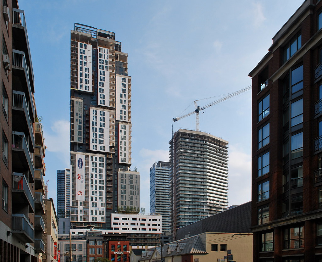 Picasso Condos by Marcus Mitanis, on Flickr
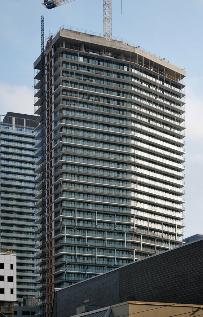 Tableau by Marcus Mitanis, on Flickr
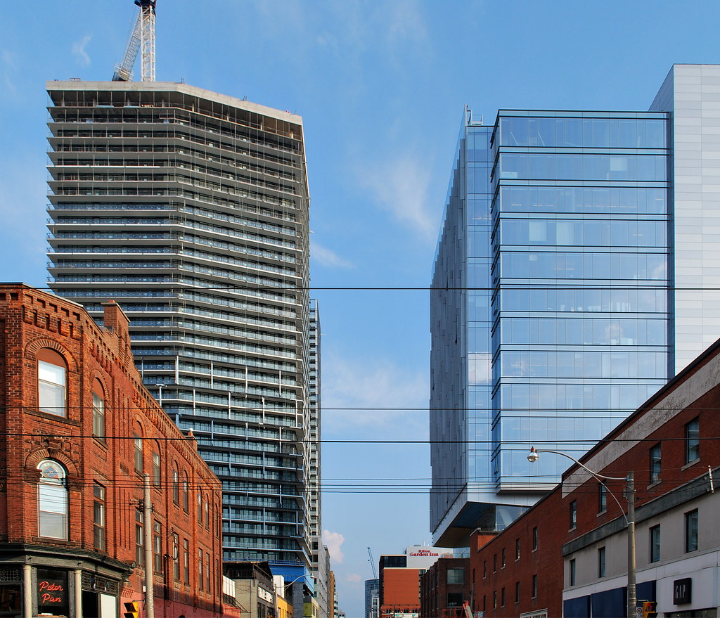 Peter Street by Marcus Mitanis, on Flickr
 Picasso Condos by Marcus Mitanis, on Flickr
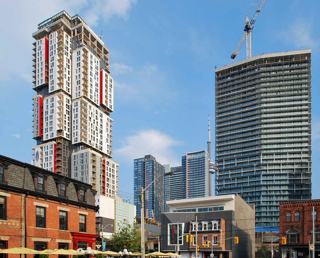 Entertainment District by Marcus Mitanis, on Flickr
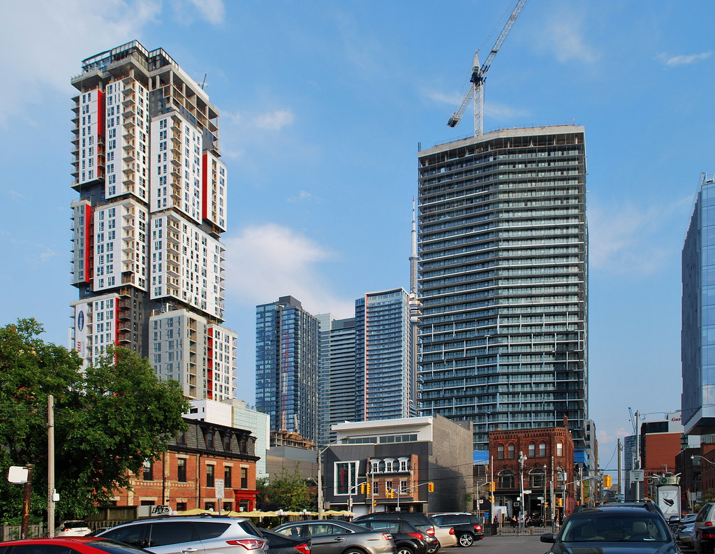 Entertainment District by Marcus Mitanis, on Flickr
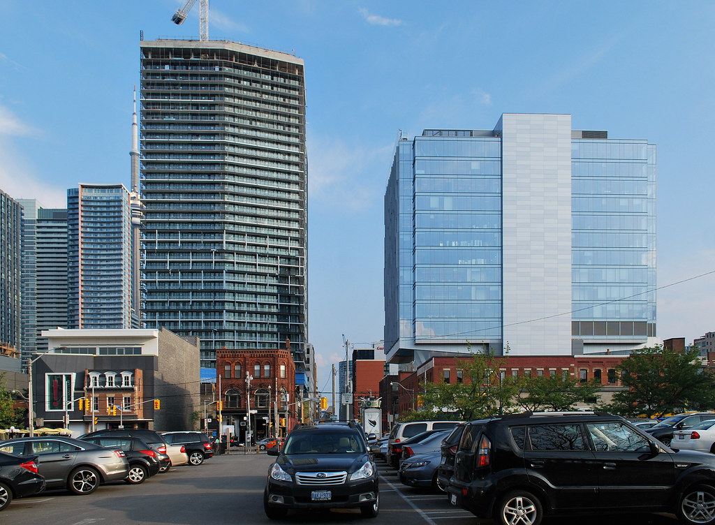 Tableau and Queen Richmond Centre by Marcus Mitanis, on Flickr
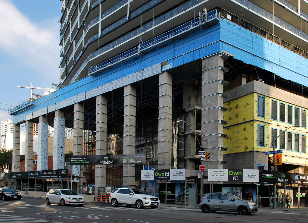 Tableau by Marcus Mitanis, on Flickr
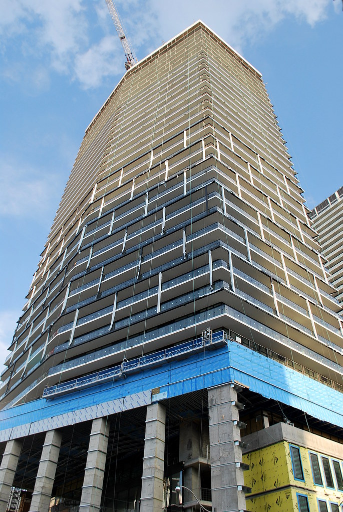 Tableau by Marcus Mitanis, on Flickr
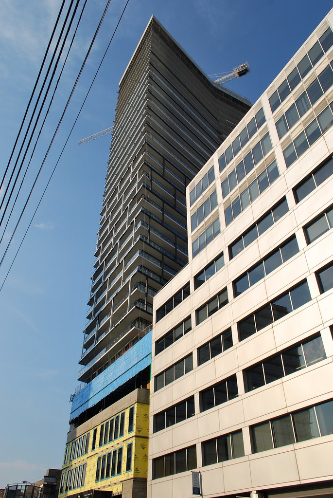 Tableau by Marcus Mitanis, on Flickr
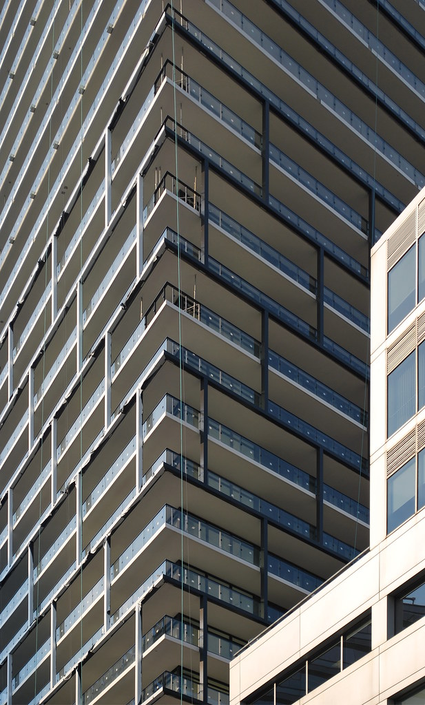 Tableau by Marcus Mitanis, on Flickr
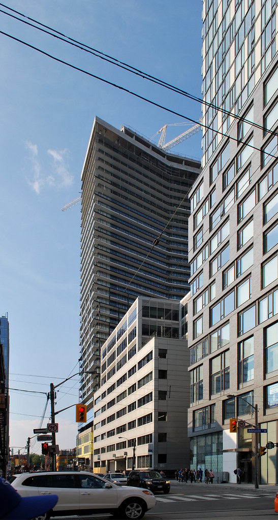 Tableau by Marcus Mitanis, on Flickr
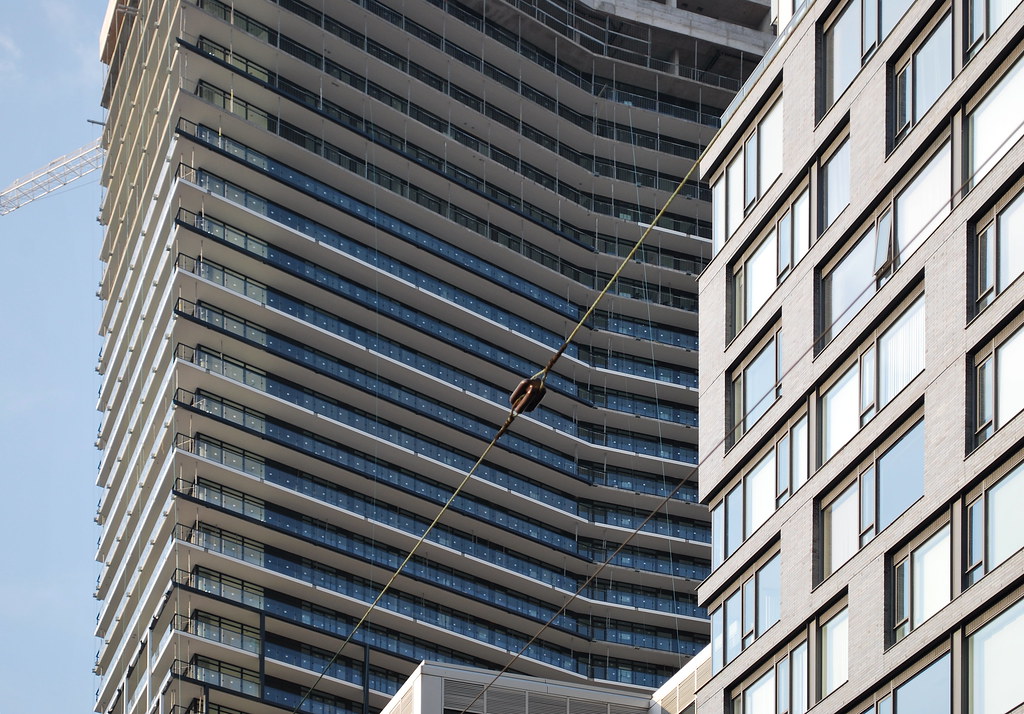 Tableau by Marcus Mitanis, on Flickr
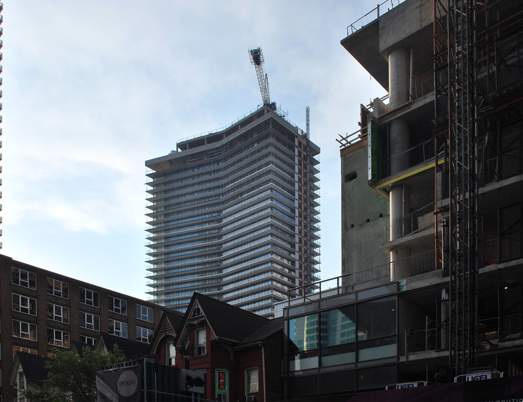 Tableau by Marcus Mitanis, on Flickr
 Picasso Condos by Marcus Mitanis, on Flickr
 Tableau by Marcus Mitanis, on Flickr
 Peter Street by Marcus Mitanis, on Flickr
 Picasso Condos by Marcus Mitanis, on Flickr
 Entertainment District by Marcus Mitanis, on Flickr
 Entertainment District by Marcus Mitanis, on Flickr
 Tableau and Queen Richmond Centre by Marcus Mitanis, on Flickr
 Tableau by Marcus Mitanis, on Flickr
 Tableau by Marcus Mitanis, on Flickr
 Tableau by Marcus Mitanis, on Flickr
 Tableau by Marcus Mitanis, on Flickr
 Tableau by Marcus Mitanis, on Flickr
 Tableau by Marcus Mitanis, on Flickr
 Tableau by Marcus Mitanis, on Flickr
urbandreamer
recession proof
Miscreant
Senior Member
Member Bio
- Joined
- Oct 9, 2011
- Messages
- 3,616
- Reaction score
- 1,795
- Location
- Where it's urban. And dense.
agoraflaneur
Active Member
someMidTowner
¯\_(ツ)_/¯
The alternating black and white slab edges are a great touch. From today:


Attachments
neuhaus
Senior Member
The alternating black and white slab edges are a great touch.
That's done to produce the black brick patterned grid over the balconies.
The black grid looks very nice over the white painted balcony undersides and it's best appreciated from the street level. Though I think the grid will get lost when seen from a distance with the window wall as a backdrop.
This is going to be a very handsome building.
Agreed—Tableau promises to look great. One note though; it's looking to me like the white edges are going to be the dominant feature in the end, at least from any distance, when it's clear in the renderings that the black edges are meant to dominate the design. From up close though, the black will rule.
42
42
Midtown Urbanist
Superstar
Agreed. It's keeping my attention.The alternating black and white slab edges are a great touch.
I am growing to like Tableau after all.
stjames2queenwest
Senior Member
August 31

junctionist
Senior Member
It's going to be fun to take off all the wrapping.
Benito
Senior Member
Benito
Senior Member
stjames2queenwest
Senior Member
Wrappings are off on the north facing side. Sept 8


