You are using an out of date browser. It may not display this or other websites correctly.
You should upgrade or use an alternative browser.
You should upgrade or use an alternative browser.
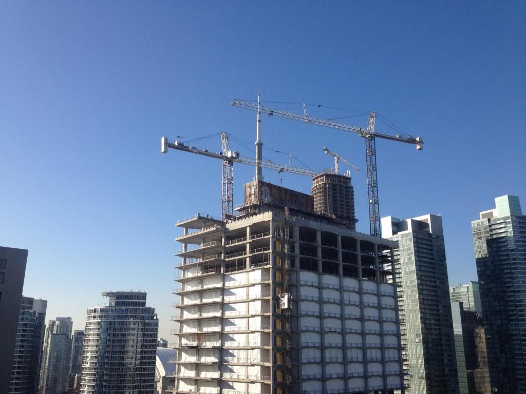
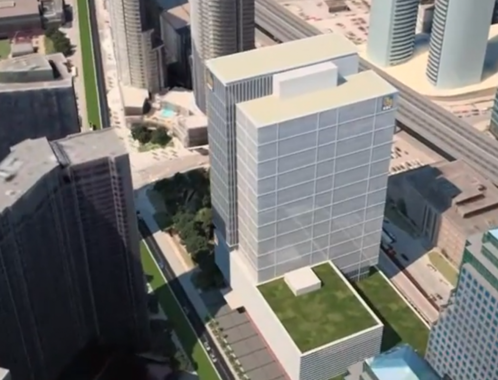
Toronto RBC WaterPark Place III | 140.2m | 30s | Oxford Properties | WZMH
- Thread starter Frank
- Start date

Zeiss
Active Member
The mechanical box is at least two times taller than shown in the video; /http://www.youtube.com/watch?v=0-tKZBuzsfI/ Also there is difference in the south west top corner.
DtTO
Active Member
The choice of glass is sickening! It looks high quality and all, but why choose something so reflective near the lake? Poor birds 
Stupidandshallow
Active Member
Did someone actually suggest bronze or gold? That's a problem with today's forums. Junk gets passed around as, "at least it's different".
Buddy, you can't tell me that the Royal Bank Plaza isn't a stunner?! I don't know what the cladding is technically, whether if it's "gold" or "bronze", but it does have the appearance of those colours. It's such a handsome building and "so different!" Also, it was built in the 70s!! Which, is really shameful given all of the advances we should have in technology/building/architecture.
maestro
Senior Member
Royal Bank Plaza is but one building with actual gold in the glass. The articulated facade makes the gold shine. It has nothing in common with this building. I've yet to see a single brown/bronze coloured facade that looked good. Different doesn't mean better.
Stupidandshallow
Active Member
Royal Bank Plaza is but one building with actual gold in the glass. The articulated facade makes the gold shine. It has nothing in common with this building. I've yet to see a single brown/bronze coloured facade that looked good. Different doesn't mean better.
HUH? Oh man... reading comprehension isn't very big on this forum...
I didn't say it had anything in common with this building. The conversation was about wanting to see more brown/gold cladding in the south core to serve as a break from the homogeneity *not specifically applied to this building as it's "forming up to be as the renders offered" (posted by DarkSideDenizen 2013-Oct-25, 00:17).
Admittedly, you dismissed someone else's desire to see more brown and gold clad buildings in the south core as junk.... I was merely pointing out that one such building exists and surely isn't Junk! (judging by your response, I think you might even agree that the Royal Bank Plaza isn't junk! haha)
I guess there's a different kind of problem with today's forums
lolSP!RE
°°°°°°
This is 2013, not 1980. The Royal Bank Plaza (with the gold in its windows) is decades-old. It's stunning, but it's very much of its time. It's certainly not junk, but it's from a different time.
Times change, and tastes change. Nobody would build an overwhelmingly gold-coloured tower in 2013. Architects wouldn't propose it to a client, and a client would never build such a thing, even if they are a bank.
Times change, and tastes change. Nobody would build an overwhelmingly gold-coloured tower in 2013. Architects wouldn't propose it to a client, and a client would never build such a thing, even if they are a bank.
rpeters
Active Member
Nobody would build an overwhelmingly gold-coloured tower in 2013. Architects wouldn't propose it to a client, and a client would never build such a thing, even if they are a bank.
http://en.wikipedia.org/wiki/Mercury_City_Tower they do in Russia, I think it looks pretty good.
Last edited:
maestro
Senior Member
Your arrogance may be clouding your own comprehension. My point remains that the Royal Bank Complex is but one of very few golden towers that looks good. I simply offered reasons being the articulation of facade and the use of real gold in the glass for its timeless look.
In the end, it's an opinion developed seeing dozens of golden towers beyond Bay Street. The golden colour lowers the aesthetics of the design. Going beyond Toronto, Imagine Moscow's newest "no corners cut" golden tower in a different colour. An opinion that strongly disagrees with golds and browns as a solution to people's concerns of there not being enough colour.
In the end, it's an opinion developed seeing dozens of golden towers beyond Bay Street. The golden colour lowers the aesthetics of the design. Going beyond Toronto, Imagine Moscow's newest "no corners cut" golden tower in a different colour. An opinion that strongly disagrees with golds and browns as a solution to people's concerns of there not being enough colour.
HUH? Oh man... reading comprehension isn't very big on this forum...
I didn't say it had anything in common with this building. The conversation was about wanting to see more brown/gold cladding in the south core to serve as a break from the homogeneity *not specifically applied to this building as it's "forming up to be as the renders offered" (posted by DarkSideDenizen 2013-Oct-25, 00:17).
Admittedly, you dismissed someone else's desire to see more brown and gold clad buildings in the south core as junk.... I was merely pointing out that one such building exists and surely isn't Junk! (judging by your response, I think you might even agree that the Royal Bank Plaza isn't junk! haha)
I guess there's a different kind of problem with today's forums
Last edited:
Quite a number of overly fussy and questionable details in that Mercury City Tower, like the zig-zag white mullion course and the smaller cladding sections above it. What does any of that add to that building?
In terms of the copper coloured cladding there, it likely adds variety to its piece of Moscow skyline the way that Royal Bank Plaza's gold always has to Toronto's. I always appreciated that you could quickly describe each tower in the core to visitors by saying "the white tower is…, the black towers are…, and that's real gold in the gold towers of the…", etc. With the crowding of the skyline now, there are fewer spots where the grouping of uniquely coloured towers can easily be seen, and while the overall effect of the growing skyline is more impressive, I'm sorry that we have less cladding/glazing variety now.
42
CanadianNational
Senior Member
I've yet to see a single brown/bronze coloured facade that looked good.
Pure bronze facade: Seagram Building, New York: Bronze all the way with 'Whisky Tinted' brown glass.
Black steel and Bronze: The Toronto Dominion Center, with it's bronze-tinted banking pavilion and towers.
These are foundational buildings from one of the 20th century's premier inventors of modernism.
These building's aren't up for judgement as to their architectural and aesthetic merits.
But it's completely subjective as to whether or not you think more would be bad. Better to post it as opinion rather than as fact.
Personally, I would l-o-v-e to have seen more colour at southcore - and proper visionary, inventive modernism that shows the computer age we are in now, instead of old standards of modernism based on the repetitious makings of the assembly-line age.
Last edited:
AlvinofDiaspar
Moderator
Yeah, definitely pass on Mercury City Tower. Or gawd forbid, Sussex Centre pink.
We need more than just different colour at Southcore - we need difference in the texture of exterior cladding as well.
AoD
We need more than just different colour at Southcore - we need difference in the texture of exterior cladding as well.
AoD
Mithras
Active Member
Pure bronze facade: Seagram Building, New York: Bronze all the way with 'Whisky Tinted' brown glass.
Black steel and Bronze: The Toronto Dominion Center, with it's bronze-tinted banking pavilion and towers.
These are foundational buildings from one of the 20th century's premier inventors of modernism.
These building's aren't up for judgement as to their architectural and aesthetic merits.
But it's completely subjective as to whether or not you think more would be bad. Better to post it as opinion rather than as fact.
Personally, I would l-o-v-e to have seen more colour at southcore - and proper visionary, inventive modernism that shows the computer age we are in now, instead of old standards of modernism based on the repetitious makings of the assembly-line age.
1 University is pure bronze as well. Gorgeous little building but the cost to replicate today would be outstandingly large. Same with RBC Plaza which has kilos of gold in the windows.
MafaldaBoy
Senior Member
10 December 2013:

Waterpark Place III by MafaldaBoy, on Flickr

Waterpark Place III by MafaldaBoy, on Flickr

Harbourfront Construction by MafaldaBoy, on Flickr
Waterpark Place III by MafaldaBoy, on Flickr
Waterpark Place III by MafaldaBoy, on Flickr
Harbourfront Construction by MafaldaBoy, on Flickr
hawc
Senior Member
I've walked by this and driven by this enough times in the last few weeks to say I really don't think this building improves the look and feel of this area at all.
If one of the problems with Toronto's waterfront is that we have high-rises and condos jammed shoulder to shoulder right up against the water's edge forming a wall between the people and the water, then this just makes the situation worse.
We can appreciate the building's design in and of itself, but its locations just increases the density of an area that is already too dense (33 and 55 Queens Quay were planning disasters for the area).
I'm pro development and I love tall buildings as much as the next guy, but I just see more and more sky and horizon disspearing.
Maybe we're too far gone now (will never have a Chicago like waterfront) but this just adds another huge building right next to the lake.
Driving along the Gardiner now from Jarvis to Jameson is starting to feel like a scene out of a Toyko car racing movie with buildings on either side and more and more of our downtown is starting to feel like a generic field of Vancouver condos.