News   Jul 15, 2024
 183     0 
News   Jul 15, 2024
 356     0 
News   Jul 12, 2024
 1.8K     1 

Toronto Crosstown LRT | ?m | ?s | Metrolinx | Arcadis

Are you saying that these art displays are comparable to a persistent strobe light?
That is another consideration, but the strobing issue is to do with mimicking the body's internal carrier frequencies. Depending on how this display is lit, it may, or likely to an extent would, effect that result. My sensitivity lies in other areas, far more complex than just fundamental carrier information (stimuli)(For want of simple explanation, I get "overwhelmed" by it, a lot of Hollywood action movies do same, I just walk out):
People with PSE experience epileptiform seizures upon exposure to certain visual stimuli. The exact nature of the stimulus or stimuli that triggers the seizures varies from one patient to another, as does the nature and severity of the resulting seizures (ranging from brief absence seizures to full tonic–clonic seizures). Many PSE patients experience an “aura” or feel odd sensations before the seizure occurs, and this can serve as a warning to a patient to move away from the trigger stimulus.

The visual trigger for a seizure is generally cyclic, forming a regular pattern in time or space. Flashing lights or rapidly changing or alternating images (as in clubs, around emergency vehicles, in action movies or television programs, etc.) are examples of patterns in time that can trigger seizures, and these are the most common triggers. Static spatial patterns such as stripes and squares may trigger seizures as well, even if they do not move. In some cases, the trigger must be both spatially and temporally cyclic, such as a certain moving pattern of bars.

Also note: Some people may also find overhead fans spinning to be of the same nature. [...]
https://en.wikipedia.org/wiki/Photosensitive_epilepsy

I have faith that a medical specialty clinic will intervene and ask: "WTF are you thinking?"

Let's flip this over for the sake of argument: What is the effect from a 'hall of mirrors' on almost everyone? Now factor that for a sizable minority in this instance...*on a Goddarn escalator yet!*
 
Last edited:
Personally, in respect of aesthetics, I'd rather see a focus on good materials/finishes, an interesting colour palette, better flooring (even just terrazzo w/colour variations), good ceiling finishes and quality light fixtures.

I completely appreciate, in theory, the addition of nice art, but I'm a bit concerned this often becomes an excuse to cut corners in other areas (see TYSSE w/unfinished trackside walls, mediocre light fixtures, and spots w/no ceiling finish at all.
Yeah, and the TTC has already been there!
Dupont Station is but one of a number of truly *welcoming* stations. Now this is Metrolinx, and they both seem to be trying to outdo each other to build *carnival sheds* instead of tasty and sensible stations.

Addendum:
dupont_subway_station.jpg


Dupont Station
dupont-station-tile_.jpg

Find out about how we’re making Dupont Station accessible for everyone.

This station and a few others are on par to compete with any around the world. Unfortunately, parts of the station need some TLC. But worry not, the money is being thrown away in spades on ones that are rusty to begin with (Pioneer Village) and massive tributes to Soviet Tractor Factories (a number of the other monstrosities on the TYSSE).
 
Last edited:
Yeah, and the TTC has already been there!
Dupont Station is but one of a number of truly *welcoming* stations. Now this is Metrolinx, and they both seem to be trying to outdo each other to build *carnival sheds* instead of tasty and sensible stations.

Addendum:
dupont_subway_station.jpg


Dupont Station
dupont-station-tile_.jpg

Find out about how we’re making Dupont Station accessible for everyone.

This station and a few others are on par to compete with any around the world. Unfortunately, parts of the station need some TLC. But worry not, the money is being thrown away in spades on ones that are rusty to begin with (Pioneer Village) and massive tributes to Soviet Tractor Factories (a number of the other monstrosities on the TYSSE).

Dupont is public art done right. It's actually integrated into the station, and the art carries itself through the entire station. This isn't something that has to be expensive.

The Crosstown design tacks on public art to one or two spots in a handful of stations, leaving the rest of the station bare and undecorated.
 
I don't know about that - the designs we have seen so far is clearly guided by certain design principles. I find the overall effect to be far more coherent than the TYSSE approach.

AoD
And more cost-effective. Remember, one of the main contributors to the overruns on TYSSE were adding the desire for world-class designs at stations AFTER the initial contracts had been awarded. Plus TYSSE was largely greenfield, acres of land for each station, while all of the underground Crosstown stations are being shoehorned between existing buildings - much like Canada Line up Cambie in Vancouver...and you have tasteful yet simple station designs.
 
Dupont is public art done right. It's actually integrated into the station, and the art carries itself through the entire station. This isn't something that has to be expensive.

The Crosstown design tacks on public art to one or two spots in a handful of stations, leaving the rest of the station bare and undecorated.
Very well put!

Gotta love the artist claiming how her work "confronts" passengers. I claim visual assault in today's PC world. #stopvisualassault

I'm only half joking. The term is "sensory overload" and most of us are affected by it, some more than others, especially hyperkinetics like myself as a result of Thyroid Cancer. (This has a silver lining to the cloud. I'm now pushing 70 with the energy of a 30 year old, damage besides) It's not art, it's a distraction. And for that second less intrusive scheme, I can see how it would cue Schizophrenics. Their ability to discern shadow from direct image is compromised enough as it is, why play with people's heads like that? Many of the disorders mentioned aren't 'all or nothing'. They affect the population by degree, and perhaps half the population is affected to some extent.

What's wrong with just making a 'public place' *welcoming* and not "confront" anyone?
 
Last edited:
Very well put!
Gotta love the artist claiming how her work "confronts" passengers. I claim visual assault in today's PC world. #stopvisualassault

Gack. I'm controlling my sarcasm and at the same time trying not to sound like Hank Hill.

There is a legitimate level of discussion of art that goes above what the average person says or thinks, but beyond that is a level that is pure self-absorption.

When we are talking about public art and aesthetics of a subway station, the average Joe's "I like it" is as good as it need get.

So yeah, we want spaces that are attractive and pleasing. But I hope Crosstown leaves the highbrow stuff down at the OCA. Which says that we don't need top-end artists and their expensive commissions, nor do we need international competitions.

IKEA kitchen pretty is good enough.

- Paul


Hold it right there, Paul! I was completely with you til the last line.

When did IKEA start making pretty kitchens?

:p
 
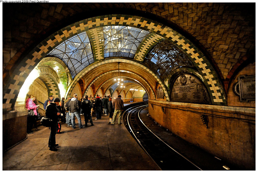
As well as unneeded expense and poor choice of what adds to most riders' experiences, there's the very real issue of *disorientation* for some (and this includes myself at times, years of cancer treatment have taken a toll on some receptor processes) and from the descriptions given, I would avoid dwelling on both of these while trying to navigate my way to a destination. I'm only mildly affected, aging eyesight and compromised depth perception add to the proclivity to convolute visual planes, but for some, both of these would be an absolute nightmare:

eglinton_station.jpg.size.custom.crop.1086x747.jpg
science_centre_station.jpg.size.custom.crop.850x478.jpg


Someone, a few, are *really* not thinking on this one. I'd suggest they consult some experts on this before going ahead with these at the locations stated.

How bad is this for someone with compromised perceptual abilities? Almost as bad as physical barriers for wheelchair users.

Note where the 'crystalline corruption of depth and distance' is aimed right at people on *escalators* for God's sakes. In my case, the problem is overly-acute processing of the image, to the point of affecting balance and sense of position. I'd immediately grab the moving handrail and look away. For some, that reaction wouldn't be reflexive, they'd just lose their balance on the escalator.

Read the artist's own description, and then think about how this will affect some:
.
Ya know, I don't blame the artist so much as the morons in charge of bureaucratic dispensation of saccharide disorientation. By all means *please* the eyes. But challenging the safety of a sizable minority of riders is just plain @#%&*) stupid.

Next week:
Infinity Mirrors presents a surprise display at Yonge and Bloor station! Dazzle people! Take them to a new world where what they see isn't real! See them trip and fall in delight, and bleed the meaning of life from within.

I am reminded of a possibly apocryphal anecdote about James Turrell’s early work. Some of his installations were supposedly so immersive, and so effective in altering visitors’ perceptions of light and shadow, that people would try to lean on beams of light, thinking they were a wall or something, and fall flat on their rear ends. A couple of lawsuits later, and he had to dial things back a little.
 
It's ironic that GO and the TTC ban music outside of headphones, and yet insist on your participating in visual "confrontations" as you step on an escalator.

What next?
TTC backtracks on $500,000 station art installation
Hold it right there, Paul! I was completely with you til the last line.
When did IKEA start making pretty kitchens?
Gack! (Again). lol...I wondered how the IKEA thing would go down, so perhaps "milquetoast" might be more apt?
I am reminded of a possibly apocryphal anecdote about James Turrell’s early work. Some of his installations were supposedly so immersive, and so effective in altering visitors’ perceptions of light and shadow, that people would try to lean on beams of light, thinking they were a wall or something, and fall flat on their rear ends. A couple of lawsuits later, and he had to dial things back a little.
Exactly! Except on an escalator or platform edge, you don't just fall on your touche.


There's a good reason why highway signs are regulated for being fatally distracting or not.
 
Metrolinx to unveil winning public art designs for Eglinton Crosstown Stations

TORONTO: January 15, 2017 – Join Leslie Woo, Chief Planning Officer with Metrolinx, who will officially announce the successful artists and unveil their beautiful concepts for the future Eglinton Crosstown stations.

Date: Tuesday, January 16

Time: 10:00 a.m.

Location: Ontario Science Centre, Great Hall

770 Don Mills Road, North York

(southwest corner of Eglinton Avenue East and Don Mills Road)


Parking: Free parking is available on site.
 
I don't know about that - the designs we have seen so far is clearly guided by certain design principles. I find the overall effect to be far more coherent than the TYSSE approach.

AoD

Exactly. Coherent, cost-effective, but with art included. This is the right approach imo. But since I haven't seen a doc on these installations, and reading the article where it's noted that only a small percentage of the Crosstown stations/stops will have art, I'm wondering if we could do a bit more. Maybe not "art", but what about tilework? Will each of the stations have a different pattern and colour scheme? Even if just done simple like Line 2 with an alternating solid and stripe colour pattern is a lot better than continuous grey or white. Then what about the surface stops of which there's many. Surely we could do something like St Clair with bits of unique artistic flair. The cost of tiles or small glass panels are a drop in the bucket.
 
Exactly. Coherent, cost-effective, but with art included. This is the right approach imo. But since I haven't seen a doc on these installations, and reading the article where it's noted that only a small percentage of the Crosstown stations/stops will have art, I'm wondering if we could do a bit more. Maybe not "art", but what about tilework? Will each of the stations have a different pattern and colour scheme? Even if just done simple like Line 2 with an alternating solid and stripe colour pattern is a lot better than continuous grey or white. Then what about the surface stops of which there's many. Surely we could do something like St Clair with bits of unique artistic flair. The cost of tiles or small glass panels are a drop in the bucket.

I have no problem with staying with the same colour scheme either - TBH I've always preferred something timeless like Bilbao or DC Metro. Other than where it truly mattered, the art should be the station itself.

AoD
 
I have no problem with staying with the same colour scheme either - TBH I've always preferred something timeless like Bilbao or DC Metro. Other than where it truly mattered, the art should be the station itself.

AoD

DC Metro is a whole different ballgame. Bare walls, but done so beautiful I dare not dream of us doing something similar. Specifically for their underground vaulted stations. And a lot of that is just a perfect combo of exceptional architecture, design, and lighting. I think it's safe to say Crosstown won't be Bilbao or DC. But do we have an answer about how the platforms will look with Crosstown - e.g tilework on one side, concrete on the opposite side, general colour scheme? Or is that still undecided?
 

Back
Top