Toronto Accolade Condo | ?m | 34s | Tridel | Burka

We need more colour like this! Why couldn't Crystal Blu be bold like Accolade?
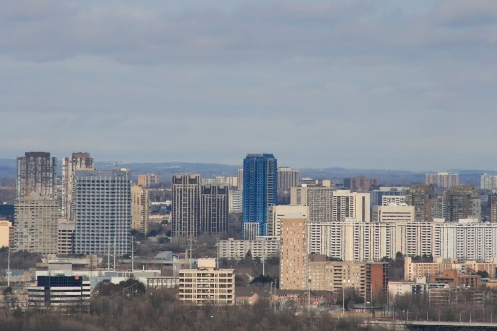
IMG_5408.jpg


^Big zoom from Casa

Great shot!

People like Hume & urbandreamer have got it all backwards, though that's not a first for them.
Accolades color is the one thing that makes it stand out. Looking at that photo I see one interesting building in a sea of banality.
 
Great shot!

People like Hume & urbandreamer have got it all backwards, though that's not a first for them.
Accolades color is the one thing that makes it stand out. Looking at that photo I see one interesting building in a sea of banality.

This building looks terrible from the highway. That picture above makes it look a billion times better than it actually is. In reality, the light blue cladding panels make the building look very sloppy. If Tridel had used darker blank panels to match the actual windows, it would have looked much better and probably would have earned a greater score from Hume.

It seems like Tridel is getting some sort of deal on off-white glass panels lately....
 
We need more colour like this! Why couldn't Crystal Blu be bold like Accolade?

thank you for the great show Casaguy ... you've demostrated perfectly how amazingly Accolade looks in its context

Great shot!

People like Hume & urbandreamer have got it all backwards, though that's not a first for them.
Accolades color is the one thing that makes it stand out. Looking at that photo I see one interesting building in a sea of banality.

I'm in complete agreement with you vegeta_skyline~

This building looks terrible from the highway. That picture above makes it look a billion times better than it actually is. In reality, the light blue cladding panels make the building look very sloppy. If Tridel had used darker blank panels to match the actual windows, it would have looked much better and probably would have earned a greater score from Hume.

It seems like Tridel is getting some sort of deal on off-white glass panels lately....

I disagree Jayomatic ... from a distance or up close driving past on DVP, Accolade looks beautiful ... I am of the opinion that the bright blue spandrels (rather than light blue) really enhanced this towers ... had it been a dark blue spandrel (like CIRCA) Accolade would have just be lost in the sea of concrete towers

I'm not sure where there is any off white glass on Accolade, the windows are in fact slightly blue tinted when you look out from the condo suites ~ are you thinking of the white spandrels @ Tridel's Republic project instead ??
 
I too think the colours work on this building. The structure itself could use some refinement, but the blue colours are the last thing worth complaining about.
 
I'm just gonna have to say those that love this building must be either colour blind or will settle for kitsch.

An example of how blue glass can be done right: Bernard Tschumi’s Blue Building apartments in Manhattan:

http://www.flickr.com/photos/jag9889/3413334678/

blue9-09-4028b.jpg


Another blue glass condo example, in NYC as well is 40 Mercer. Would look great anywhere in Toronto (reminds me of Peter Clewes' aesthetic.):

http://www.40mercersoho.com/index.swf

Actually, if Tridel had hired aA to do a blue glass condo, it would've looked stunning. Instead, Toronto gets another eyesore by an inferior architect.
 
Last edited:
just for once, it would be nice if one were to not put aA on the pedestal treating it as if it was 'platinum'

whether you agree or not .... there are decent architects with high quality projects out there other than aA, I frankly am not impressed by the copy + paste glass box designs time after time from this firm ... I'm quite happy that Tridel retained someone OTHER THAN aA for Accolade

I'm just gonna have to say those that love this building must be either colour blind or will settle for kitsch.

for the record ... I for one love the Accolade building and NO I'm not colour blind NOR would be described as tasteless by any one that I know ~
 
What I see in the photo that has been posted is a building that, through its colour, calls a certain attention to itself apart from all the other buildings nearby. To me, this is not a good thing, for an ordinary condominium tower. There is no particular reason why this building should stand out so much or want to be seen that much. It reminds me of a person at a party who continually talks too loud but says little of interest if you happen to listen, or someone who wears highly unusual, attention gathering clothes which are in the end quite ordinary apart from their attention gathering elements.

If you want to make a statement, it is better to have something to say.
 
No offense but there is nothing "high quality" about a spandrel glass tower. It's a fake, nothing design that can be produced in no time.

As to Accolade, it's a box with a solid base but what the hell is happening with the penthouse levels? I understand the desire for bold colours but, there's a fine line between bold and tacky "blue eyesore in the Don Valley". It doesn't help either the blue vision/spandel is the most commonplace off the shelf colour available.
 
I'm +1 for liking this building. No doubt its not cutting edge but very little of what we are getting these days is, especially in the suburbs. I really must take issue with my friend urbandreamer who continuously complains about the lack of colour in this city and now when we get some colour in Accolade, its not the right colour. Geeesh! Luckily for him he doesnt frequent this area of town.

I would agree with Maestro that spandrel glass is a very cheap method of cladding, but so is virtually every other method of cladding going these days. Its the times we live in - everything must be cheap and mass produced. I do not agree that this colour of glass is the most common place out there. I think we have all learned by now that title goes to green. Perhaps you could supply a list of other condo towers of this colour - certainly no others in the picture above...
 
the difference is ... Empire Plaza has blue glass with + grey spandrels + redish granite (like Scotia Plaza)

a building like Empire Plaza @ Eglinton + DVP would be so out of place with its rounded shape + granite exterior (which I actually like), it simply doesn't relate to / link with the rectangular slabs in the area ~
 
I agree that Empire Plaza is a stellar example of architecture, long been a fave of mine too. I actually remember when it was built as you say about 20 years ago and was marketed as the only residential address on University Ave at the time. (I guess it still is until Shangi-la is completed???)
 
Last edited:
I have a couple friends that live at Empire Plaza. The units are HUGE! Also, the rooftop patio is amazing. Very nice building.
 

Back
Top