Toronto Accolade Condo | ?m | 34s | Tridel | Burka

lol that last picture is telling about the current situation in Toronto.


In the background you have a brand new sparkling Condo tower.


In the foreground you have a sign missing to a likely a vacant factory or office place... ;)

That was the location of the late, lamented Bata International Building. If you check out the Aga Khan museum thread you will see that the project has been stalled since it was announced in 2002.
 
October 11 2009 update

The Entrance Canopy
IMG_1662.jpg


The Building
IMG_1663.jpg


The View to Downtown Toronto
IMG_1665.jpg


The View to SCC
IMG_1664.jpg


Delmanor Wynford
IMG_1666.jpg

IMG_1667.jpg
 
It is a pretty amazing and impressive building.

I was at the Accolades "Ribbon Cutting" last Thursday, and I was blown away. Very rarely have I seen occupancy commence for a building, where all the amenities and common space (such as hallways) have been completed.

The building looks great, and the purchasers that I spoke to were extremely pleased with the building.

Also got a peak of the view from the 34th floor. Personally, I don't normally like units over the 12th floor, but the over overlooking the Toronto skyline was very nice.
 
Accolade Signature Collection Model Suite S4

This is the model suite photography taken last Thursday of the two bedroom Signature Collection S4 at Accolade. S4 is located on the upper floors 32 to 34.

Suite features 10 foot smooth ceilings, granite counter tops, porcelain tile in the kitchen, stainless steel appliances, insuite laundry and crown molding in the living room.

Accolade-3205-01.jpg


Accolade-3205-02.jpg


Accolade-3205-03.jpg


Accolade-3205-04.jpg


Accolade-3205-05.jpg


Accolade-3205-06.jpg
 
I didn't follow this building until I saw it profiled on the home page, I only have time to follow projects in the general downtown area where I live. My immediate response was what has been posted above, this is what Crystal Blu should have looked like. I really like this building, Tridel has done a nice job here. Opening ceremonies and building complete for residents to enjoy? Leave it to Tridel! That's how you treat your buyers who, for the most part are making the biggest purchase of their lives. Developers take note!
 
i was thinking the same thing ...... if this was crystal blu then it would have been a huge success. This building looks great!. Location not so much......
 
Hume's response:
Eglinton a victim of good intentions

February 20, 2010
Christopher Hume


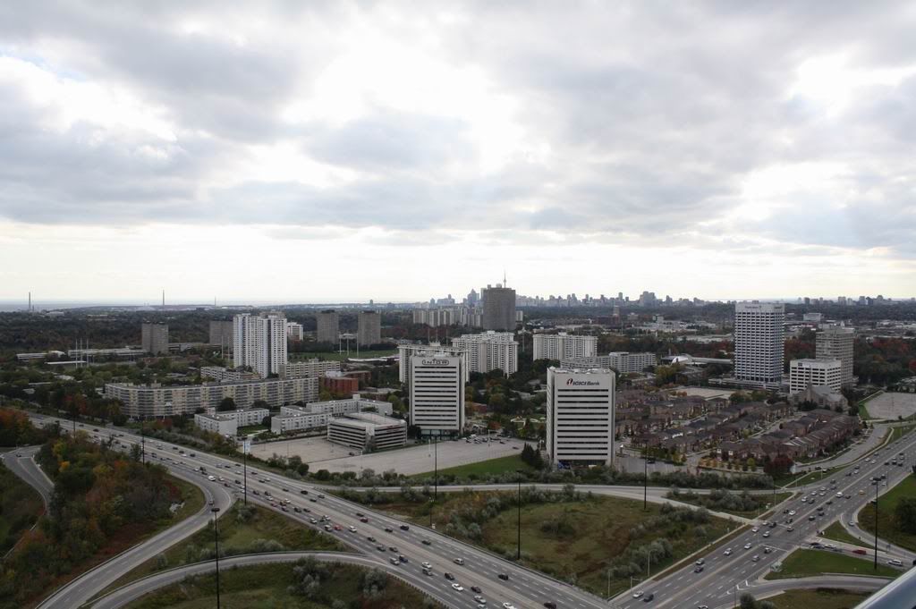
Suburban intensification may sound like an oxymoron but it happens all the time. Eglinton Ave. E. is no exception; indeed, here's an area well into second or third wave of development. The large industrial complexes that appeared in the 1950s and '60s are now surrounded by malls and condos.
At the same time, buildings have grown taller; the lowrise topography of the post-war era has been replaced by residential skyscrapers.
The results can be interesting, if not always for the best of reasons. Different planning ideas have held sway over the decades, each leading to different outcomes. The spread-out aesthetic of traditional suburban planning has given way to densities that reflect increased land values in an ever expanding city.
Because density will be key to future prosperity, this is all good. The problem lies in design, planning and architecture.
Worst of all, the clash of intentions and philosophies along a street such as Eglinton means the public realm ends up as leftover space that people pass through but never inhabit.
CONDO CRITIC

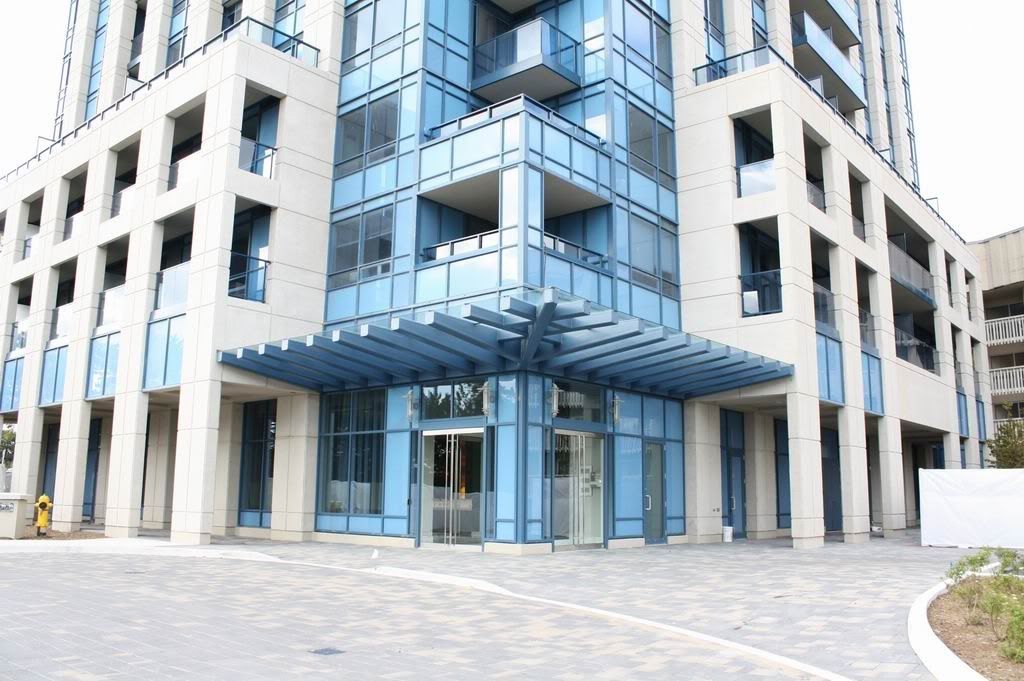
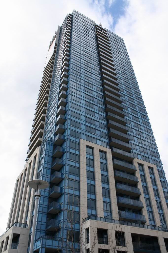
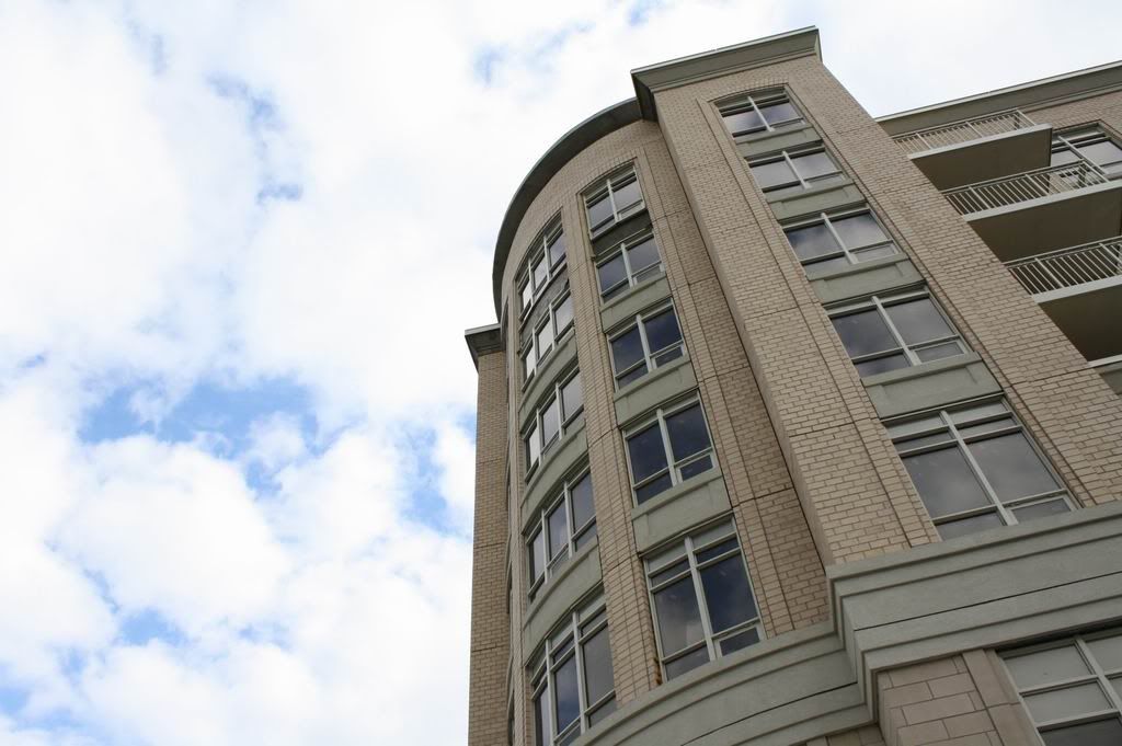
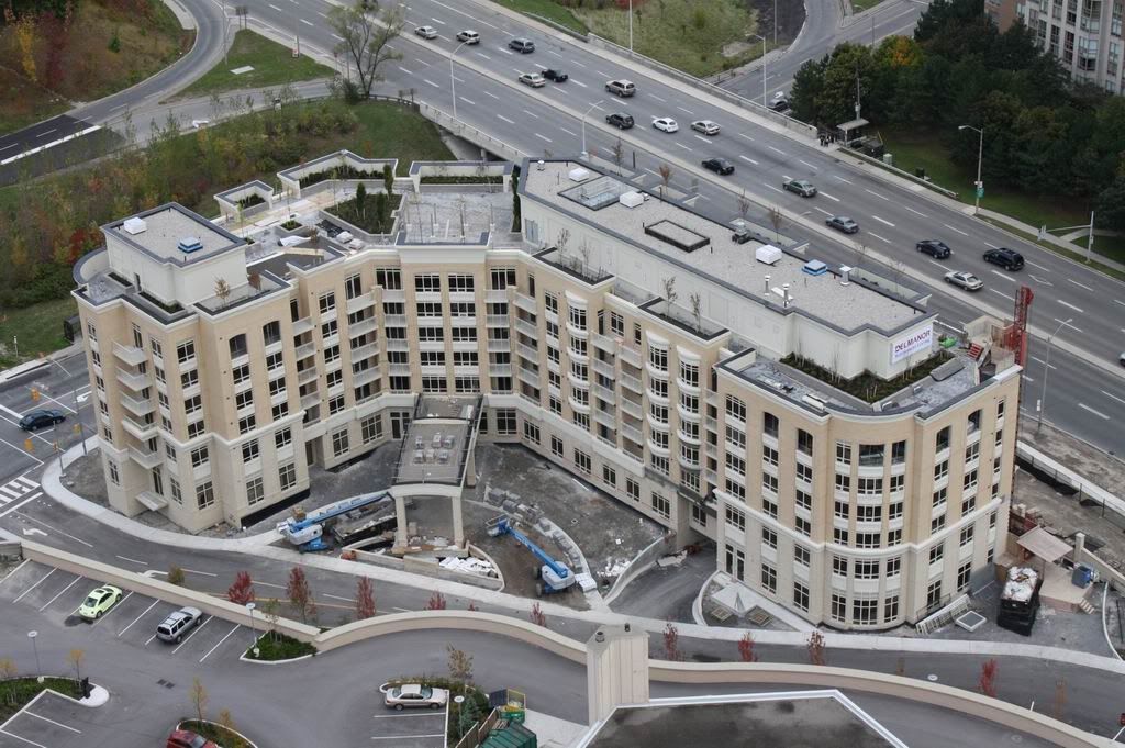
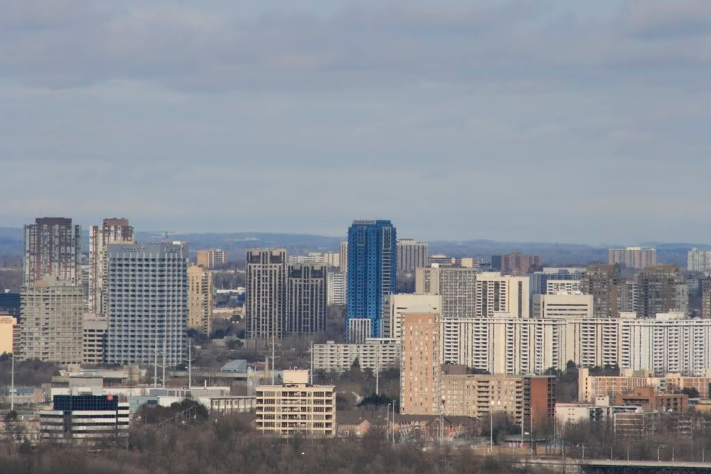
ACCOLADE, 181 WYNFORD DR.: Located at the end of what might be described as a sort of suburban laneway, this failed attempt at architecture stands out on the landscape for all the wrong reasons: At a time when most buildings are going green, this one went blue.
What the designers were thinking isn't clear; perhaps it had something to do with a desire to create a monument, a local landmark. Nothing wrong with that, of course, but this tower – all 35 storeys of it – stands out as one of the most unfortunate-looking additions to the skyline in some years – and that's really saying something.
Located on the east side of the Don Valley Parkway, just north of Eglinton, this is the ghastly blue highrise that appeared recently. It sits on a small hard-to-find lot tucked in behind a badly designed hotel and other condos. Despite its height, Accolade occupies a relatively tiny site and makes good use of it.
The shaft sits atop a podium of about 10 floors; a precast concrete grid has been added to provide greater definition. From a distance, the (very traditional) massing of the tower is harmonious and makes sense. Tall and thin, it has a spire-like quality. More than most, this is a tower that celebrates verticality.
Too bad, then, about the choice of glass. For most, it will be hard to see beyond that obvious and painful mistake. That's why regardless of its virtues, this will forever be that blue building at Eglinton and the DVP.
GRADE: C-
http://www.yourhome.ca/homes/columnsblogs/article/767126--eglinton-a-victim-of-good-intentions
 
The only thing he didn't like was the blue glass, yet he slammed it with a C-. It's true that a tall tower at this location will get noticed and there was a good case to make for a memorable architectural element other than the colour of the glass, but it doesn't detract from the architecture at all. Many will refer to it as "that blue tower", but those same people will probably also refer to the most prominent downtown skyscrapers by something as basic as the bank logo on the tower.
 
The only thing he didn't like was the blue glass, yet he slammed it with a C-. It's true that a tall tower at this location will get noticed and there was a good case to make for a memorable architectural element other than the colour of the glass, but it doesn't detract from the architecture at all. Many will refer to it as "that blue tower", but those same people will probably also refer to the most prominent downtown skyscrapers by something as basic as the bank logo on the tower.


Speaking of which, I guess blue glass'd carry the same negative symbolism here that Carrara marble did at FCP (I mean, originally, when it was that "there goes Ed Stone again" cladding material par excellence).

However, Chris Hume committed one reeeeal boner in referring to the "badly designed hotel"--er, I presume he's referring to Moriyama's Holiday Inn? Methinks he seeks to apply arbitrary cheap shots to *any* suburban-interchange hotel he doesn't know the background of...
 
The only thing he didn't like was the blue glass, yet he slammed it with a C-. It's true that a tall tower at this location will get noticed and there was a good case to make for a memorable architectural element other than the colour of the glass, but it doesn't detract from the architecture at all. ...

True. I am sometimes baffled by Hume's grading system, where he is known to list several positive attributes, then one negative one, then he concludes with a low overall rating, apparently based on that one feature that he didn't like. In any case, obviously some people like the blue colour.

This building looks fairly good IMO, particularly with the features at both the top and the bottom emphasizing its verticality or "spire-like" quality.
 

Back
Top