News   Jul 17, 2024
 32     0 
News   Jul 16, 2024
 696     0 
News   Jul 16, 2024
 607     0 

The Tenor (10 Dundas St E, Ent Prop Trust, 10s, Baldwin & Franklin)

  • Thread starter billy corgan19982
  • Start date
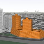
I am not sure why people are now upset and 'surprised' at the new rendering. It accurately represents what they have asked the city for and all official elevations diagrams of the building (including those on their site for years). They never have asked for rooftop elements (or attempted to lease the space) and nor have they ever asked or shown "signs of the different stores and restaurants inside Toronto Life Square" on the side of the building. And it was clear from the first box backlit sign that there was going to be very little added flash beyond a bunch of big signs.
 
WTH??? IS that the official new rendering? It looks so bad its so dull and doesn't even smells of modern architecture. The original rendering was amazing with the roof top element as you guys pointed out, and it had the big Coca Cola sign!!!

:thumbsdown:

To complain:
Telephone: 416-408-3080
 
Well i'm surprised. I was expecting something like this:

Metropolis.jpg


now we're getting this:
tlsbigrv7.jpg


Rather underwhelming no?
 
Previous renderings (NOUN: 1. A depiction or interpretation, as in painting or music. 2. A drawing in perspective of a proposed structure. 3. A translation: a rendering of Cicero's treatises into English. 4. A coat of plaster or cement applied to a masonry surface) and Pen Equity's "Leasing Kit" illustrated varying elements along and above sections of the roof-line, now they are apparently absent. The only official documents I recall seeing were for exterior signage elevations and interior leasing floorplans. So this comes as a disappointment to me.
 
This latest update may seem to some as a tad underwhelming however it has to be remembered that this is V1 of all the Ad's, in 5 years that building could be covered in only Video Boards. If you use Times-square as an example, most of the time ad space start off as a simple billboard and at the end of its run it will usually be upgraded to more complex glitzy ads.

Its the ad companies that are paying for the space. The market still needs to be tested to the whole Metropolis concept. Thats why most companies probably are being weary about the size of the investment they are putting in.

This building once "Completed" will never be totally finished, the ads are all on Brackets, they are are in no way integrated into the building, things can be relatively easily adjusted when the demand comes for such things.

I actually happen to think that its good that pen-equity and the ad companies are be somewhat cautious
 
More pedestrians pass through Dundas Square than any other one point in the country, what's there to be cautious about?
 
I think it does look less like a 5 year old's b-day party than before - which, to me, is a good thing.

I realize it's pretty ridiculous to use the word sophisticated with this project, but this updated version is something more along those lines to me than the one we've been looking at for the last 5 years.
 
How unfortuante. Pen Equity can't even do cheese right.

LOL, that's a very funny comment but true.
It's kind of like a birthday cake with no frosting on top.
 
PenInequity does cheese - but very slowly. And old cheese can be crumbly, so pieces are expected to fall off over time.


Then again, this place is named Toronto Life, after the magazine. We aren't talking about earth-shaking excitement in that department, either.
 
It's kind of funny that the sponsor and all the tenants with signage on the upper exterior have red logos -- sort of an unintended theme.

The left over junks from Olympic Spirits...


Well, another example why people in this city are incompetent. Can't do a shit half right.
 

Back
Top