News   Jul 15, 2024
 134     0 
News   Jul 15, 2024
 332     0 
News   Jul 12, 2024
 1.8K     1 

Museum Station

Museum's look was always a bit of an orphan on the Y-U-S, so I'm not so against this re-branding of the station. I do have issues with Pape on the B-D though.

I am also very bothered by the fact that only the track-level of Museum is being re-done which will make for a very inconsistent station.
 
The layout issues are a whole other story though...

Well, not a *whole* other story...tiles are one thing, but once signage, benches, etc. come into play, affecting navigation and pedestrian flows, these rogue benefactors are doing more than just changing the wallpaper. Maybe we can get them to pay for new/moved escalators!
 
as built, the stations were beautiful. clean, elegant, streamlined. 40 years of disrepair, tacking on "solutions" to wayfinding, and ill-conceived renovations have turned most of the stations "ugly". just looking at the archive photos of the stations when they first opened proves this point.
 
I disagree. I see the TCF donation as a counter balance to the problem that most city initiatives pay little focus on aesthetics and instead focuses on delivering function at the cheapest possible cost. I don't think that if you were to examine interior design of the 1960s you would find homes and office buildings lined with patternless bathroom tiles. If the function of the station is lacking then the blame should be on the city and the TTC and not people financing a new look for the station.

Lining home and office spaces with tiles has never been common outside of the washroom or perhaps the kitchen, but the use of tiles in subway stations has been. They went with a refreshingly clean look with the stations themselves forming patterns. The colour combinations are interesting, and the extensive use of aluminum is a nice touch. Bathurst has those superb grey/blue combination that makes the grey look like a really light blue, and then those red doors for fire equipment create a superb contrast.

As I mentioned before, we can redesign stations and still be true to that 60s heritage. This is a solid backbone. Tiles and the ground level structures can be restored, more sophisticated but still durable floor surfaces can be used, the ceilings could be raised, and public art could be incorporated. The patterns and colours would still be there. Even the minimalist approach of restoration and some public art in every station would go a long way.

What is slightly disturbing is the more radical generalization that the entire subway is ugly. Are those narrow, vibrantly coloured tiles on the northern section of the Yonge line unattractive? What about the way the benches are wrapped around the columns on the centre platform? The use of chrome, or those round windows at Sheppard-Yonge? The Spadina line answered many design complaints (though it has other non-aesthetic issues). The line brought more sophisticated tiles and patterns, natural light, public art, and high ceilings.

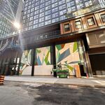
For the record, the Museum station redesign hasn't brought art, but reproductions of artifacts wrapped around columns. Design is so important, but for the odd redesign of Museum, the money could have actually made the station function better.
 
Museum's look was always a bit of an orphan on the Y-U-S, so I'm not so against this re-branding of the station. I do have issues with Pape on the B-D though.

I am also very bothered by the fact that only the track-level of Museum is being re-done which will make for a very inconsistent station.

Well as you mention that, King Station still has that washroom tile on its exteriors (Melinda) as well.

BD should be consistent, to the point Kipling becomes green and Kennedy white. If the Pape reno were tied into Greektown somehow (marble columns, busts of Greek gods?) it'd marginally make sense to modify it. However without a major landmark nearby to signature X Station as the X's transit link, there's really no point to these new renos especially if they in no way improve station utility and functionality e.g the roof, er lack of roof at the west end of Sherbourne.
 
Well as you mention that, King Station still has that washroom tile on its exteriors (Melinda) as well.

But it ain't original to the 1954 line. In fact, if you're talking about the Commerce Court exits, its present configuration only dates back to the early 70s, i.e. the Yonge Line extension era.

And while I don't mind it as a colloquialism, let's not go far with "washroom/bathroom tile" as a slur--heck, virtually every line's got a bit of the bathroom about it, even the more self-consciously "designed" parts, and the reasoning is similar: easy maintenance, easy to clean. Therefore, the washroom analogy practically becomes a *compliment*.

Besides, if you want an earlier and arguably more depressive (i.e. a *negative* example for Toronto's original subway planners to learn from) version of a utilitarian "bathroom" aesthetic, consider the interwar sections of the New York subway. Yet at this point, scarcely anybody's arguing for *its* total extreme makeover, and a bit because, hey, why huff and puff and waste energy just because it isn't "pretty"...and New York's no poorer for it. (Of course, it's easier to say that now than it would have been 25 years ago in the heart of the graffiti era...)
 
If our subway had been built a few decades earlier the platform walls would probably have been clad in glazed bricks, which are extemely durable.

( As an aside, I see that such bricks - shiny and white - have recently been uncovered during the renovation of the Chinese grocery store on the south side of Gerrard just east of Broadview).
 
If our subway had been built a few decades earlier the platform walls would probably have been clad in glazed bricks, which are extemely durable.

Yup, probably just like this:
s0376_fl0001_it0090b.jpg
 
The last piece of the Museum sign and wall framing will be install Sat night and completely finish in time for start of service on Sunday. Panels sitting in the jail this past week.

Panels have been installed on the north end walls as well the stair walls.

Panels were being installed on the south end wall Sat night. They are about 1" thick and unpainted.

Some of the electrical piping have been relocated with a lot more to be done. This is moving at a snail pace. At this progress, Late Feb or early March is the moving time frame now.

Not much work has taken place this week on the 6 exposed columns behind the hording.
 
It doesn't look as if though they're adding the false ceiling. They've painted it white which seems to be final.

I notices that sometime ago and most likely to cover up mistakes and for testing to see what color will work for the ceiling over the tracks. They are to have an off white colour.

The ceiling panels can't be done until the electrical work is done and is way behind because of various changes.

Will have a look at the walls today when I'm down there.
 
Yes, let's bring on the experts who designed the entire system with a bathroom-tile feature

...which has lasted for decades and is, whether you like it or not, one of the defining features of the Toronto subway along with its distinctive typography. While that is most clearly evident on the Bloor line, that consistency and distinctiveness really is there even if you disapprove of it. Not every subway can be Moscow’s or Stockholm’s.

To bring your complaints to their ultimate expression, we’d have to rip up every station and refinish each one in… what? Fake Helvetica? Fake Egyptian columns?
 
...which has lasted for decades and is, whether you like it or not, one of the defining features of the Toronto subway along with its distinctive typography.

And if those original planners had included crying clowns, or fake eqytian columns (is the complaint that we're saving the real ones for the museum?) than they'd have become 'defining features' of the toronto subway, too. Big yawn. Just because we decided on something once, a million years ago, doesn't mean we can't change our mind as we go along. Forward ever, backward never.

To bring your complaints to their ultimate expression, we’d have to rip up every station and refinish each one in… what? Fake Helvetica? Fake Egyptian columns?

Big yawn pt 2. No one's calling for other stations to be razed just because they're tiled and replaced with spitting-image replicas of Museum.
 

Back
Top