News   Jul 15, 2024
 476     0 
News   Jul 15, 2024
 582     1 
News   Jul 12, 2024
 2.1K     1 

Museum Station

LOL ... it's okay for me, as I only look out towards the platform side anyways to determine what station I'm at if I didn't already know.

But they've removed all the station names from the actual platform to make way for Chewbacca.

maybe we should have integrated bench/station IDs like they do on the Jubilee Line in London along the middle of the platform. That'd solve the ID problem.

That would certainly be nice. I wonder what style they would do it in to make it fit in to the station?
 
n122602698_34866386_2202.jpg


This is what I envisioned... and it would be a unifying element, so it is the same style regardless of the station.
 
[note: UT citation]

http://www.eyeweekly.com/city/scrollingeye/article/15860

Museum makeover
BY Marc Weisblott January 23, 2008 14:01


Today on the Scroll: Who is paying for the Museum station makeover and what are those hieroglyphs embedded in the lettering supposed to say, anyway?

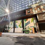
Coming soon to the Museum subway station is some TTC signage like no other.

“I was loved by my father, honoured and praised by my mother. I gave them a proper burial — by royal decree because I was honoured by the king — so that they could praise the god forever. I was a good son from my childhood until their demise, never causing them anger. Moreover, my opinion was considered in every royal project.”

So reads the inscription that will be contained with the letters on the track walls, once they are unwrapped, taken from a limestone relief from the tomb of an ancient Egyptian nobleman by the name of Met-jet-jy, dating to around 2300 BC and housed in a gallery at the Royal Ontario Museum.

The opinions surrounding the effort to reflect the quintessence of the ROM — and the neighbouring Gardiner Museum of Ceramic Art — throughout the columns and walls of the relatively superfluous transit stop that runs under University Avenue haven’t been considered enough, based on reactions to the construction process in a rolling thread on the Urban Toronto Forum. Perspectives range from those who think the TTC should make its decisions based on open-source input to others who brandish a passion for preservation.

But those benefactors paying for the job through the Toronto Community Foundation (TCF) are likely to be pleased with the final $5-million result after the makeover is ready for spring.

The list of donors is not ready for release yet, according to TCF president and CEO Rahul Bhardwaj, who extended an invitation to Scrolling Eye to drop by their office for an explanation about what this mostly unheard of organization is actually all about.

“We serve as a catalyst for city building initiatives,” he explains. “An administrative, transactional point providing investment management and foundation support.” The concept originated in Cleveland in 1917, and made it to Winnipeg by 1921. Toronto’s version started in 1981, designed to serve as “a research hub for community knowledge.”

The foundation helps nurture ambitions of its philanthropic clientele with the release of its annual Toronto’s Vital Signs report. Last year’s snappy headline for its media release: “The city has stalled."

Good news for people who love bad news, apparently. Bhardwaj, however, asserts there’s nothing cynical about releasing research about urban decline.

Priorities being what they are, where does sprucing up a little-used subway station — even one described by former TTC chair Howard Moscoe as redolent of early Canadian washroom architecture with the character of a jail cell — fit into that philanthropic perspective? “This is something that inspires them,” says Bahrdwaj. He describes the Arts on Track project — brainstormed by donors, partially funded by the province and inspired by cities whose rapid-transit stops incorporate design informed by the cultural institutions they serve — as “a discreet initiative." (Plans for St. Patrick and Osgoode stations await after Museum is ready.)

Is subway-station revitalization more important than all of the other bottomless social, environmental and economic causes promoted on the TCF office walls? “You’re assuming that they haven’t contributed in those other ways as well,” replies Bhardwaj.

And are the donors the kind of people who consider themselves subway riders? “Maybe not today,” says Bhardwaj. “Perhaps they did at various points in their business life. It’s not for me to comment on their traveling habits. But we are talking about people who recognize the importance of the subway, and recognize the importance of connecting people to cultural institutions. It depends on what lens you want to put on the effort being made.”

Money spent on aesthetics isn’t stalling Museum’s part in the TTC’s promise to make the station fully accessible by 2014, including a second exit along the platform. “The TCF is helping to refurbish,” says Bhardwaj. “Not to reconstruct.”

Bhardwaj most pointedly defends the authenticity of influence throughout the station: “What we’re doing is anything but kitsch.”

“Kitsch” is the word that transit typewatcher Joe Clark most recently bristled at hearing from TTC chair Adam Giambrone’s operative, in regard to the original design of Pape station, where the cream-coloured structural glazed tile is due to be replaced with “artificial stone.”

Clark, who previously called for the cancellation of the Museum Renaissance project, and discussed it as the denouement of his epic typographic conference paper Inscribed in the Living Tile, is at least seeking a little less hypocrisy in how the TTC prioritize station renovation.

Diamond + Schmittt Architects managing principal Gary McCluskie supervised the process of incorporating five different load-bearing objects into the 48 columns in Museum station: Greek Doric, Bear House Post, Egyptian Osiris, Chinese Forbidden City and Toltec Warrior designs are all represented, and signage in the station will explain those origins along with a translation of the hieroglyphs embedded in the station name.

McCluskie, whose duties often find him at the station during the train-free 2-5am hours (when the most constructive stuff can get done), claims the Museum reno has been a crash course in how few of the elements of a 1963 subway station can be sourced from manufacturers today. “It’s made it a challenge for the TTC to keep a steady palette throughout the system,” he says. “We have a hard time getting a new supply of something you’d think as simple as the wayfinding tile on the floor.”


And the hieroglyphs from 4,300-year-old Egyptian tombs are more enduring than anything ever scrawled on a bathroom wall.

Send news, tips, links about arts, culture, media to scroll@eyeweekly.com
 
They're right that the subway is important. The subway is important because it provides quick, comparatively affordable transportation for the public. But all the millions invested in this have failed to improve the functionality of the space in any meaningful way. To extend this, they have only dictated the importance of the museum above, not the actual subway. They've degraded the subway as dated washroom ugly and in need of their dollars and high taste. These have to be the most superfluous efforts by the TCF's donors.

It seemed hard for the TCF to tiptoe around the issue that many of their benefactors don't actually ride the TTC. Do the donors have any interest in the design strengths of the current system? What kind of dialogue did they engage in with the transit community?
 
But all the millions invested in this have failed to improve the functionality of the space in any meaningful way. To extend this, they have only dictated the importance of the museum above, not the actual subway. They've degraded the subway as dated washroom ugly and in need of their dollars and high taste. These have to be the most superfluous efforts by the TCF's donors.

I disagree. I see the TCF donation as a counter balance to the problem that most city initiatives pay little focus on aesthetics and instead focuses on delivering function at the cheapest possible cost. I don't think that if you were to examine interior design of the 1960s you would find homes and office buildings lined with patternless bathroom tiles. If the function of the station is lacking then the blame should be on the city and the TTC and not people financing a new look for the station.
 
I like Museum Station being redesigned to it with the Museum above. I have absolutely no issues with this retro-fit. I disagree that the stations should remain tiled on the basis of "preserving history". I dont think that the designs were significant enough to warrant that. I am also not one for thinking that each station has to follow the exact same design to create consistancy. Ask Joe Public, and he doesnt know anything about the design features that were first put in (colour scheme), or the changes that have already occured.

As for TCF funding this - I am also in agreement with that. The TTC is getting a station makeoverm funded through non-TTC means. This is a donation to the TTC by a charitable foundation. At least we werent getting corporate sponsorship to station renovations. Who cares if those donating the money dont ride the subway?

It may be a bit kitch, but I think that it adds to public art in our city, and can only go further to making the TTC more of a destination for tourists. Kids will love it too.
 
Nobody asked for [John Q.] Public’s opinion

I disagree that the stations should remain tiled on the basis of “preserving history.†[...] I am also not one for thinking that each station has to follow the exact same design to create consistency.

Because the YUS line isn’t consistent.

Ask Joe Public, and he doesnt know anything about the design features that were first put in (colour scheme), or the changes that have already occurred.

Nonexpert opinions are of limited value in this context.
 
If getting a station makeover funded through non-TTC means is the deciding factor in what gets done, maybe if another group of rogue benefactors with even more money and influence comes along next year and induces the TTC to load Chewbacca and his buddies on the back of a truck and take them away, replacing them with something else, they'll be even more thrilled and grateful.

I haven't been able to find a definitive list of which stations these people will be waving their magic wands over. Eventually they'll lose interest, I suppose, and move on to the next charity case that catches their attention.
 
Nonexpert opinions are of limited value in this context.
Yes, let's bring on the experts who designed the entire system with a bathroom-tile feature.

Let's face it - the Toronto subway is hideously ugly, and poorly designed. There's little value in preserving much of it.
 
Aesthetics aside, there's enough cases of astoundingly poor station design in the TTC that we should think twice about giving "experts" a free reign. Kennedy and Scarborough Centre stations are complete disasters in terms of station layout, like where the stairs/escalators are...they're simply the worst possible arrangement, with discontinuity and crossing lines of traffic at every turn, and the fact that they were "designed" that way on purpose is scary.

My all-time favourite "what were they thinking?" design flaw is at the north end of North York Centre, where the automatic entrance is on the northbound side of the platform and the exit turnstiles are on the southbound side...the connection to the civic centre is also on the southbound side, forcing users to make two short but utterly useless crossings of the platform. What were they thinking? They weren't.
 
As a designer myself I think it looks great. Clean and simple, while displaying some great little design bits such as the typography set in the walls from Lawrence to York Mills. If we cleaned the "bathroom" stations up to their original state, I think we would all agree that they can look quite attractive. There is a timeless quality to them. Clean up the signage, fix the cracks and the ceiling and we'd have a great looking system.

The layout issues are a whole other story though...
 

Back
Top