News   Jul 26, 2024
 972     0 
News   Jul 26, 2024
 2.6K     2 
News   Jul 26, 2024
 2.4K     3 

Bay Adelaide Centre West Tower (Brookfield, 50s, WZMH)

Re: >Re: Official Bay Adelaide Centre Thread (UT)

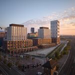
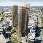
When we first saw the line renderings for this way back when we were all complaining about the facade then too. My two cents was (since bb is repeating his too) that the facade should have been reassembled part way up the tower, and maybe "exploded" like the CBC logo or a Hockney collage. Admitterdly that strips away most of the historical aspect of it, but if could be made to be both aesthetically pleasing and maybe even exciting that way...

...and would make a statement about the silliest of facadism's results.

42
 
Would have been cool if the facade was really assimilated into the new design as a morphing transition from masonry into glass like an Escher etching.
 
Would be nice if they had made room for retail, for upper tier retailers like Tiffs, or even Christian Dior stores, that already have nice stores in tall skyscrapers elsewhere.
 
Not to stray too much from topic- but I'm just wondering if anybody here has some idea of the selective process with re to the choice of design of a large corporate office building? For instance, would a major tenant have much input? Who makes the final choice for a design?

I'd be really interested to know what designs were rejected for the BA site.
 
The core of the thing is the client and how enlightened they are. Swiss Re were open to Lord Foster's visually stunning and innovative solution, OCAD was to theirs, and in Paris Unibail has their new Lighthouse tower to look forward to.
 
There is also the matter of the enlightenment of the client's bank balance.
 
No law forces clients to be design savvy or aware of anything other than the bottom line.
 
We have no design review panel with teeth, which would be the equivalent to legislated aesthetics. It appears that the best we can hope for, in the absence of enlightened clients, is the involvement of the planning department to fend off bad design whenever they think they see it and are moved to take up arms on our behalf to thwart it.
 
Yeh- it does require more teeth. It's one of the areas I whole-heartedly agree with Hume.

One of the difficulties is that B-A isn't necessarily 'bad' design-it's just guilty of being a very ordinary and traditional design. In the context of most modern world capitols- the massing is very ho-hum run-of-the-mill architecture. It adds little aesthetically to the city of Toronto. It's not 'bad'- it's just, as mentioned, 'bottom-line' - it works- everyone is content.

Is Canada's corporate culture not in the game yet when it comes to cutting edge designs on the international scene?
 
True- it's hard to legislate aesthetics and, unlike cities like Chicago, Toronto has little precedent for architectural innovation. But I think I'm the most disappointed with this project than any of the other DT office projects (151 Front being the most interesting based on initial renderings). Perhaps because it is prime real estate. I do like the plaza and park concept at street level however.
 
I love that term: Masonry decal. That's exactly what it looks like. I used not to think it looked bad, but ever since I heard that term I find the facade comically inappropriate.

I don't mind the plainness of the building, I actually think it will work well with what's already in the CBD. I would rather they err on the side of caution than put up a silly-looking comic book tower and turn our skyline into Shanghai's. I know that's the problem, though: There are too many people like me, thinking the same way, and not enough people willing to push the envelope.

I like clean lines and simplicity, though. They endure.
 
Bogtrotter, I'm not so sure that architectural innovation in this complex or lack thereof can be blamed entirely on the developer - it's Brookfield's lead tenant that they have to worry about here. As it is KPMG taking the pole position in this building, they have a built in excuse - they're accountants - and that makes them very, very, very, very dull, dull, dull people. Very, very dull. It's best for them to project a simple, clean, transparent design, and one that does not look super costly. And while I'm not saying that I'm entirely happy with this design, at least it's modern enough, and sleek enough, not aesthetically offensive. It's merely a missed opportunity in an important spot in town. Too bad the lead client wasn't a firm in a more dynamic sector than (yaaaaaawwwwwwwwnnnnnnnn) accounting, like for example the exciting world of mutli-coloured mapmaking.

42
 
This tower..from the few renderings I have seen looks incredibly banal.
 
i on the other hand love the clean lines. Very simple very sweet.

I studied accounting and finance in unversity. And my job for 5 years following school was as a treasury analyst.

I'm not dull...well maybe I am. But that is a sweet and sexy building in my eyes.
 

Back
Top