News   Nov 12, 2024
 414     0 
News   Nov 12, 2024
 449     0 
News   Nov 12, 2024
 516     0 

650 Bay St Boutique Hotel Redevelopment (Lanterra, ?s, ?)

This redevelopment could become a youtube sensation.

I wish we had a time lapse. Everything they gamely bolt on is more heartbreaking - the aluminum window casings from a Home Depot kit, chipping away the paint giving the appearance of a rash, and now bolting on patio tiles...

I am a fan.
 
Aug 05
Did everyone go on holiday or has something happen to this project?? No work has been done since my last visit to the site.
6015751075_15bea2e161_b.jpg


6016305190_4639cee5ca_b.jpg


6016304622_fd3c45367c_b.jpg
 
Aug 05 Did everyone go on holiday or has something happen to this project?? No work has been done since my last visit to the site.

Maybe it IS finished, the new 'urban decay' look? I also note that on 5 August there was a complaint to Municipal Licencing and Standards which said "odor from building. bad odour coming from building."
 
That would have been a much more respectable treatment than this disaster. But unfortunately it's not uncommon, this type of defacing can be found throughout downtown covering up older building stock.
 
The big mistake was to use materials and colours that would never have been used on a building from that period. I feel sorry for the developer, he probably didn't know what he was getting into - the render looked decent.

Going for this look would have been a lot more reasonable:

Advantage-Painted-Brick.jpg
 
Actually i would rather see them tearing it all down... than knowing what was there before would become that as a final product.

Think carefully painted brick as opposed to stucco. But regardless, would you rather see it become a surface parking lot?

I appreciate the effort to save the building and re-integrate it into the fabric... it's just being done unnecessarily clumsily.

To be honest even covering the brick with a thin layer of concrete and painting over it in a tasteful colour would have been a much better idea.
 
Last edited:
The big mistake was to use materials and colours that would never have been used on a building from that period. I feel sorry for the developer, he probably didn't know what he was getting into - the render looked decent.

Going for this look would have been a lot more reasonable:

Advantage-Painted-Brick.jpg

There are a few buildings on downtown Yonge that have been similarly ruined with this look, I don't like it at all. It looks like something one would find at a big box centre, or worse, Di$ney World.
 
There are a few buildings on downtown Yonge that have been similarly ruined with this look, I don't like it at all. It looks like something one would find at a big box centre, or worse, Di$ney World.

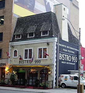
Think Bistro 990. Sure it looks fake to you and I, and it'd be a lot nicer if they restored the whole thing brick by brick, but as far as I'm concerned the choices are:

-What there was, which was horrid.
-Current clad, which is disappointing to say the least.
-Surface parking lot.
-Unobtrusive fake-looking infill.

Obviously budget for this lot wouldn't allow for any other option, and as such, I'd have gone with:

275px-Bistro_990.jpg


You might even get some clueless tourists and suburbanites taking pictures of it "cause it reminds them of Europe" hahah. It'd fare well as the boutique hotel it's meant to be, too.

P.S. I have no idea how expensive it'd be to re-brick it with the shallow bricks LCBO uses for their stores. A red version of that would work well.
 
Last edited:

Back
Top