News   Jul 12, 2024
 1.5K     0 
News   Jul 12, 2024
 1.2K     1 
News   Jul 12, 2024
 439     0 

1 St Thomas (Lee Development, 29s, Stern)

What's your opinion of 1 St. Thomas?


  • Total voters
    33
  • Poll closed .
Re: 1 St. Thomas

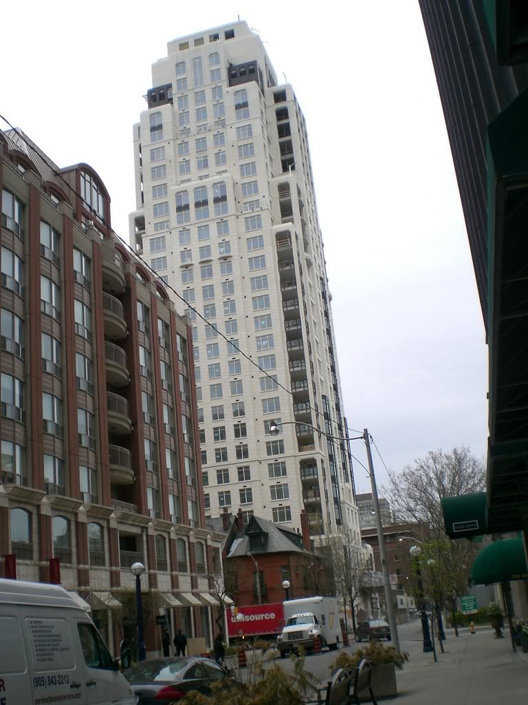
There are some interesting broze coloured step-backs or enclosed galleries being installed near the top of the building. They balance out the other bronze detailing well.
Is that the term "step-backs" to describe the various receeding shoulders?
 
Re: 1 St. Thomas

the top is near completion
100_0019.jpg
 
I'm not so thrilled with the dark window treatment - particularly on the lower floors.
 
I'm really trying hard to like this building. I'm not there yet.
 
I like it because this is the only city in the country where it has a chance "to fit in"... and it does.

Stern's conservative "wedding cake" and Libeskind's slightly insane "Italy on acid" ... what a great town to live in... "electric eclectic"... it's fun to be tourist in your own town.
 
The extreme contrast between the light and dark portions is a bit jarring, in my opinion. The overall shape of the building is quite nice, but the stuff that looks like siding just does not seem to fit in.
 
I feel the same way. I think this building would be a success in every way if the black was tinted out to a pewter-ish colour, or stony grey. As it stands, the contrast of the black frames and spandrels - plus the heavy top masses - is a shock, and detracts from the detailing and subtleties of the rest of the structure.
It might be a fault of style more than structure, but in a building whose worth and raison d'etre is dependent on it's gentlemanly grammar more than it's formal innovations, it's an egregious lapse.
 
It's growing on me... barely... a little bit. Ultimately, it still looks like an imposter and the dark windows just don't fit.
 
I would think the colour contrast will become slightly less stark over time as the black will fade towards the dark grey and the light will likely yellow or brown some. It's like monuments or elements of historic structures that look all wrong when they are cleaned or re-surfaced.
 
pic by Toronto-West over at SSC...this one seems to be looking better and better all the time.....

CIMG1843.jpg
 
I don't know about this one. It's either going to age well - or its going to look dirty in a couple of years.
 
I think it's fantastic, and the age will only make it more 'legitimate.' I wish we had more of this kind of project instead of just glass, glass, glass. It's getting old.

Also seems to me that the building proves that precast need not necessarily be a bad word.
 

Back
Top