CanadianNational
Senior Member
October 9, 2008
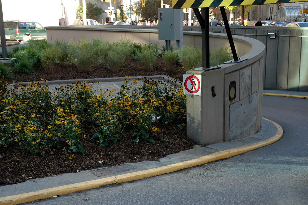
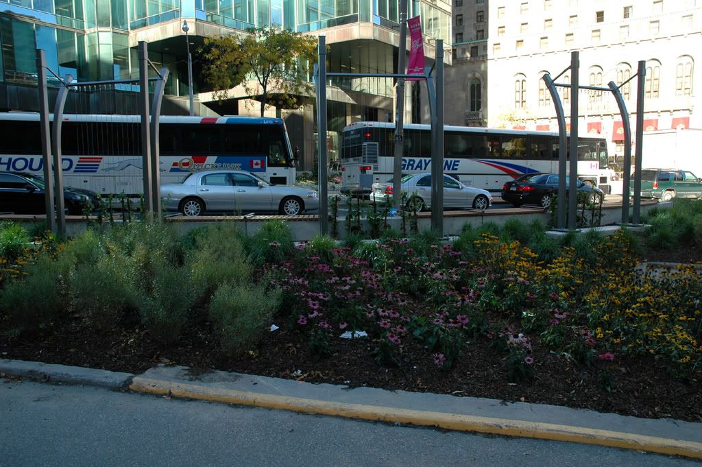
Well, the results are not overwhelming. Pleasant, sortof, for a small effort. But....better than it was. Now if they had done something about the street alignment and parking ramp orientation, that would have been something! As it is, the ramps' awkward positions still present a lot of utilitarian concrete and asphalt to the pedestrian, still isolating and dominating the triangle. All the low-rise greenery and landscape work here don't really lessen it's barren impact. Still, it is an improvement.
A real railcar might have been nice. As it stands, I like UrbanShocker's suggestion of having it up on tracks, beetling about, roller-coaster style. I hope that's not graffiti I see!
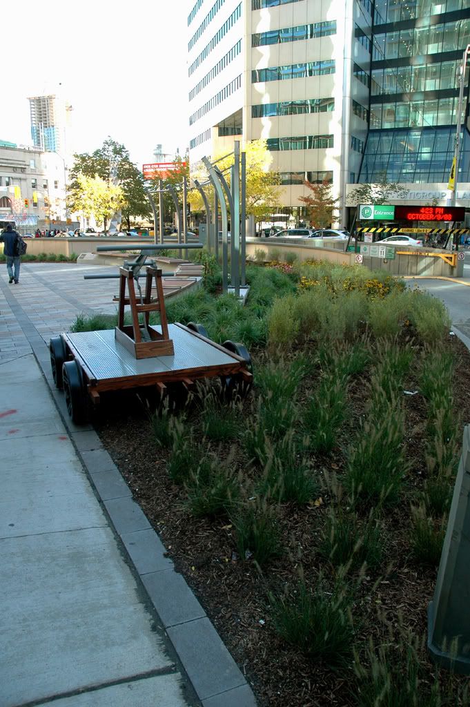
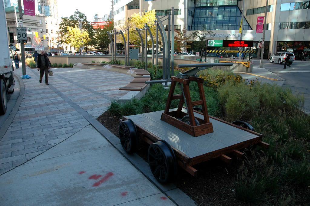
The paving is nice. The three harp-like looking thangs in the background are actually trellises for growing vines. A small vertical element, most welcome.
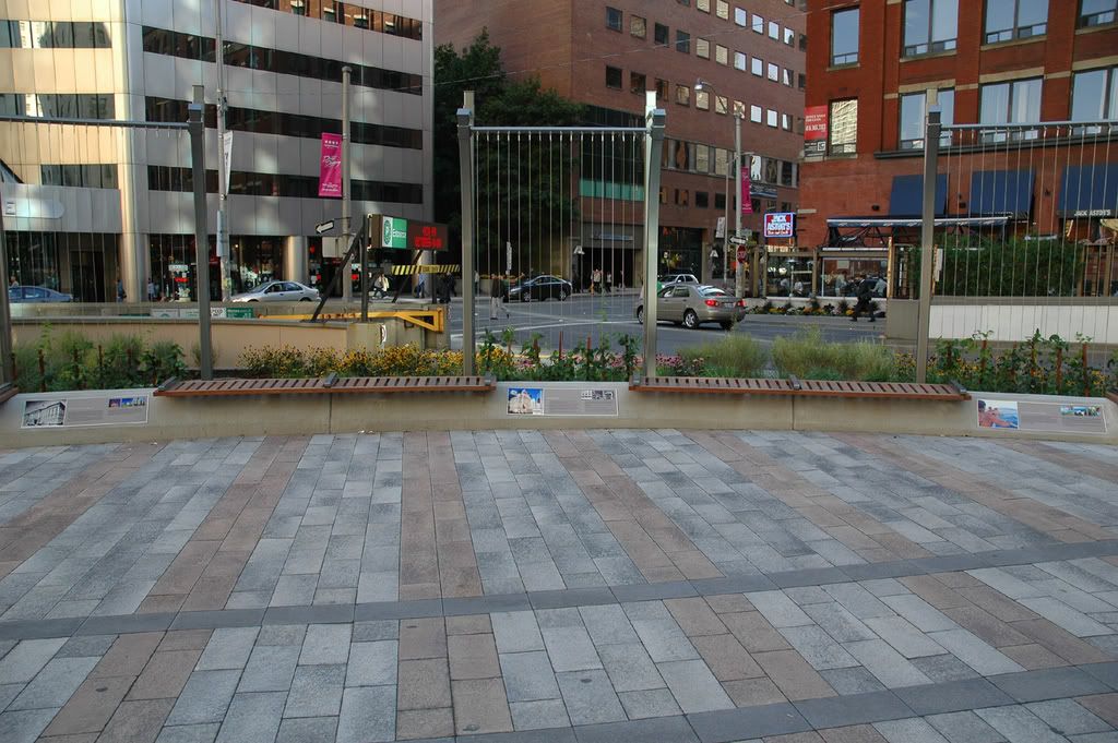
All this is not without a (un?)healthy dollop of advertising, though - note the plaques on the granite rise.
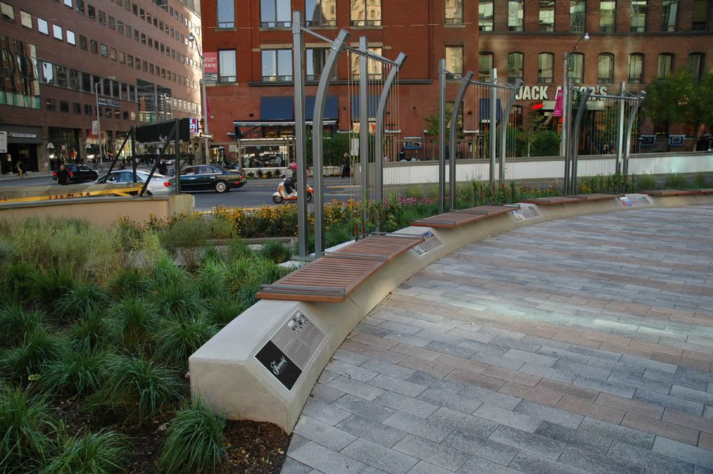
Concrete and curves. And flowers.


Well, the results are not overwhelming. Pleasant, sortof, for a small effort. But....better than it was. Now if they had done something about the street alignment and parking ramp orientation, that would have been something! As it is, the ramps' awkward positions still present a lot of utilitarian concrete and asphalt to the pedestrian, still isolating and dominating the triangle. All the low-rise greenery and landscape work here don't really lessen it's barren impact. Still, it is an improvement.
A real railcar might have been nice. As it stands, I like UrbanShocker's suggestion of having it up on tracks, beetling about, roller-coaster style. I hope that's not graffiti I see!


The paving is nice. The three harp-like looking thangs in the background are actually trellises for growing vines. A small vertical element, most welcome.

All this is not without a (un?)healthy dollop of advertising, though - note the plaques on the granite rise.

Concrete and curves. And flowers.
