News   Jul 12, 2024
 1.2K     0 
News   Jul 12, 2024
 1K     1 
News   Jul 12, 2024
 376     0 

U of T: Rotman Expansion/Ctr for Jurisdictional Advantage and Prosperity (KPMB)

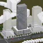
Visually overpowers the Newman Centre, which I really like, so I'm not too fond of this actually.

They need it to be a certain size - one that is going to overpower the Newman Centre by sheer volume - but by cladding it in glass, they are significantly reducing the effect. Had it been all red brick, the Newman Centre would have all but disappeared.

42
 
Last edited:
I quite like it, though I like 90% of renderings (I am a sap for bright colors). The house that is currently occupying the site seems extremely out of place with the, rather large, Rotman building and Innis residences directly north of it, and Fort Book directly opposite it. As for homogeneity, St. George between Bloor & Harbord will have quite a bit of glass if this is built, together with the School of Continuing Studies (with the odd wheat crop garden...) and the new economics building. The Rotman & Innis buildings are new enough that they will fit in. Really, it is just Robarts that wont fit in, but is there any place where Robarts would fit in?
 
Not great or ground-breaking, but an interesting addition to the existing street. Remember, this seems to be a preliminary render, so perhaps it will get better with time. Scale seems fine though.

Fingers crossed!
 
this is u of t. architecturally and aesthetically speaking, i'm not sure any institution in this city has given as much. i have great faith.

also, if anyone gets the chance, check out the new economics department just up the road, it's quite beautiful and it has terrific new courtyard.
 
Last edited:
Perhaps I'm just behind, but there seem to be some new renders on the KPMB website. Once again, I don't know if they are new or not, but there are now four renders as opposed to one on their site.
 
Ehhhhhhhhhhhhhhhhhhhhhhh, ehhhhhhhhhhhhhhhhh, ehhh, those have been around for, ehhhhhhhhhhhhhhhhhh, a while.

42

ehhh
 
Finally something to replace that ghastly parking lot. I have a friend whose dorm is in Massey College and whenever I go from there towards Spadina, I used to cut accross that parking lot. Good design but this box-with-barcode-stripes style might start to become a little boring after a while.
 
I attended the groundbreaking for this bad boy on Sept. 9, 2009 and was able to procure some new info (i.e. their website) and additional renders:

June 2008 Design

1.jpg


2.jpg


3.jpg


4.jpg


6.jpg


8.jpg


9.jpg


11.jpg


12.jpg


14.jpg


15.jpg


October 2008 Design

1.jpg


2.jpg


3.jpg


4.jpg


5.jpg


6.jpg


There's also a video and some additional info here.

The video does illuminate how the curved spaces will flow rather organically but I'd still reiterate what I (and others) have said about this being nice but nothing ground-breaking. Especially in light of having seen the new Cooper Union Building by Morphosis in New York for after witnessing that incredible, 'dynamism in amber' building, I just can't help thinking that 'Toronto-style' or not, this thing is desperately Toronto. I also say that in light of Mayne having thoroughly underwhelmed us with Graduate House (find me a marketing shot which shows the interiors), so I am aware of how things can go. What do you think?
 
I didn't realize they were keeping that house. It doesn't really flow well with the new building (unlike Max Gluskin House up the street). IMO they should demolish it and build a more remarkable design. The house doesn't look like anything special anyway.
Also, I find the design too tall and bulky. But maybe a narrower tower would work.
 
I'm a great big fan of keeping old buildings and integrating them into new structures. The National Ballet School is as close to genius as you would find in Toronto, and the Conservatory of Music comes close. That's why it seems disappointing that no effort will be made (apparently, based on these renderings) to integrate this red brick house somehow with the existing red brick Rotman building and the new extension.

The house seems to be left sitting there in isolation, looking very out of place. If they really can't devise a way to integrate it into the new building, it might indeed have been better just to tear it down. There are enough others like it, in the immediate neighbourhood, that I can't think its loss would be such a disaster.
 
I like KPMB and I think they are quite good at their choices in materials, and detail executions, but really, their projects are getting repetitive. One box on top of another, beside another, sitting adjacent to another, or perpendicular to one another, or stacked and flipped - no matter how much you fluff up the story of the building you are building, it is just a f-ing box already. Not that the brief did not call for such in this case, but a little variety wouldn't kill anyone would it? Maybe a curvilinear approach to the box?


p5
 
u of t does it again. certainly the gold standard in this city for institutional architecture, heritage preservation, and pedestrian friendly design.
 

Back
Top