Why the insults?
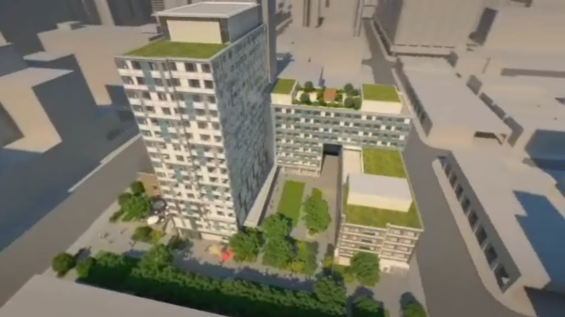
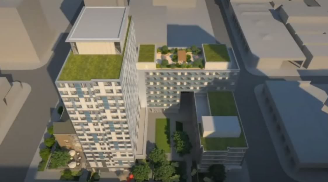
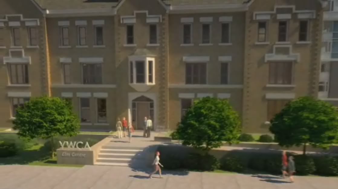
The proportions used in the design feel very early 90's / late 80's Tridel to me. I can't really point to a picture because all I have is the video, but looking at 2:27 in the video you can see that they're using very wide blue and white spandrels between the units which is a classic trick to save money (spandrel is much cheaper than vision glass, so increasing the spandrel to vision ratio saves piles of money even if it means residents don't get as much light). Same reason why there's huge bands of spandrels between floors instead of floor-to-ceiling vision glass. Given those two cost-cutting measures I can confidently predict this will be garbage windowwall instead of curtainwall, so it'll have lots of ugly snap caps everywhere (another hallmark of 90s design)
What are your expectations, exactly? In one statement you seem to be defending the design as just fine, and then in the next statement you defend it as just fine for a YWCA. So which is it? If this were a privately funded project would it still be acceptable, or is it just acceptable given that it's future occupants will be disadvantaged women? And are disadvantaged women less deserving of something that's actually nice?
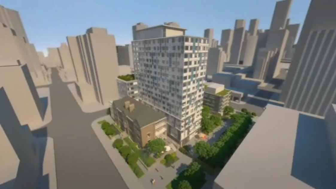
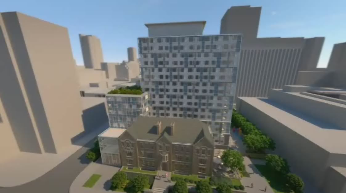
And incidentally, I do think public housing can be done better than this. 60 Richmond E is what I would call contemporary. This is just a retread
No insults, just some strong disagreement, which I normally reserve for assertions that something is some way or another, but where no supporting evidence is given. Why the unsupported assertion?
I am surprised to see you liken this to early 90s late 80s Tridel - as far as I know that was an era when Tridel was nothing but suburban brick slabs. If you can find a Tridel project that looks like this - or anyone's project that looks like this - from that age, please post it in this thread. tobuilt.ca lists 231 completed structures from 1988 to 1992, and none of them strike me as looking like this at all.
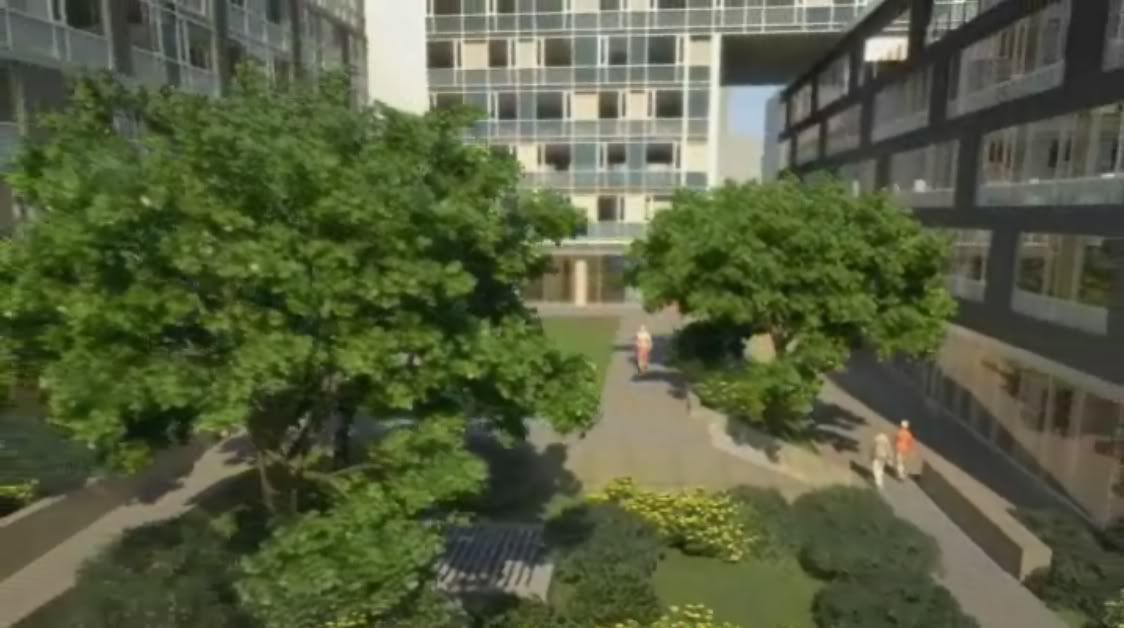
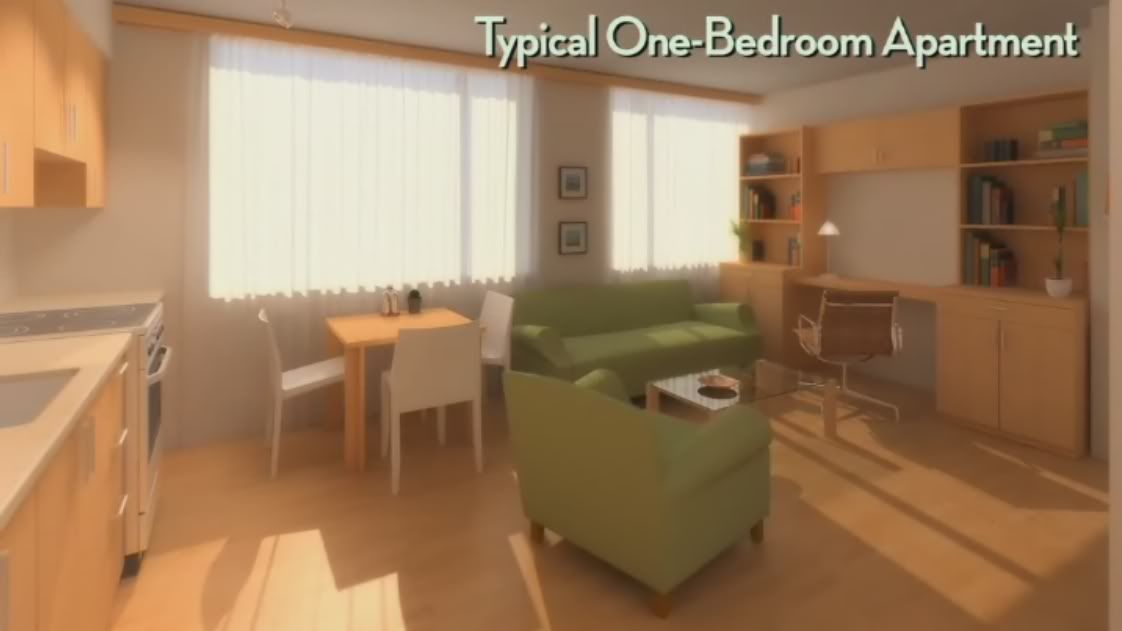
In regards to my expectations... I do think the design is both fine in and of itself, and fine for a YWCA: this is not a case of a double standard, this building manages to work both ways. I think it is important that it work both ways too: one cannot ignore that fact that as the YWCA is a non-profit, it must do its best to provide as much housing as possible for its mandated aim, in this instance to provide for disadvantaged women and their families. They do not have an unlimited budget to spend; in fact they must be thrifty with their budgeting to meet their goal, and no-one would expect anything less of them in that regard. At the same time they have to provide housing which meets today's standards. You mention light. The architectural renderings, along with the photos of the work in progress, support the fact that there will be plenty of light in these units. I think there's more of a question these days as to whether the current vogue for floor to ceiling and wall to wall windows, in evidence in so many projects in the city such as Casa, Festival Tower, Charlie, Sixty Loft, X2, etc., will last owing to the heat gain and loss issues associated with such large expanses of glass, and the increasing cost to heat or cool such buildings.
In regards to snap-caps on windowwall vs. mullion-free curtainwall, I'm not sure where you are coming from. So far only the most expensive new condos in this city have featured curtainwall: it's normally reserved here for Class A office construction, and even there it is not universally applied owing to its cost. So, snap-caps: do I think that it will be detrimental for disadvantaged women and their families to live behind snap-caps? Do I think that snap-caps will only perpetuate the downward spiral that put these people at a disadvantage in the first place? Nope, I do not; I think they will be fine behind the snap-caps, and I'll be fine looking at them. I cannot imagine for a moment that curtainwall could ever have been accommodated in the budget for this building.
I agree with you that Teeple's 60 Richmond East is more forward looking architecturally than this building, but I do not think that its appearance in this city suddenly relegates all others not designed in its vernacular to the scrap heap, and in this case certainly not a scrap heap of 20 year old buildings. I am looking forward to more 60 Richmond-esque structures popping up in this burg, but I still find the YWCA's architecture to be shiny, happy, playful, and contemporary. I'm looking forward to this project's completion: everything about is seems right to me.
42
")