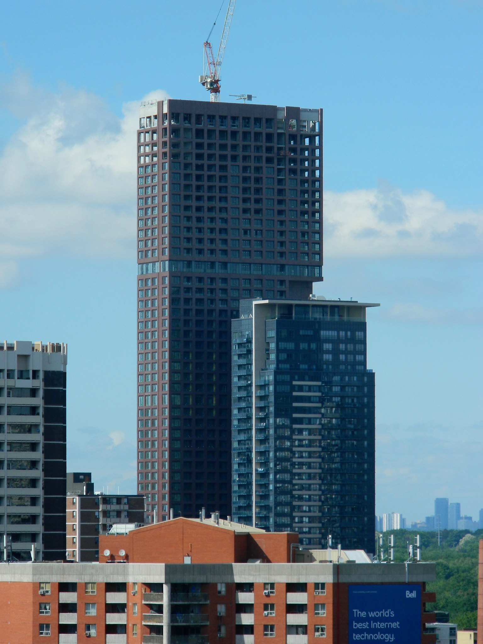
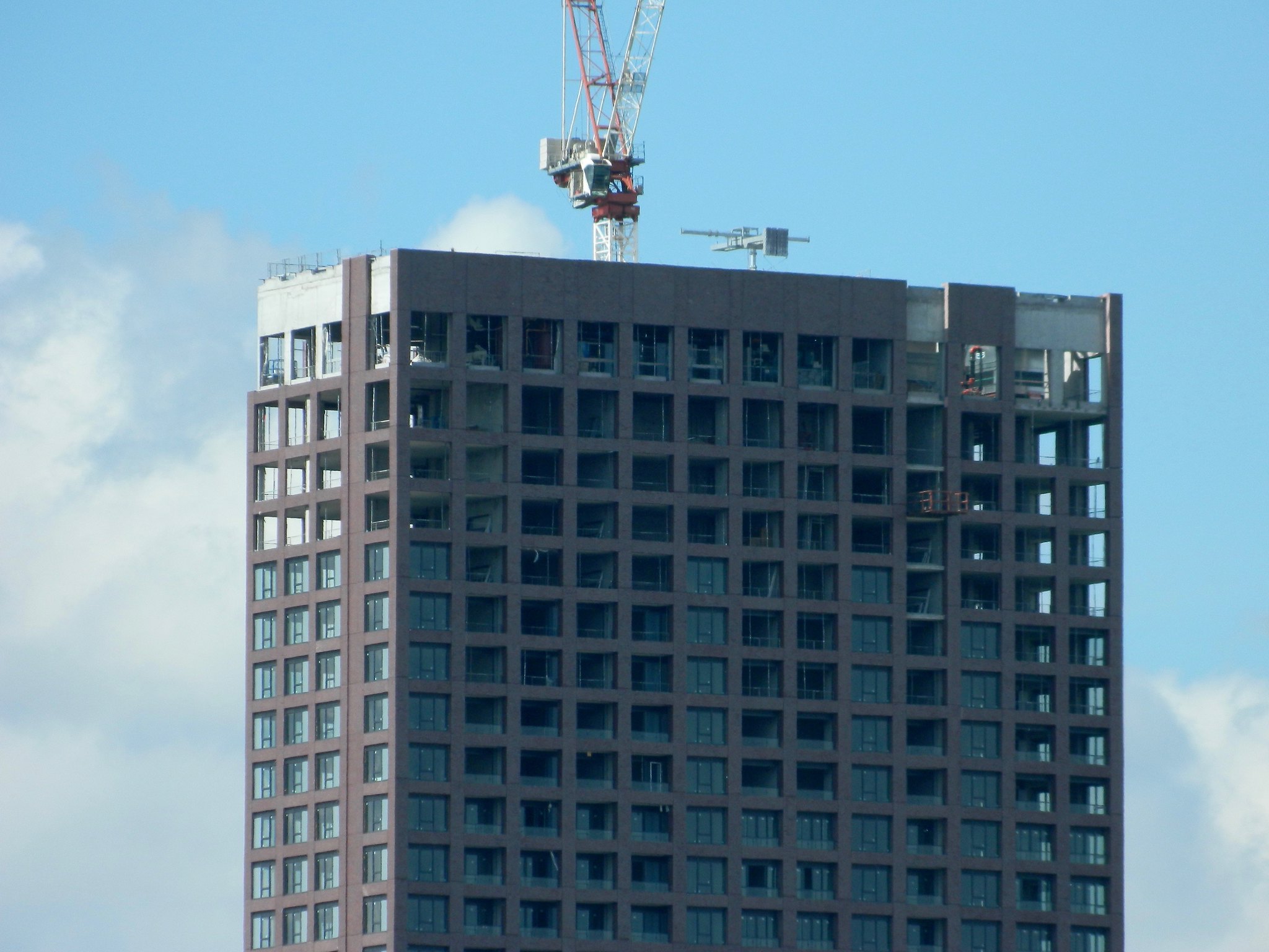
Toronto The Selby | 165.5m | 50s | Tricon | bKL Architecture

It looks like the developer wanted to add an illuminated sign to the mechanical penthouse and filed an appeal:

https://www.toronto.ca/legdocs/mmis/2018/sb/bgrd/backgroundfile-115164.pdf

Screen Shot 2018-05-30 at 8.45.02 AM.png
Screen Shot 2018-05-30 at 8.45.15 AM.png
 

Attachments

  • Screen Shot 2018-05-30 at 8.45.02 AM.png
    Screen Shot 2018-05-30 at 8.45.02 AM.png
    418.1 KB · Views: 601
  • Screen Shot 2018-05-30 at 8.45.15 AM.png
    Screen Shot 2018-05-30 at 8.45.15 AM.png
    317.8 KB · Views: 574
Anyone know why they left a single panel of brick in the glass section? it's nicer without it - gives the top part of the tower a floating look.
 
Anyone know why they left a single panel of brick in the glass section? it's nicer without it - gives the top part of the tower a floating look.
To me, having one brick panel shows that more thought went into the design than had they merely wiped all brick off that floor. The whole building has been handled deftly to my eye, and I'm glad to have one bKL tower in town.

42
 
It looks like the developer wanted to add an illuminated sign to the mechanical penthouse and filed an appeal:

https://www.toronto.ca/legdocs/mmis/2018/sb/bgrd/backgroundfile-115164.pdf

Interesting- are we seeing more developers branding their towers these days? Tridel does that (though with banners) on some of their buildings, and Concert just did that with 88 Scott. Could be an interesting way of directly linking more prominent buildings to their developers.

Edit: Nevermind, it's not Mod's logo, but Tricon Capital's
 
Interesting- are we seeing more developers branding their towers these days? Tridel does that (though with banners) on some of their buildings, and Concert just did that with 88 Scott. Could be an interesting way of directly linking more prominent buildings to their developers.

Helps that this one is a rental and a bit "iconic".

AoD
 
Look how hot this building looks from the photos above ! The Indian red brick with blue tinted windows really make this structure pop out from a distance . We need more buildings like this in the city.
 

Back
Top