Toronto Ten York Street Condos | 224.02m | 65s | Tridel | Wallman Architects

http://blacktower.tv/BUILDINGS/UNDER DEVELOPMENT/120 HARBOUR.html
003e120harbour2.jpg

Looking at that pic of that ugly 6-7 storey parking garage at the rear of WaterCub condos .... i wonder for that location how long before a new tower or two is proposed to compliment 120-130 Harbour/Ice1-2.
 
Last edited:
120harbour.jpg


120harbourbytridel.jpg


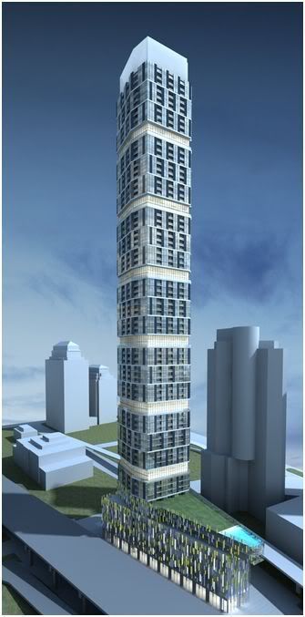
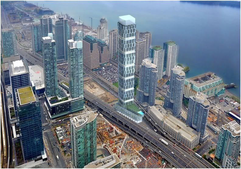
These images may be of an earlier version of the design, that has been superseded. Or maybe not, they might be preliminary renders of the current version of the building.

Each of the six repeating sections contains 3x3 + 2 floors, for a total of 66 floors and 3 more in the bottom section. That leaves 6 floors for the podium.
 
Last edited:
I would rather see Blacktower's render at this site. I'm sure it's too premature to tell what's going on and which render is which, but I am not fond of this latest render. Why not play off the shape of the site? It's being done with the podium, so why not make the tower play off the triangle-shape as well?

120harbourbytridelx3.jpg


120harbourbytridelx2.jpg
 
Last edited:
I agree with you cruzin4u! If the tower is not a flatiron, hopefully the podium is at least a few more floors so that the wedge shape can be easily visible as you drive east on the Gardiner. As well, hopefully the colour of the building is something other than the standard blue or green prevalent in the Southcore/Cityplace.
 
I would rather see Blacktower's render at this site. I'm sure it's too premature to tell what's going on and which render is which, but I am not fond of this latest render. Why not play off the shape of the site? It's being done with the podium, so why not make the tower play off the triangle-shape as well?

120harbourbytridelx3.jpg


120harbourbytridelx2.jpg

From what I have been told from reputable sources these renderings are the current design
 
It's going to be hard not being disappointed if Tridel does not take advantage of the odd lot shape with a flatiron skyscraper here. With that said, I prefer the first design shown by blacktower. I do like the protruding windows; a modern bay window, perhaps.

Also, and I won't say this often, but I think they should go higher here.
 
I would say from an efficiency point of view Tridel is taking full advantage of the site. We are talking about a floor plate that will be broken up into 500 sq ft units.
 
Call me a snob.. but I have NO CLUE why anyone would want to live sandwiched between a freeway and an offramp... Am I wrong?
 
Call me a snob.. but I have NO CLUE why anyone would want to live sandwiched between a freeway and an offramp... Am I wrong?

The City is planning to remove the off ramp and replace it with one that descends at Simcoe Street. If all goes well the ramp will be replaced before 120 Harbour is built.

42
 
Yikes. The heavy banding manages to make a very tall, very slender building look somehow chunky. The earlier design, while a bit plainer and more boxy, at least managed to emphasize the verticality of the thing in a way that added some grandeur.

I would have to agree with earlier posts that both schemes are disappointing in that they take no real advantage of the 'flatiron' site.
 
By the time this is started 4 years from now, the skyline and construction will make this area much different than it is now. Maybe this tower won't stand out as much as the render shows, in fact it may fit in quite nicely. All the Art Vandalay's out there may have a much better grasp of archtectual merit,but time will tell.
 
@Tridel has retweeted the render, although without making a comment, nevertheless it seems that the revised render is indeed the correct one...
 

Back
Top