Toronto Picasso Condos | 128.62m | 39s | Mattamy Homes | Teeple Architects

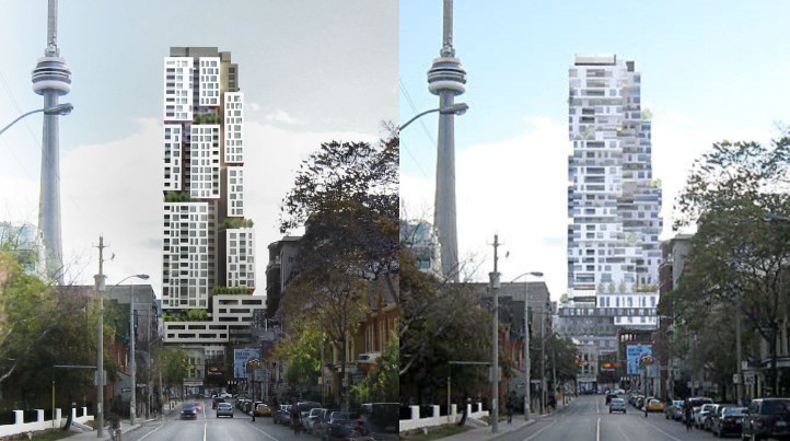
I love the building, but the location is really problematic -- it looms over Queen St., and really changes the low-rise character of that part of the city.

+1

It will really change the feel of Queen St. in that area. The rendering from Queen St makes it look like it might as well be fronting directly onto it. I'm not certain it's a bad thing (the building itself looks pretty sick*) but it will definitely take some getting used to. Could make a bright, sunny stretch of shopping street a bit canyon-like.

*'sick' is a main design objective for Teeple, one that few Toronto architects pursue
 
It's not the original, but one can definitely get excited about this project. The architecture shows that Teeple refuses to produce bland or tediously repetitive work. He always presents creative flourishes, and I tend to look forward to his projects. In terms of Queen Street, it could use a lot of improvement, but it would be ruined if it wasn't the low-rise streetscape dominated by heritage blocks that it is now beyond University Avenue. Fortunately, this tower is so distinctive that it could stand on its own, but I am concerned about the shadowing implications. There's nothing like a stroll on Queen West with the sidewalks filled with people from all walks of life, the streetcars clanging, people on corner patios, street musicians playing, and the sunlight bathing the Victorian brick blocks. The restored ones are glorious.
 
The Gansevoort version was much better compositionally. The new version is clunky and rather ugly. Teeple does great buildings and is always pushing Toronto's boundaries, so I'm surprised this design is as stodgy looking as it is.

But I also think it's way too massive for it's location.
 
Ya sure about all that?

6200083725_4d4173310b_b.jpg
 
The issue in Toronto time and time again is the low-rise built form of its central thoroughfares, a built form that is completely inadequate for its development needs and aspirations... and the cultural/heritage importance of this low-rise built form. How to reconcile the two?? Queen Street along most of its length outside of the Yonge/downtown core and Yonge Street north of Dundas are excellent cases in point...

For this reason I like the solution a project like the Picasso offers, which is to say high rise along streets that are contiguous to low-rise arterials/thoroughfares, preserving the scale, diversity and heritage of the low-rise built form yet providing an adjacent high-rise background that adds the supportive density required. This will have symbiotic benefits, the low-rise and high-rise enriching and supporting each other. This formula also seems suitable given the low-rise 'village' past of many of Toronto's main thoroughfares where most of the streets adjacent to them are fairly 'unimportant' in terms of the built form (or so it would seem at first glance), prime candidates for more intense development and density.

As I see it the main question that remains then is how high is too high for those streets for development that abut main thoroughfares? Picasso seems to be on the too high side when looking at the renders. Then again, at the moment it is standing out on its own and looking very much out of context. It will all very much depend on the long term vision for these areas.
 
Is there a reason why the original design could not have been used? Perhaps a payment to the people who commissioned the original design equal to, or slightly more than, what they had originally paid for it? I hope that the reason is not simply pride.
 
Fair enough, of course I completely disagree. I believe that the massing and composition of the new model is very suitable. Compared to the old version its more slender and less disjointed. However, by no means am I suggesting that the Gansevoort version was ugly. It indeed excelled in its own unique way. I just feel that both designs are eye-catching and superior to the norm.
 
Last edited:
Is there a reason why the original design could not have been used? Perhaps a payment to the people who commissioned the original design equal to, or slightly more than, what they had originally paid for it? I hope that the reason is not simply pride.

You'll be relieved to know that the original design was 'tweaked' in response to Gansevoort pulling out and the building moving from a mixed condo/hotel to a purely residential building. The hotel would have contributed money to the project which now isn't there. Monarch and Teeple therefore had to adjust both the shape of the building and the finish applied to it to compensate for the loss of those funds.
 
Not to mention that the old design was probably still quite conceptual.

The new one is quirky, but really futuristic. It looks like a colony they'd build on the moon, I think :)
 
Maybe as a bow to Toronto's own Barenaked Ladies, they could build a second tower and call it the "Garfunkel"
 
I'd love to see a city full of Teeple-designed towers. This is awesome.

This building works with Queen St the same way Five condo works with Yonge St - the tower is offset from the heritage buildings on the main thoroughfare. To me, this is the new Toronto urban planning style. This is what the city should advocate. It works and it looks good and it maintains the heritage nature of its main streets.
 
Is there a reason why the original design could not have been used? Perhaps a payment to the people who commissioned the original design equal to, or slightly more than, what they had originally paid for it? I hope that the reason is not simply pride.

For a few reasons, but the most significant being the previous design was unbelievably costly and complicated to build. Each floor plate was completely unique and random, and each suite design the same.

I think Teeple did a great job at maintaining the essence of the original design, while value engineering it down enough to make it cost effective and reasonable to build. Will be a great new addition to the city.
 

Back
Top