ganjavih
Senior Member
This once attractive neighbourhood has really been butchered. Very awkward.


No disrespect, Tridelwebmaster, but I hate this building. I find it architecturally, contextually, and materially unacceptable. That said, thanks for the link to the pics (and for The Republic pics).


No disrespect, Tridelwebmaster, but I hate this building. I find it architecturally, contextually, and materially unacceptable.


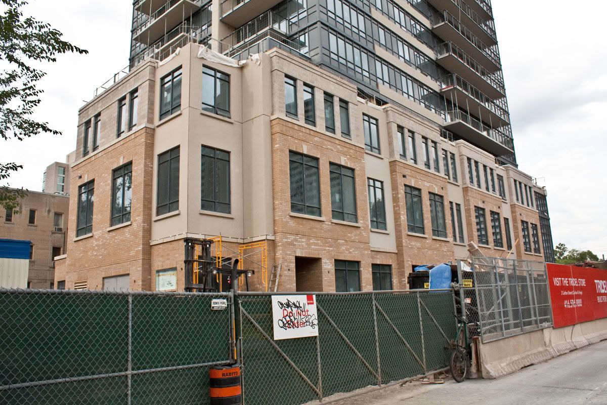
The podium is pretty horrible. The precast up against that ugly brick. The podium should better match the tower portion. If it had grey precast with grey bricks, it would look a million times better.