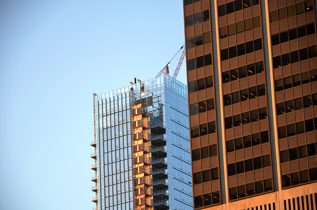
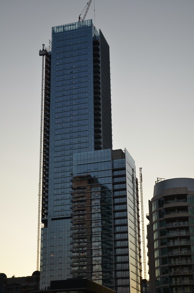
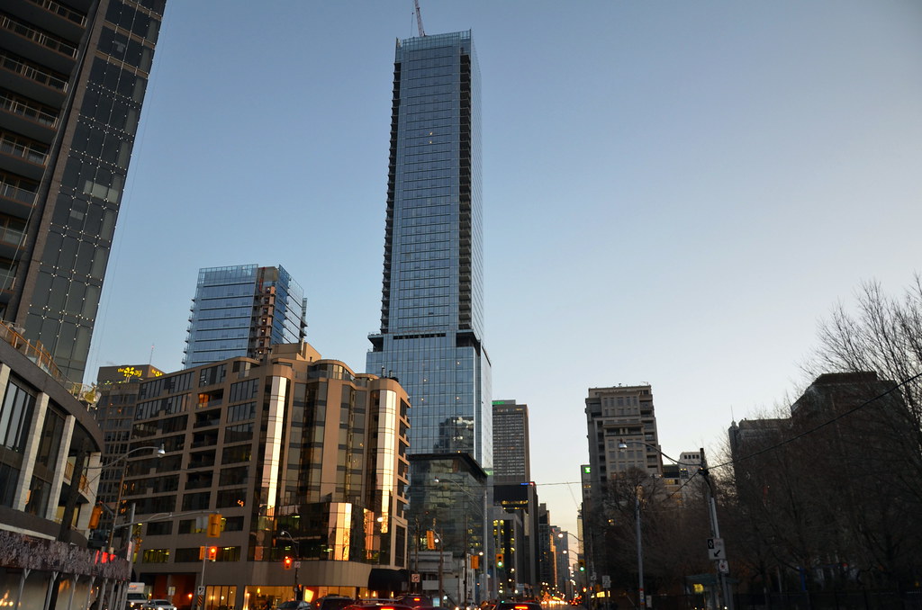
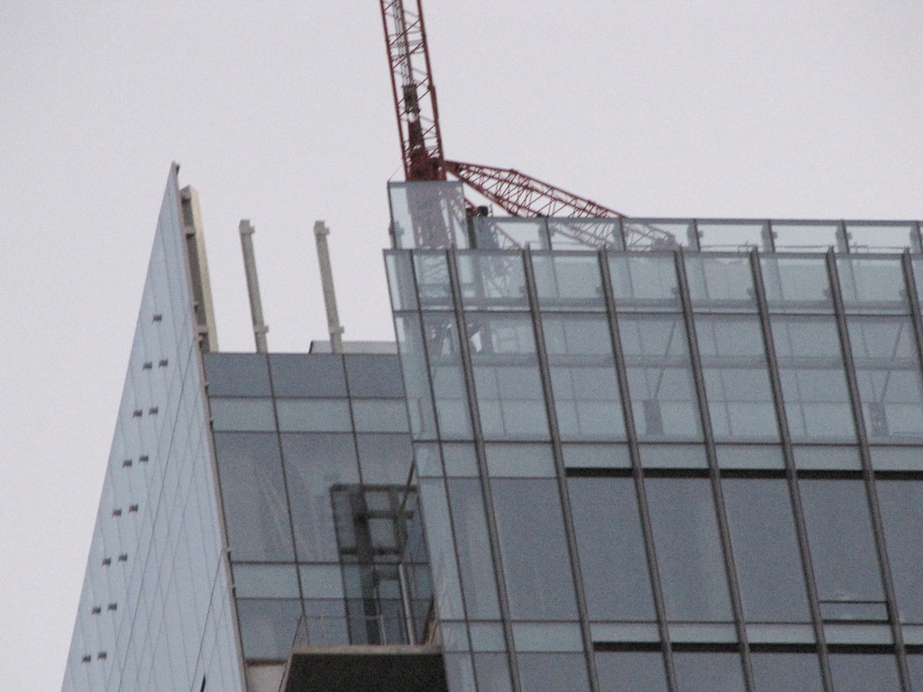
Toronto Four Seasons Hotel and Private Residences Toronto | 203.9m | 52s | Lifetime | a—A

it'll grow on me ^^^
but looking at that photo, i'm equally worried about the north side.. with those random cut outs of glass they have going there... kinda awkward.

Steveve - awkward is how Trump's random floor heights look. This looks cutting edge - and planned to have that effect - where Trump looks haphazard.
 
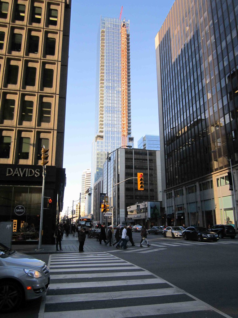
I'm not crazy about the black stone on the podium. It looks like black tar paper from a distance in fact this is what I thought is was before I realized it was the final product. The pop-out window frames only add to the impression that this is some kind of underlay and the final cladding is yet to come.

I think polished granite would have looked more luxurious.
 
Steveve - awkward is how Trump's random floor heights look. This looks cutting edge - and planned to have that effect - where Trump looks haphazard.

the awkward floor heights at trump have little to do with this/non comparable.
and i don't get it?
 
I'm not crazy about the black stone on the podium. It looks like black tar paper from a distance in fact this is what I thought is was before I realized it was the final product. The pop-out window frames only add to the impression that this is some kind of underlay and the final cladding is yet to come.

I think polished granite would have looked more luxurious.

Or more garish/cheesy '80s, like the black granite on Uptown. Four Seasons has employed, what I believe to be, a more sophisticated and textured material that contrasts nicely with the smooth, shiny glass. The differing materials, shapes, and textures work very well here. I don't get the black tar paper at all; perhaps those peepers were seeing a little below 20/20 that day.
 
Day and Night

0324seasonscouture77cha.jpg


048fourseasonshoteltoro.jpg
 
Last edited:
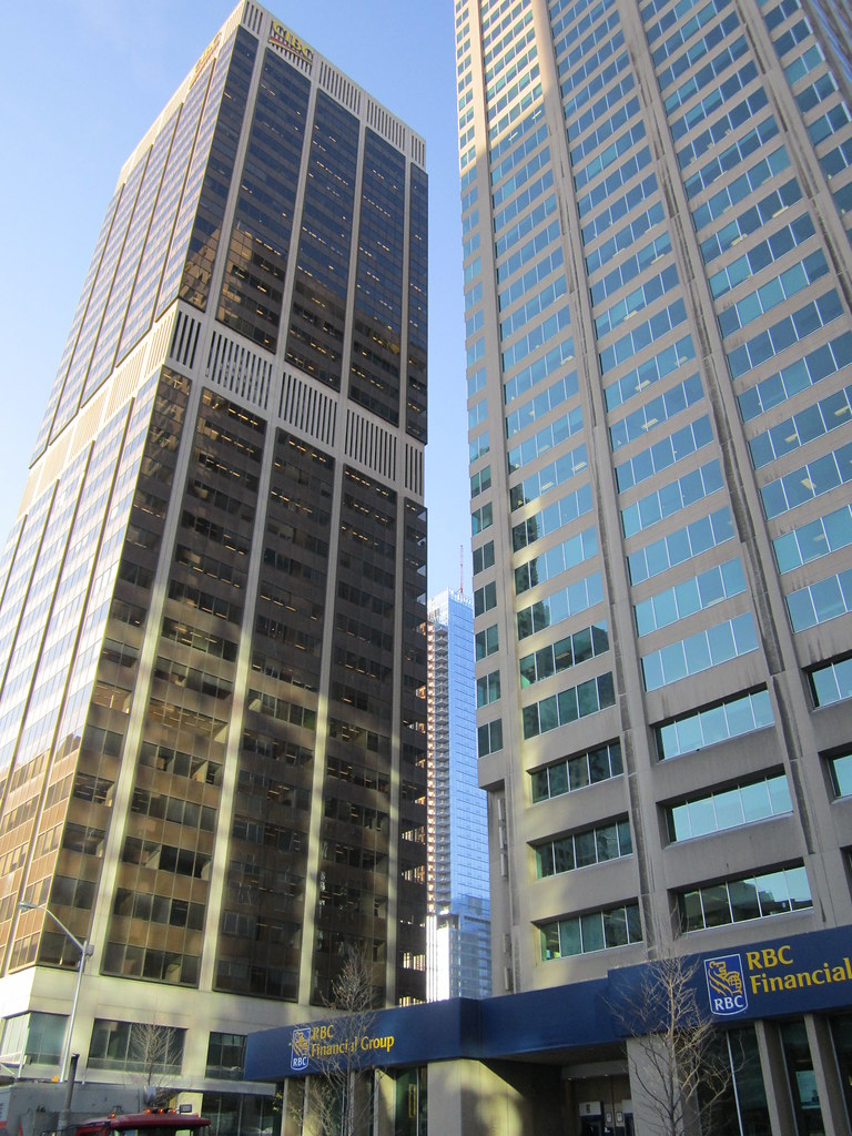
personally, one of the best places to view this tower is in that 2nd shot on yonge just north of bloor. it looks great and the shorter tower looks better and less overpowered.
 
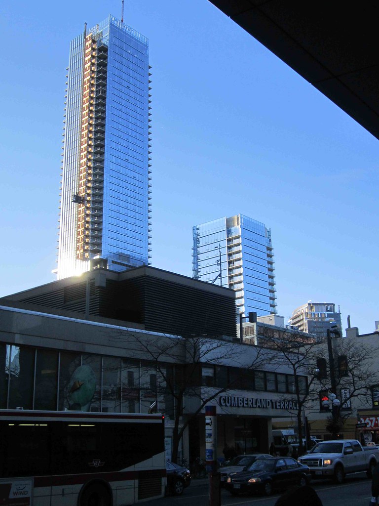
The second-last view is sure to become a new iconic old/new view of Toronto (think Gooderham building). The two gorgeous, gleaming, 21st century towers looming up behind the two precious little cookie jars from the 19th.
 
yes, quite a juxtaposition... though I also really enjoy the views from west on Davenport, or the one looking down Bay from Davenport also shown above.
 
The second-last view is sure to become a new iconic old/new view of Toronto (think Gooderham building). The two gorgeous, gleaming, 21st century towers looming up behind the two precious little cookie jars from the 19th.

... and if you step back further to the east, taking in aA's 18 Yorkville, the view gets even better. Are such expressions of our local design culture too good for Toronto to handle? I think not! Bring on more.
 
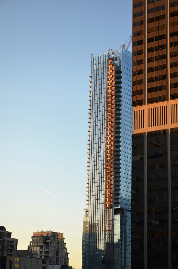
Four Seasons reminds me of a well-tuned instrument. It's stunning. The Florian is gorgeous too, like a fine piece of German engineering. Great shots.
 
Last edited:
Those photos drum just posted, make Toronto look rich like Dubai!

I know it's just the illusion of the shimmering glass, but it almost looks like we are really a high rolling city.
 
umm...we are. Dubai went bankrupt, and had to borrow from its actually rich brother Abu Dhabi. We are in a higher league in almost every way then smoke and mirrors dubai.
 

Back
Top