Toronto Cinema Tower | 142.64m | 43s | Daniels | Kirkor Architects

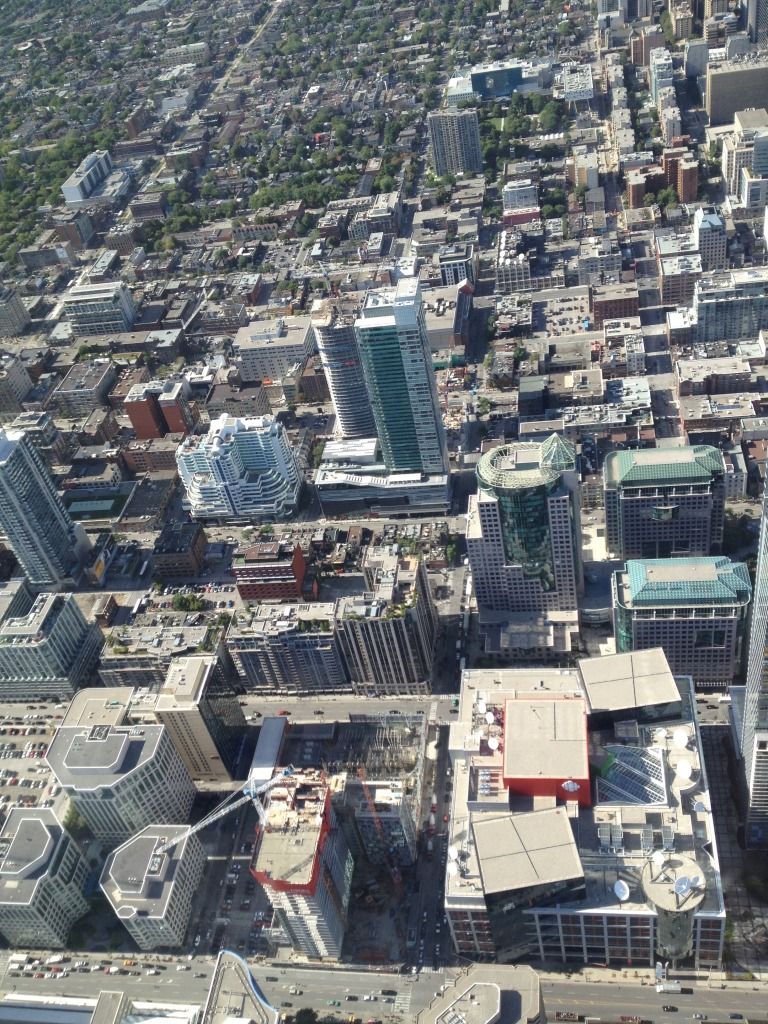
Agreed. I appreciate curved take on the Festival Tower and I am liking the terracotta look of the podium (and I agree that the colour is refreshing). I hope the street level is pulled off successfully.
 
Perhaps it will come together better when it's finished but I can't be the only one who sees what is shaping up to be a big disappointment. The cladding on the podium looks cheap and monolithic (hopefully with windows installed the effect will be diminished). And the precast (/aluminum?) strips up the length of the tower do not look promising. I think primarily because they chose a colour similar but not the same to that of the podium cladding, it just looks off. Maybe the sweeping overhang due to take shape over the podium will help the two sections better come together but I doubt it.

Daniels + Kirkor, not sure why I deluded myself into hoping they'd use better than bargain materials.

Oh and by the way, by no means is this the only project using something other than grey spandrel. Paintbox, Hullmark (so far), E, Sickkids, L, and that's not to mention the others that shunned the heavy use of spandrel like ICE, Massey, X, and others.

Come on people, we should expect more.
 
^^
Paintbox and Hullmark not grey? Are you kidding me? They are overwhelmingly grey. (both spandrel and trim) It's very hard to find new buildings in this city that don't use grey in some regard, unfortunately.
 
They definitely have grey in them but I don't think that's what you'll notice.

With the cultural centre and the colour running the length of each floor on the tower I think the grey on Paintbox provides necessary contrast. Hallmark might be predominantly grey when both towers are finished but I think the white accents of the podium and office portions will be attention grabbing.

You also only commented on the worst two of my examples from that list. If you're not satisfied there's also Motion (although I'm not a fan) and I don't know how I had forgotten Picasso. Could throw The Yorkville on that pile too even if it does have some grey.

Besides, my issue with this building has really to do with all the other aspects I listed. The glass on its own could very well turn out above average. Everything else, not likely.
 
Last edited:
People say the silliest sh*t on this site. I guess some people see an eyesore whenever a condo breaks the mold and rejects grey spandrel for something a little different. This condo is looking damned good and is giving us some unique textures and colours, which in my book, is a good thing.

Well said, and I agree with you. I'm having a problem visualizing this completed but it shows promise so we'll just have to wait and see how it turns out. One negative is I rarely like above ground parking structures at the bottom of a building, again we'll see how it fits in once completed.
 
Curves (I see a bit of Pantages here), but mostly colour. Very radical I know... :)
There was a student residence that went up at Gerrard & Church a few years back, a 12-14 storey building with a mix of orange, red and yellow brick & precast. It was almost universally disliked - well, hated, including by myself. After it was completed it dawned on me one day as I passed it that it actually settled into the neighbourhood quite well and the colour was welcome. By no means is it a great building and it fails miserably by not including any retail at the street level but I do like the addition of colour to the area. How disappointed were we by the lack of colour on M5V?
Moral of the story, colour can be good sometimes, so that's just my 2¢.
 
^^
Yep, I agree, colour, curves and texture. I'm also not a fan of above ground parking but this seems to be covering it pretty well. As long as the ugly florescent lights in parking lots are covered/disguised, it's not so bad. This tower will also provide retail and an arts space at street level, so it will be adding some entertainment/culture to a district that identifies itself with that name. Grey is my least favourite colour/shade, so the fact that it has none, is a BIG plus for me.
 
People say the silliest sh*t on this site. I guess some people see an eyesore whenever a condo breaks the mold and rejects grey spandrel for something a little different. This condo is looking damned good and is giving us some unique textures and colours, which in my book, is a good thing.

textures and colours aside, the only mold this thing is breaking is that it imports a completely suburban style of condo design into the heart of downtown.

those meaningless clunky curvy roof designs are a hallmark of cheezy cornball condos found all over North York, Mississauga etc. and the swoopy podium just adds to the clumsiness. in fact, i can say pretty unreservedly that the roof on that podium is going to be hideous.

3fcf42c0.jpg


81e289f1.jpg


c6cba9cd.jpg


285d952a.jpg


25096d97.jpg


6fa3849d.jpg
 
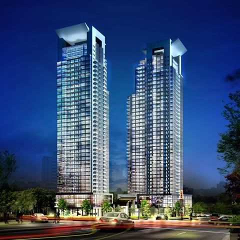
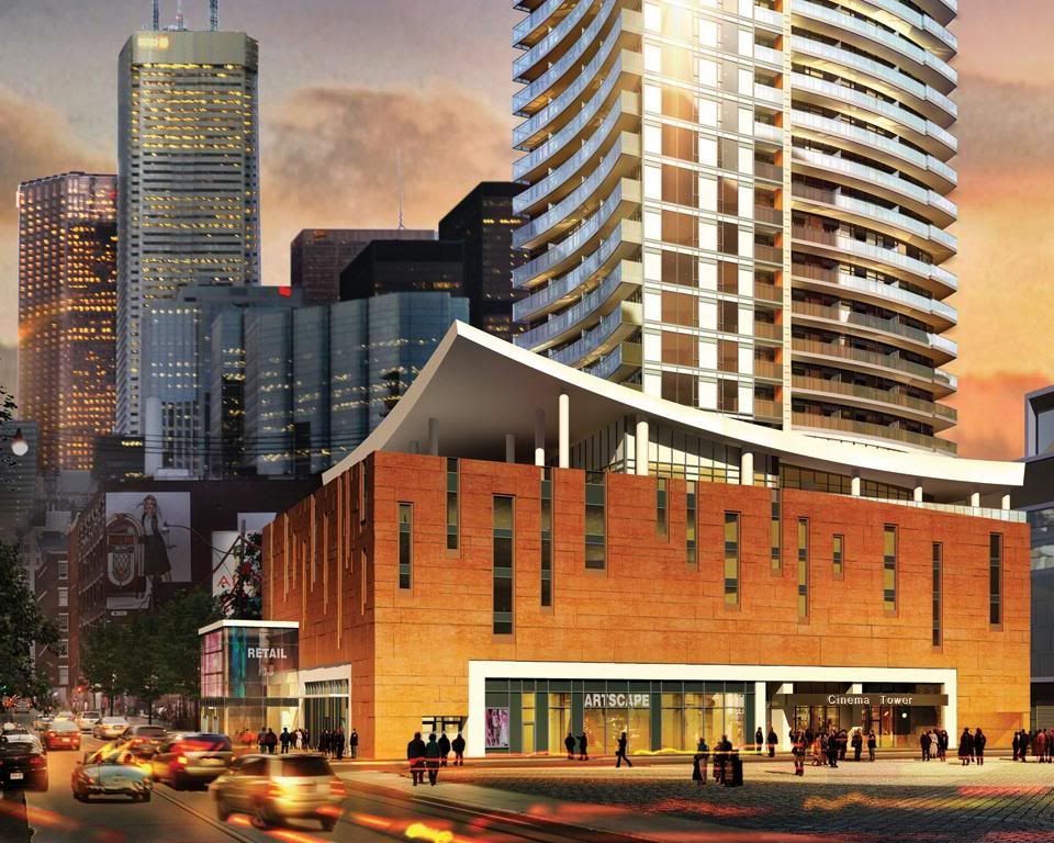
Looks pretty nice in the last render.

Well, sure. It's a render. In person, though, it's not that nice. The podium just isn't that interesting; they're really relying on the cladding to do all the aesthetic heavy lifting. Sadly, the cladding isn't up to the task. It just feels like a big blank orange concrete wall. Which it is.
 
It's way too early to judge the podium...

The whole thing is hardly clad and has no context with all the construction equipment still around it.
 
I wish the podium cladding looked close to that render, a nice rich, golden terracotta, unfortunately that isn't what was used. The actual (coloured concrete?) cladding looks cheap and uninteresting and doesn't promise to age very well either.
 

Back
Top