Toronto Boutique Condos | 106.37m | 35s | Urban Capital | ZAS Architects

  • Thread starter superdeduperawesome
  • Start date
I like the placement of the double floor unit.
 
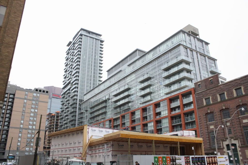
The type of window mullions they used look cheap-- but more than anything, the lack of detail on the brick podium (look to Vancouver for real detail on a brick podium) and the grey siding used on the entire height of the tower.
 
Taken today.

5132753025_75cc5b6163_b.jpg
 
RE: Look to Vancouver

No thanks. I like the minimal look. Vancouver's designs/massing tend to be awkwardly busy. It works well for the landscaping but, rarely the towers.
 
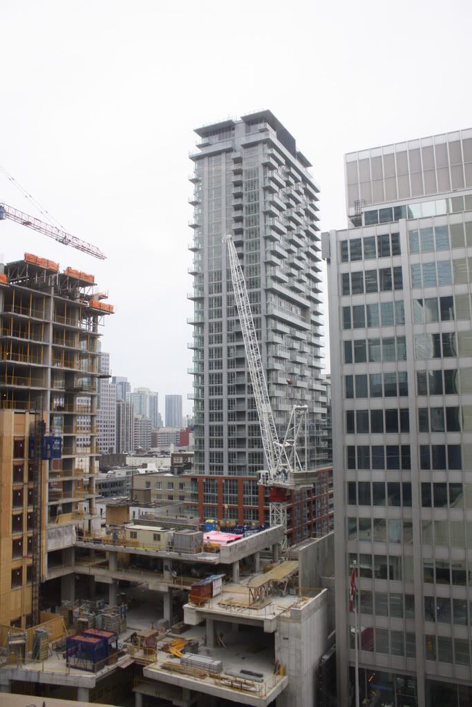
Oct 1 2010 update

photos that I never got around to posting previously ~

IMG_5056.jpg
 
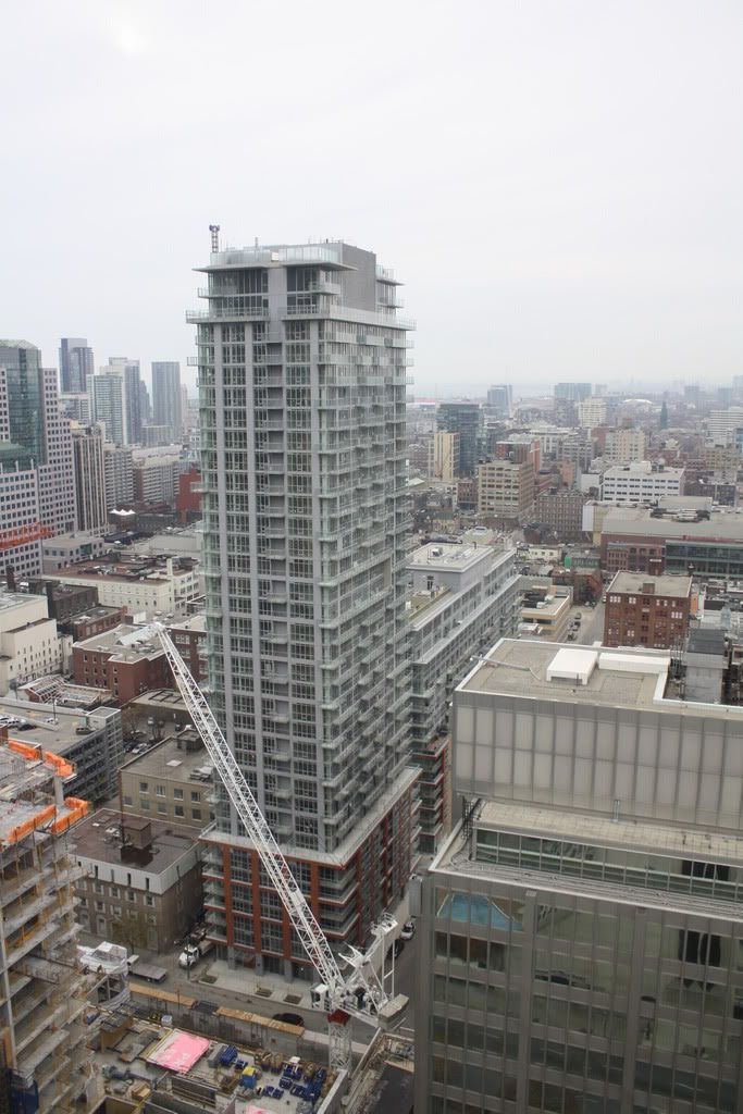
Nov 16 2010 update

from last week ...

IMG_5128.jpg
IMG_5129.jpg

IMG_5130.jpg

IMG_5131.jpg
 
RE: Look to Vancouver

No thanks. I like the minimal look. Vancouver's designs/massing tend to be awkwardly busy. It works well for the landscaping but, rarely the towers.

Note how I didn't say that there is something wrong with minimalist neo-modernism like the sort we have in Toronto. I was speaking to the richness of materials and detail in Vancouver condos.

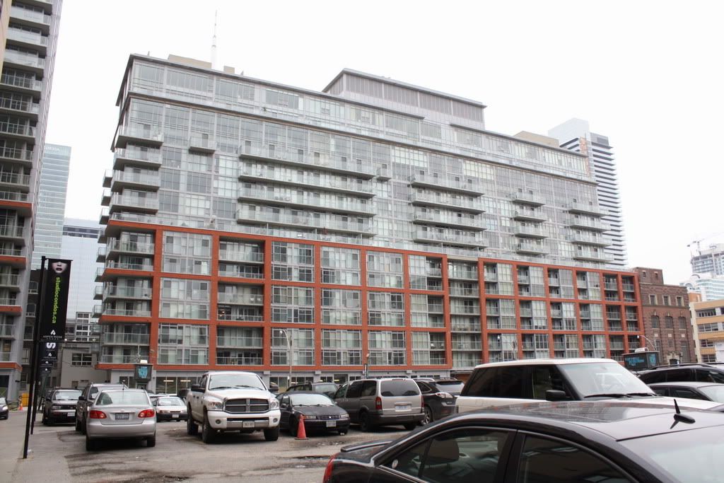
The picture above taken at ground level just accentuates how plasticky this tower looks. And silver mullions/window framing against red brick... yikes.
 
Last edited:
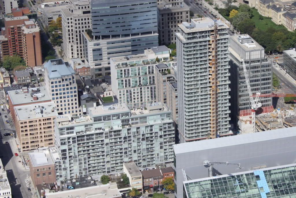
Nice pics Jason. In the first shot, all the buildings on the left hand side of the road probably already have developmental bulls eyes painted on em.

That stretch will probably change dramatically over the next dozen years!
 
Last edited:
I really find this picture makes me realize why I don't like City Place for appearance. Too much glass and repetition. Even though University Plaza has been much maligned on this forum, I find the appearance of this along with the red brick of Boutique and the glass makes for a more interesting streetscape. Also, it will be nice when the West (rear) face of University Plaza is partially hidden by Studio. And of course, the Shangrila will just be in another league but this little corner I believe will be actually very nice when it is finished.
 

Back
Top