Toronto Bloor Street Neighbourhood Condos | ?m | 32s | Cresford | Northgrave

I don't understand how anyone could possibly think that Casa looks better than BSN. Casa is just a tall, uninspired tower of glass. BORING! BSN has sophistication and character. The idea of an outdoor pool at Casa is just a nightmare waiting to happen, everyone who moves into Casa will regret buying there is a few years when they see their maintenance charges skyrocket to keep that outdoor heated area and pool going. Sure, BSN may have had more delays but sometimes perfection takes time!
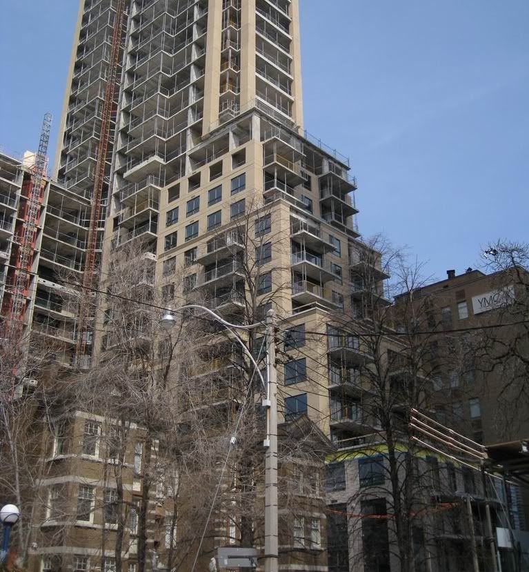
 
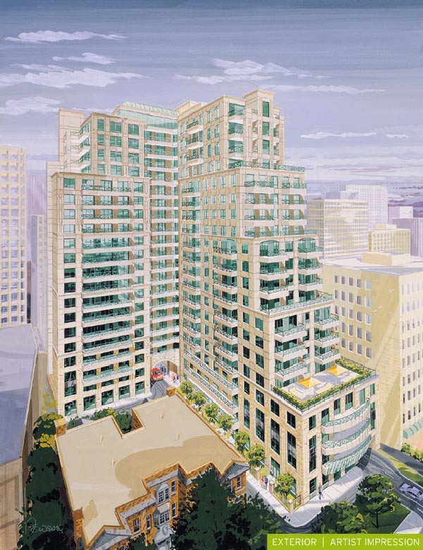
pepper79 ... I don't have anything FOR nor AGAINST Casa in particular ~ but I will have to file my objection to your claim that "BSN has sophistication and character", are we on the same planet here ??? the redesigned BSN, is simply U G L Y ... the scale is totally unproportional, the tower section does not fit and was just 'slapped on top' ... and the cheap pairing of forest green and beige spandrel panels is simply a disgrace :(

04/07/2009
picture.php

BSN would have been a perfectly good looking building IMO had they kept the original (20s) design, the planned step backs / terracing were spaced out appropriately making an interesting building that fitted in well to the Charles Street streetscape

March 28, 2009
IMG_3620.jpg

 
Last edited:
Although I don't have any problem with BSN, another 1 or 2 setbacks would have done wonders to make it more attractive. I asked the architect about the lack of setbacks on the tower portion and he seemed surprised that I mentioned it so I guess it wasn't really on anybody's radar, except here at UT.
 
i don't understand how anyone could possibly think that casa looks better than bsn. Casa is just a tall, uninspired tower of glass. Boring! bsn has sophistication and character. The idea of an outdoor pool at casa is just a nightmare waiting to happen, everyone who moves into casa will regret buying there is a few years when they see their maintenance charges skyrocket to keep that outdoor heated area and pool going. Sure, bsn may have had more delays but sometimes perfection takes time!
hahahahahahahahahahahahahahahahahahahahahahahahahaha...
 
Why is it that everybody only comments on the exterior of the tower, what about the interior, where you are actually living! I mean why would anyone judge a building based on the colour of the windows, that is bizarre. And if you are comparing exteriors, why would you be so excited about Casa, it is just a big glass tower. Wow, how original and exciting (I am being sarcastic!)

BSN has better floorplans and the amenities make more sense (an indoor pool in Toronto is preferable to an outdoor pool in this cold climate).

Some people get all excited when they hear Casa is designed with Armani funiture but it is not like you are getting that stuff in your suite! BSN is also closer to the Yonge-Bloor subway entrance, another plus. BSN has class where Casa is just all flash!
 
I would probably agree with you that BSN has well laid out floorplan, but only for units that are in the lower half (1-16) of the building

you should go check out the floorplans from 17-32nd floor, those long narrow unit layouts are ridiculous ~

"BSN is also closer to the Yonge-Bloor subway entrance, another plus." - very true and agreed

"BSN has class where Casa is just all flash!" - everyone is entitled to their own opinion, in this case, I particularly disagree with the statement that BSN has class, it has NOTHING !! I will cease to comment on Casa~
 
The interiors of BSN also provide the huge bonus of not being able to see the exterior of BSN from them.
 
Unless your windows are on the inside corner of the L - in which case you'll be looking out of BSN at BSN.

Double bogey.

42
 
Why is it that everybody only comments on the exterior of the tower, what about the interior, where you are actually living! I mean why would anyone judge a building based on the colour of the windows, that is bizarre. And if you are comparing exteriors, why would you be so excited about Casa, it is just a big glass tower. Wow, how original and exciting (I am being sarcastic!)

BSN has better floorplans and the amenities make more sense (an indoor pool in Toronto is preferable to an outdoor pool in this cold climate).

Some people get all excited when they hear Casa is designed with Armani funiture but it is not like you are getting that stuff in your suite! BSN is also closer to the Yonge-Bloor subway entrance, another plus. BSN has class where Casa is just all flash!

Might as well throw in my 2 cents here.

To the person who said that "sometimes perfection takes time"...that is completely ridiculous...BSN took so long because they didn't start the damn thing and had nothing to do with making it better.

While I don't think BSN is a stunning building or anything I will admit that I think it has come together very nicely...it looked ghastly when it was a shell but I actually think that it looks very decent now that it's mostly done up.

I do agree that at this point most of us are overemphasizing how the building looks from the outside. Sure it's nice to say hey look that's my building and to be pointing at something that looks nice. But at the end of the day resale value is mostly reflected by location followed by the unit itself and then a small role could be the amenities. Most of your time is spend inside the unit. A friend of mine just bought an a 25 year old (UGLY from the outside) building at bay and bloor that is known to be a very well run building. It in fact is a fantastic building and for $15,000 he had the unit completely renovated and his unit is spectacular now and the building is excellent other than how it looks on the outside.

I guess unit layout is very personal...but I do think this is where CASA wins easily. I think alot of the layouts in BSN are horrible. While some may not like the open the open concept at CASA...the units will be far more impressive from the inside with the glass and spectacular views. I don't think this fact can be disputed. Sure its a simple block of glass some say...but that solid glass makes for excellent views from the inside.

Finally, I think CASA can easily look cluttered when all is said and done and everybody has everything out on their balconies.
 
I think CASA can easily look cluttered when all is said and done and everybody has everything out on their balconies.

I suppose there is a risk, but if you take a look at Spire today I don't think you'll find balcony furniture, plants, pots, etc. ruining the beauty of the building.
 
I think 22 Wellesley looks awful because of the cluttered transparent balconies.

I wonder though if that's just your impression because of the questionable taste of the people living on the first couple of floors on the south side (which are only about 10 feet away from those walking by). I've never really noticed it with the rest of the building.

Anyways, that said, as pepper79 clearly demonstrates, taste is a personal thing. How many times have you gone into a store to wonder, "Who buys this crap?" and then you see exactly who a few minutes later on the street (usually he's talking loudly on his bluetooth).

The best debate about what is beautiful, though can be found in the Saudi Arabia thread over at SSC. (Saudi Arabia, the land that taste forgot.).

Anyways, back to BSN.
 
I think 22 Wellesley looks awful because of the cluttered transparent balconies.

You'd rather it look like an uninhabited shell? Or perhaps you would prefer some draconian rule-based system whereby an independent adjudicator assesses the building from the street and drops by later to inform you that your balcony furniture must be removed because it is a Class 2b, Section 378a infraction.
 

Back
Top