Toronto 1Thousand Bay | 104.85m | 32s | Cresford | a—A

No. You're missing the point widely. You posted 5 examples of the trend you've identified a distaste for (3 of which are essentially different phases of the same project), and then I posted 15 that do not at all conform to that trend. Yet you still assert that aA does the same thing over and over again.

How many of the buildings you posted are actually built or under construction? 2? How many of them are actually visible on the skyline (given that wraparound balconies don't really matter much from an urban planning point of view)? 1 (Theatre Park)? Meanwhile, every single building I posted is visible and prominent on the skyline from at least one angle, and all look terrible, including 1Thousand Bay, the subject of this thread. Either you're not looking hard enough to see the trend I'm seeing, or for some reason find the need to defend aA regardless of the legitimacy of the criticism. Do you honestly think it matters if Casa I, II, and III are different phases? They all share the common feature of a featureless exterior with wraparound balconies that will inevitably be littered with people's junk. I know many here take the self righteous approach and label all those who oppose as philistines, but there is nothing wrong with taking architecture at face value. When the same architect consistently produces the same inferior result, it becomes difficult to sugar coat it as "modern sophistication" and easier to see it for what it really is; bland, uninspired, path-of-least-resistance architecture.

I wonder whether anyone defending aA so vehemently here is equally willing to defend the end products of their work; how about 1Thousand Bay? Is there any justification for this atrocity? For those of us who aren't so blindly loyal to aA, it is an obvious result of aA's wraparound balcony concept that they've been repeating all over the city for years.
 
Last edited:
How many of the buildings you posted are actually built or under construction? 2? How many of them are actually visible on the skyline (given that wraparound balconies don't really matter much from an urban planning point of view)? 1 (Theatre Park)? Meanwhile, every single building I posted is visible and prominent on the skyline from at least one angle, and all look terrible, including 1Thousand Bay, the subject of this thread. Either you're not looking hard enough to see the trend I'm seeing, or for some reason find the need to defend aA regardless of the legitimacy of the criticism. Do you honestly think it matters if Casa I, II, and III are different phases? They all share the common feature of a featureless exterior with wraparound balconies that will inevitably be littered with people's junk. I know many here take the self righteous approach and label all those who oppose as philistines, but there is nothing wrong with taking architecture at face value. When the same architect consistently produces the same inferior result, it becomes difficult to sugar coat it as "modern sophistication" and easier to see it for what it really is; bland, uninspired, path-of-least-resistance architecture.

I wonder whether anyone defending aA so vehemently here is equally willing to defend the end products of their work; how about 1Thousand Bay? Is there any justification for this atrocity? For those of us who aren't so blindly loyal to aA, it is an obvious result of aA's wraparound balcony concept that they've been repeating all over the city for years.


aA is a one trick pony, and their trick of wraparound balconies is getting old really fast. They have quickly gone from modern minimalist designs to predictable second rate budget architecture; wraparound balconies with a ton of spandrel, mullions, mismatched balcony doors, etc.

This is your original argument - and if you want to ignore the posted examples that disproves your "one trick pony" argument , you can always consult the corpus of aA's work yourself:

http://www.architectsalliance.com/

I am sure you jest when you say "consistently produces the same inferior result" against that. And to go further against that whole skyline argument - ICE? Harbour Plaza (because we know skyline meant the Bay/Yonge corridor). Why not those prominent examples of it done right? How about Four Seasons? 18 Yorkville? Pier 27? Radio City? Karma? Brant Park?

AoD
 
Last edited:
Also, Mr. Pony, what exactly do you think is going to happen with those of the 15 examples that aren't yet complete?

Are they going to magically sprout wraparound balconies in the construction process?

Honestly, you're making this too easy.
 
Last edited:
Also, before one complains about wraparound balconies - it was an innovation at the time, and every period has its' style - we are probably look at the tail end of this given how aA seem to have moved away from it in their recent proposals. Recall the original thread for CASA dating back to what, 2006 (and the proposal received approval in 2004):

http://urbantoronto.ca/forum/threads/toronto-casa-148m-46s-cresford-architectsalliance.507/

There was literally no project like this at the time, and it take 5+ years from proposal to completion.

AoD
 
Last edited:
I don't have a lot of time to wade deeply into this, piling up lots of examples, but I'll say that the original premise here—that wraparound balconies are an idea whose time has come and gone—and that they are ugly on this particular building—is not shared by everyone. It's a personal opinion only that they are ugly here: to me, the taller part of this building looks fantastic all because of the shifted balconies. There are a pile of photos on earlier pages that I contend bear that out. For me, it works great, a local landmark even… but if others don't agree, oh well, too bad for them in this instance.

BTW, neither do I care how many people pile on to tell me that wraparound balconies are necessarily ugly/intrinsically evil. There's nothing at all objective in those pronouncements: it's all personal preference.

In regards to what might be on balconies, sure, we may see the stuff on Casa's, but that'll be hidden by the frit on Casa II and Casa III. Besides, a balcony does not have to be wraparound for someone to put things on it.

So, @DtTO get as riled up about subjective matters as you want, that's your right, but it's only an opinion, not an objective truth.

42
 
Here is the Second Cup sign:
DSC_0597.jpg
 

Attachments

  • DSC_0597.jpg
    DSC_0597.jpg
    897.7 KB · Views: 484
Ohh man is this ever frustrating. The City has ripped up the blue-grey pavers that the developer had laid and replaced it with standard concrete sidewalk.

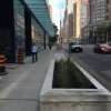
Looks like we're getting planters, which is nice I suppose, but ugh.

image.jpeg
 

Attachments

  • image.jpeg
    image.jpeg
    2.1 MB · Views: 480
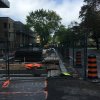
So the city has made a bunch of progress on the Bay sidewalk and planters, but I sure I they're not done because the concrete looks terrible in places.

image.jpeg
image.jpeg


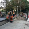
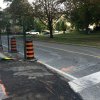
On the bright side, they've been doing a whole bunch of work on the St. Joseph side as well, which (somewhat remarkably) includes a significantly large bump-out and vehicular lane reduction.

I'm not sure I've ever seen a lane reduction pseudo-coincide with condo-related construction. But I hope to see more of it!

image.jpeg
image.jpeg
image.jpeg
image.jpeg
image.jpeg
 

Attachments

  • image.jpeg
    image.jpeg
    1.3 MB · Views: 718
  • image.jpeg
    image.jpeg
    1.5 MB · Views: 915
  • image.jpeg
    image.jpeg
    1.9 MB · Views: 741
  • image.jpeg
    image.jpeg
    1.9 MB · Views: 731
  • image.jpeg
    image.jpeg
    1.8 MB · Views: 666
  • image.jpeg
    image.jpeg
    1.8 MB · Views: 654
  • image.jpeg
    image.jpeg
    1.9 MB · Views: 742

Back
Top