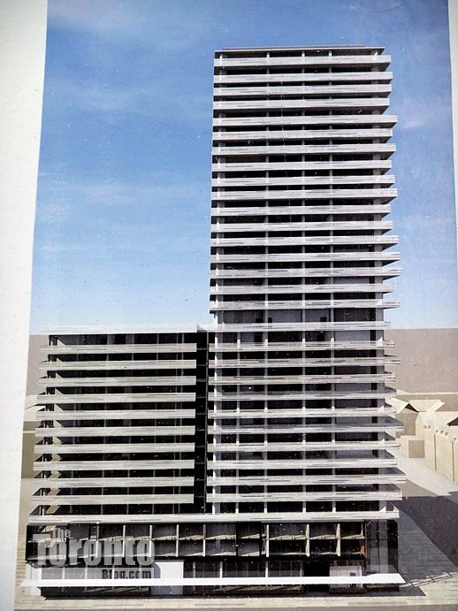
Toronto 1Thousand Bay | 104.85m | 32s | Cresford | a—A

Many of those will be nothing like the renderings. Theatre Park is there best work in recent times. Also, there are these actual buildings which are either under construction or recently completed:

CAsa-December-21-2010-IMG_9327.jpg


20163-68688.jpg


casa3-condos-toronto.jpg


1000-Bay-Street-Condos-illustration-January-21-2012-DSCF5350.jpg


u-condos-1080-bay-65-st-mary.JPG


See the pattern?

You said they're one-trick ponies. I presented a number of images of buildings they designed that very obviously refute that assertion (including three that actually are complete and, arguably, turned out even better than the renderings). That is what happened.
 
You said they're one-trick ponies. I presented a number of images of buildings they designed that very obviously refute that assertion. That is what happened.

I don't see any real photos in your post, just renderings. I did acknowledge the only real example you used (Theatre Park). I guess it's hard to be unbiased when your only source is the aA website (via the database).
 
I don't see any real photos in your post, just renderings. I did acknowledge the only real example you used (Theatre Park). I guess it's hard to be unbiased when your only source is the aA website (via the database).

383 Sorauren and Brant Park are both done and both gorgeous. In what possible earthly sense are those not "real"?
 
...MOZO, Market Wharf, 18 Yorkville, Radio City...

Of course, the haters of aA are unlikely to acknowledge that these buildings are: a. any good b. different from each other c. well executed.

The level of hate toward aA is an excellent indicator of the level of sophistication in understanding architecture on the part of the hater, i.e., the greater the hate, the greater the cluelessness about architecture.
 
Last edited:
Many of those will be nothing like the renderings. Theatre Park is their best work in recent times.

Also, these are these actual buildings which are either under construction or recently completed by aA:

See the pattern?

I'm not sure that insulting people who disagree with your opinion looks good on your part.

I do "see the pattern". It's one of minimal excellence and quiet yet steadfast attention to detail. What I can't see (both from your pictures and my own experience) is the claimed "predictable second rate budget architecture; wraparound balconies with a ton of spandrel, mullions, [and] mismatched balcony doors". If it's the details you're concerned with, why not post a few of those shots so that we can get a better sense of whatever the hell it is you're talking about. Without that articulation, throwing out baseless claims, then getting stuffy when they're challenged, certainly doesn't 'look good on your part'.

This is also not to deny that HPA also do great work. Quite the opposite really since pitting them against each other in some sort of childish pissing contest misses any number of points about mutually reinforcing what are easily the two best local firms in their field.
 
The level of hate toward aA is an excellent indicator of the level of sophistication in understanding architecture on the part of the hater, i.e., the greater the hate, the greater the cluelessness about architecture.

I can't say I didn't expect this supremacist attitude. It seems the type of people who defend aA are similar to modern art affectionados who will swear that the toilet is a great addition to the exhibit, until they realize they're standing in the washroom. Congratulations for being so enlightened and seeing the sophistication. Personally, I do think that aA has done a lot of good for the city, but that their main trick has been overused and is getting stale.

What I can't see (both from your pictures and my own experience) is the claimed "predictable second rate budget architecture; wraparound balconies with a ton of spandrel, mullions, [and] mismatched balcony doors"

The wraparound balconies should be pretty obvious to anyone who actually viewed the photos I posted. They're just not cool anymore, and whether or not they take it into account, the fact of the matter is that people use balconies as storage rooms. aA condos look like trash a few months after the move in date as a result. Is that your definition of minimalism?

Oh, and incidentally, some of my favourite condos in the city (X Condominium, Theatre Park, Four Seasons) were also designed by aA, and guess what all of those DON'T have in common? The wraparound balconies need to stop; it's a shame that aA has become such a one trick pony (with a couple of exceptions) as of late.
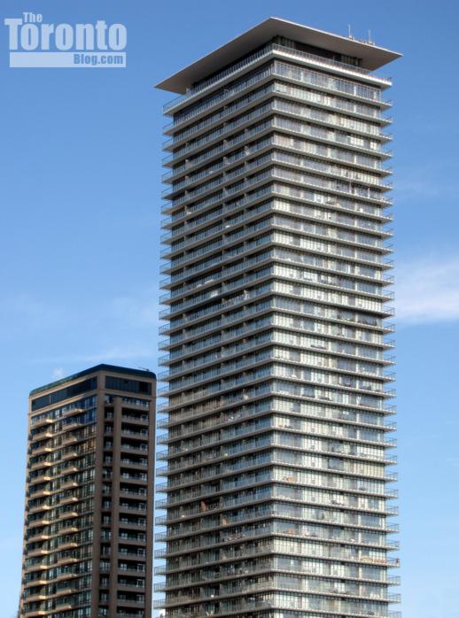

aA condos, which you can only give a few examples of, look like trash after a few months? Perhaps it is the idea of balconies, not the firm. And most of these projects are approved more than 5 years ago.

Having said that I am not a fan of this particular project, for a whole host of reasons.

AoD
 
I can't say I didn't expect this supremacist attitude. It seems the type of people who defend aA are similar to modern art affectionados who will swear that the toilet is a great addition to the exhibit, until they realize they're standing in the washroom. Congratulations for being so enlightened and seeing the sophistication. Personally, I do think that aA has done a lot of good for the city, but that their main trick has been overused and is getting stale.


The wraparound balconies should be pretty obvious to anyone who actually viewed the photos I posted. They're just not cool anymore, and whether or not they take it into account, the fact of the matter is that people use balconies as storage rooms. aA condos look like trash a few months after the move in date as a result. Is that your definition of minimalism?

Oh, and incidentally, some of my favourite condos in the city (X Condominium, Theatre Park, Four Seasons) were also designed by aA, and guess what all of those DON'T have in common? The wraparound balconies need to stop; it's a shame that aA has become such a one trick pony (with a couple of exceptions) as of late.

"One-trick pony" is just so overtly absurd. There are literally fifteen individual refutations of that assertion above.
 
Untrue. Everyone is entitled to an opinion and it's great that they're all freely-expressed here but don't come with slack-jawed, neanderthalic, 'dis is boring / one trick pony' nonsense and expect that no one is going to disagree or take you on.

Exactly. I really dislike this building, and don't particularly care for a bunch of others aA has done. I also think they've done some of the best buildings in the city and have also designed some of the better-looking ones currently in the pipeline.

Shocking, I know, that I (and others) wouldn't love every single design from a particular firm. It's almost as if there's the possibility of moderation and nuance in this world.
 
Untrue. Everyone is entitled to an opinion and it's great that they're all freely-expressed here but don't come with slack-jawed, neanderthalic, 'dis is boring / one trick pony' nonsense and expect that no one is going to disagree or take you on.

I posted several projects off the top of my head that confirm my criticism of aA. If your disagreement is over my use of the term "one trick pony", then you should have no problem admitting that aA is at least guilty of abusing the wraparound balcony concept. However, I'm sure you won't, and you'll probably come up with some reply about proportions and that their designs represent absolute flawless perfection and that I'm just an uneducated commoner for disagreeing.
 
I posted several projects off the top of my head that confirm my criticism of aA. If your disagreement is over my use of the term "one trick pony", then you should have no problem admitting that aA is at least guilty of abusing the wraparound balcony concept. However, I'm sure you won't, and you'll probably come up with some reply about proportions and that their designs represent absolute flawless perfection and that I'm just an uneducated commoner for disagreeing.

No. You're missing the point widely. You posted 5 examples of the trend you've identified a distaste for (3 of which are essentially different phases of the same project), and then I posted 15 that do not at all conform to that trend. Yet you still assert that aA does the same thing over and over again.

One doesn't even have to comment on the trend itself to take exception to your blanket assertions and misguided disparagement of the work of other people.
 

Back
Top