News   Jun 28, 2024
 1.3K     1 
News   Jun 28, 2024
 1.2K     1 
News   Jun 28, 2024
 532     1 

Street Signs

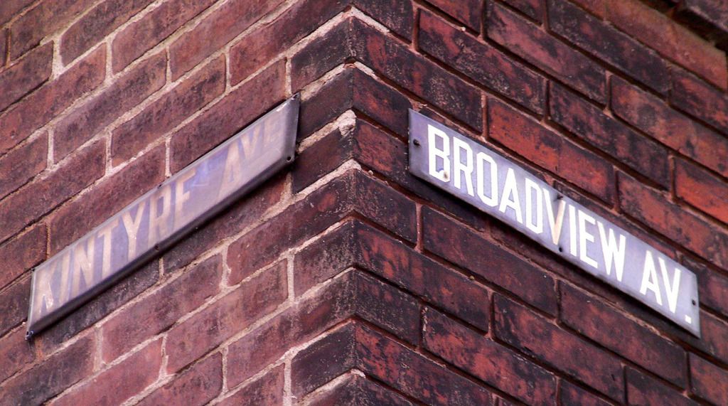
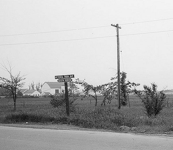
Linsmore Crescent is another street with odd signs. Prior to amalgamation, the Toronto part of the street was named "Linnsmore Crescent", while further north East York named the same street "Linsmore Crescent", with one "n". It will be interesting to see which spelling the city settles upon.

We have a winner! Actually two as the City lists BOTH in the official street-name index!

Linnsmore Cres 11375 29,30 EAST YORK,TORONTO TORONTO AND EAST YORK
Linsmore Cres 227 29 EAST YORK,TORONTO TORONTO AND EAST YORK
 
Can anyone advise what year the original City of Toronto gave up on pressing the street sign letters into the street name signs, and simply painted the letters onto the flat sign blanks? The Drayton & Danforth signs in the photo a couple of posts back is a good example of early pressed signs.
 
^Not sure myself, but I suspect it may have occured around the time when this sign went up (whenever that was):

flatpress_zpspxc0bbeo.jpg


Note the mixture of a pressed street name and painted street type/number.

By the centred alignment of the name it looks like a pressing error. Perhaps when they painted on the "AV." suffix someone said "Hey, this is cheaper. Why don't we just paint them all from now on?"

It also looks like the non-pressed paint lasts longer - assuming they went on at the same time.
 
Last edited:
^Not sure myself, but I suspect it may have occured around the time when this sign went up (whenever that was):

sany3092.jpg


Note the mixture of a pressed street name and painted street type/number.


By the centred alignment of the name it looks like a pressing error. Perhaps when they painted on the "AV." suffix someone said "Hey, this is cheaper. Why don't we just paint them all from now on?"

It also looks like the non-pressed paint lasts longer - assuming they went on at the same time.


You don't often see that vintage of sign without the street-type identifier at the end. Usually, it was only found when the name of the street was too long for the blank eg. Northumberland (St). This was obviously a mistake that was caught after the pressing, but before it went onto the pole. The "Av" is simply too straight for someone to have climbed up a ladder after the fact and stuck on a couple of letters. Perhaps there was a better awareness of the cost of each blank back then that they simply didn't just throw it away.

I certainly have never come across any spelling mistakes from that vintage. Not like recent signs, such as: "Norsman St" or "Rememberance Dr". Quality control seems to have slipped in recent years. (Or, perhaps just people's ability to spell.)
 
A rare glimpse inside one of the old pressed signs:

runnymede_zps2g4bl7ai.jpg


and... a missing crossroad, or an acorn sprouting into an oak?:

broadview%201_zpsodvrz4cl.jpg
 
Last edited:
Perhaps there was a better awareness of the cost of each blank back then that they simply didn't just throw it away.

I think that's likely right.

The amount of work in setting the type and stamping out a sign would have made the finished product comparatively expensive, and certainly worth keeping unless it was a horrible error. Add to that consideration the number of re-used signs exhibited in this thread (And on the street), and it seems to me that sign departments were a little more "cost conscious". They may well be so now, for that matter.
 
Speaking of the old (and newer) Toronto signs, here's a little post on our various variations...


The old signs are increasingly rare. Finding an intact intersection - even rarer.
But what are the odds of finding an intersection with differing designs? (note the "Ave" styles):

aveo.jpg

I don't know about rare, I've seen many of them in old Toronto, South of the Danforth. Does anyone make replicas of these signs?
 
^ Good pics!

I don't know about rare, I've seen many of them in old Toronto, South of the Danforth.

Well, "rare" is a relative term I suppose. I didn't mean to say that they're difficult to find. I'm sure everyone here has seen them before. I just meant that there certainly aren't as many as there used to be. And even those that are still with us aren't always treated as such:

cover1_zpsgda536kg.jpg


cover2_zpsrepukjmp.jpg


Nevertheless, my initial estimation of the rareness of the differing suffix styles on intersections may have been a bit off. Since posting that picture you quoted from back in 2010 I've spotted a few others, including this one:

Aves%202_zps6hlhvv99.jpg
 
Last edited:
Some may be interested to learn that affixed street signage isn't limited to the old-timey ones on buildings. If you check under a bridge you may find some like the Don Mills or Overlea ones seen below:

ey%20bridge1_zpsexjkeq7t.jpg


ey%20bridge2_zpsnpkljpyu.jpg


And, of course, even some waterways have their own "street signs":

creek%20ey_zpscqmsurog.jpg


river%20don_zpsv6otc59j.jpg
 
Last edited:
So I'm just guessing that these style of signs were put up in the 1900 - 1925 time frame?

Consulting the city archives, there seems to have been a diversity of signs around this time period, just as today.

Here's a white affixed sign from around the turn of the century at Toronto Street & Adelaide:

1900-torontoampadelaide_zpsvaphy5y7.jpg


A white Jarvis Street lamp post sign, sans-suffix - with a classic blue affixed sign on the house in the background - circa 1916:

1916-jarvis_zpsr21ysnrv.jpg


Some rather hard to make-out signage on College Street, a la 1919:

1919-college_zpsjo3fjtf3.jpg


More suffix-less signage, but now with a dark background at Church & Shuter in 1922:

1922-churchampshuter_zpsc2ipi2vj.jpg


A blurry, blizzardly shot of Danforth & Main in 1926:

1926-danforthampmain2_zpsw4poavbg.jpg


Further on, in 1944, some rather minimal yet redundant signage on Bay Street:

1944-bay_zps1ajlbcnt.jpg


Around the same time period at Victoria Park Ave:

1950-vicpark_zpsemd3zbyx.jpg


Late 60's or early 70's? A screen-grab I took from a documentary on Tiger Jeet Singh:

1960-queentigerjs_zpswquh78kh.jpg


And my all time favourite T.O. street sign pic:

albert_zpsy6kqqfrr.jpg
 
Last edited:
The rectangular black on white signs were installed at several intersections along Yonge and the Lakeshore in the '50's or '60's. Possibly coinciding with the road reconstruction after the subway and the Gardiner were built. It looks like they were replaced with the back-lit centennial signs in the late '60's, but several examples still exist on Lakeshore Bl E., in the section under the Gardiner. The stand-alone white on black signs at Danforth and Main may have been a hold-over from the East Toronto days.

I am awe-struck by the back-lit Jarvis sign that seems to take its illumination from the streetlight globe. It looks relatively expensive and fragile. I have never seen an example of that before.

It looks like Toronto may have gone through a period of experimentation in the teens in an effort to improve street signage, ending up with the ubiquitous black on white signs that we all grew up with. It would appear that they replaced them all in one stretch of time (while electing not to go onto private property to remove the old white on blue ones affixed to buildings). Council's present decision not to replace the present old pre-amalgamation signs unless they need to means that we will be stuck with a veritable dog's-breakfast of signs in this city for decades and decades to come. (Which may not be a bad thing, as I am not in the least enamored with the design they chose.)
 
The rectangular black on white signs were installed at several intersections along Yonge and the Lakeshore in the '50's or '60's ... but several examples still exist on Lakeshore Bl E., in the section under the Gardiner.

Really!?! I've never seen one of these. I'll have to check this out...
 

Back
Top