News   Nov 25, 2024
 198     0 
News   Nov 22, 2024
 844     1 
News   Nov 22, 2024
 1.5K     6 

Miscellany Toronto Photographs: Then and Now

Always liked this pic of the Royal Visit in 1959 showing the SE corner (which was replaced by the Simpson Tower):
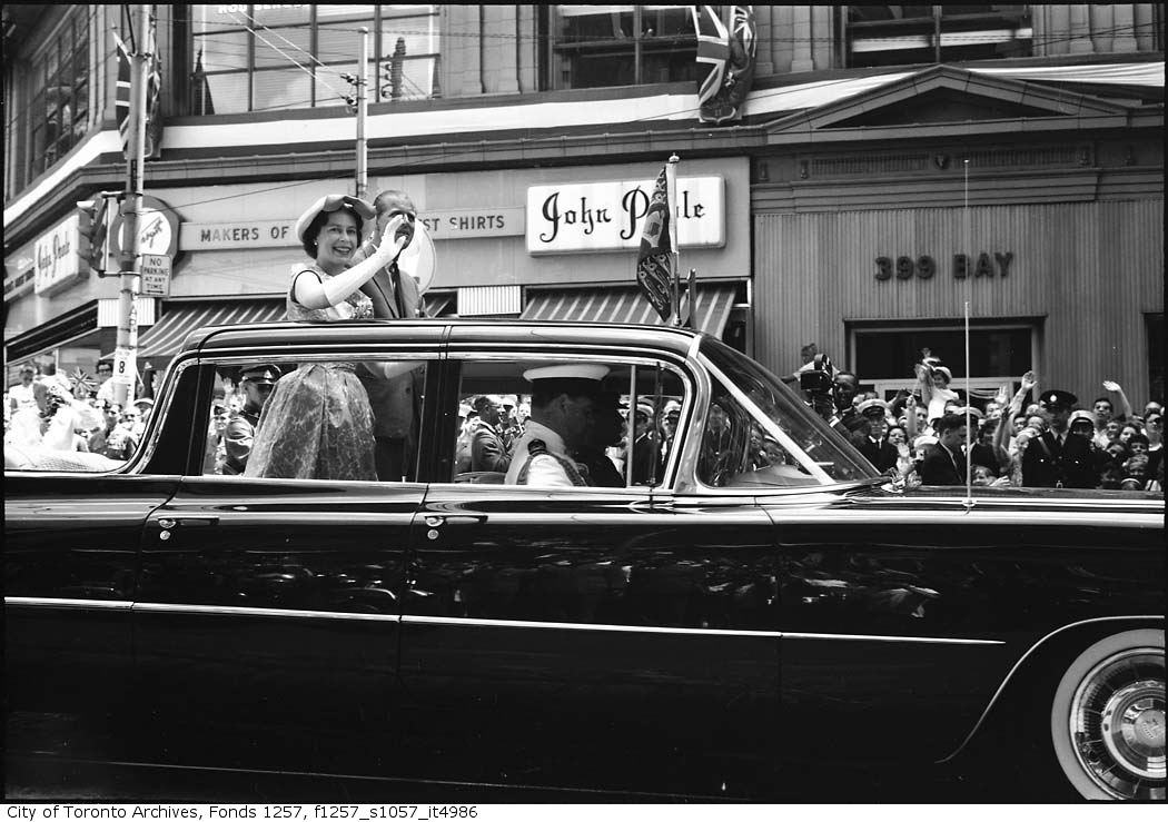
f1257_s1057_it4986.jpg
 
I didn't know the Rexall brand was over 50 years old.
It definitely is; but 50 years ago it operated on more of an IDA-style "franchise" level (until recently, the drug store on the E side of Roncy N of Queen bore a 50-years-old-or-so Rexall sign). Then it basically became a zombie brand until being domestically rebooted in the 90s and ultimately taking over the Tamblyn/Boots/PharmaPlus lineage.


"Rexall gained national exposure through its sponsorship of two famous classic American radio programs of the 1940s and 1950s: Amos and Andy and The Phil Harris-Alice Faye Show. Both shows were often opened by an advertisement from an actor (Griff Barnett) portraying "your Rexall family druggist", and included the catch phrase "Good health to all from Rexall." They also sponsored the Jimmy Durante Show and references are made by the character Mr. Peavey in some of The Great Gildersleeve radio shows. Rexall also sponsored Richard Diamond, Private Detective starring Dick Powell from April 1950 until Camel replaced Rexall as the sponsor after the December 6, 1950, broadcast."
 
Here's one to mark 10 years of Vince Ave, one of the city's newest and worst residential streets. The street and the bulk of the houses on it are relics of the Urbancorp collapse.

Streetview 2009:
vince-02b.jpg


It is a barren expanse of driveways and ground floor garages. The corner buildings were finished to a slightly higher standard by another company after Urbancorp went bust,

2024:
vince-02.jpg


An article about a public meeting before this was built is as depressing as the street. Neighbours opposed the project based on loss of greenspace, construction disruption and .... parking.

The city defended the project like this: "Major pointed out that the proposed plan met all the criteria for neighbourhoods under the new Official Plan in terms of density, height, parking and setbacks. The architect, Presch Jane, pointed out that “this is as low density [development] as you will see in the city.”"

Streetview 2009:
vince-01b.jpg


With a blank slate where they could have built anything, they built THAT.

2024:
vince-01a.jpg
 
TBH and to a casual observer, it doesn't come across as *that* horrid, Urbancorp collapse or no--I've seen many a school-site or brownfields-infill street schlockier than this. (Unless the self-conscious neo-modern avoidance of spec-build schlock is part of the problem.)
 
It's a context situation; this one is more functionally bad than aesthetically bad (for me, I can think of beautiful buildings that are functionally bad and aesthetically horrible buildings that work well as parts of the city).

In this case, the new street was dropped in the middle of a compact neighbourhood of small houses on small lots and a few lowrise apartment buildings. It's a top-notch walking area with gently meandering streets, lots of green space and hidden spaces and interesting dead ends. But it's not served at all by transit, so a couple of newer private cul-de-sacs were built to serve cars with garages lining the main floors. This development took that trend to its most extreme and Vince Ave's street level is basically a parking lot. Aesthetically, the houses are just grey and bland (the interiors of the original phase had an odd, institutional finish). It's the jarring contrast with the rest of the area and the total failure of the process that earns this street my neverending lack of love.
 

Back
Top