News   Nov 26, 2024
 888     1 
News   Nov 26, 2024
 693     0 
News   Nov 26, 2024
 1.4K     0 

GO Transit: Construction Projects (Metrolinx, various)

The technology exists, but using it just to jog around an obstruction is very expensive. We can use that money to build transit or to bury wires. I know my preference.

- Paul

I found a couple of online documents that summarize the technical considerations. Another document using 2011 numbers determined that 'undergrounding' is about 5x more expensive, not counting the cost of the specialized termination points and not counting increased maintenance costs.
 
Screenshot_2024-02-22_221218.jpg

Screenshot_2024-02-22_221304.jpg
 
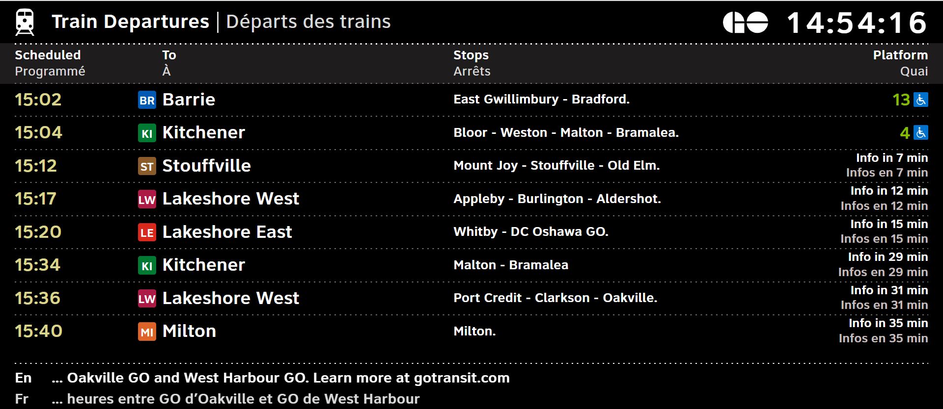
I'm pretty sure I saw the layout at Weston GO about 2 weeks ago for the Union Pearson screens so it's possible they were testing things out; I wasnt really impressed with how it looked but overall it looked clean and easy to pull information from which I suppose is the ultimate goal of these screens so it works well.

Let's see if Metrolinx can get it done right for the GO information screens without making things more complicated than they should be.
 
The description of the GO screens in that article sounds a lot like the design that Metrolinx surveyed people on 2-3 years ago:View attachment 542750
This design is so far superior to what we have now. Only design change I’d make is to have the entire horizontal bar for each train the colour of the line.
 
The new one is pretty unimpressive. Love how half of the screen is for advertising. 🤨

The one from 2-3 years ago looks a lot better. So of course they didn't use it.
 
Platform number should be larger, needs to be at least as large as the time digits. Coach length is useful but should be smaller especially in relation to the platform number. Maybe platform number can be colour coded.

Bigger issue at outlying stations is how many of the screens are not legible in bright light. Maybe they need shrouding - or just replacing.

- Paul
 
The new one is pretty unimpressive. Love how half of the screen is for advertising. 🤨

The one from 2-3 years ago looks a lot better. So of course they didn't use it.
It’s not much different from the old UP Express screen
IMG_4136.jpeg

UP and GO are getting different screens, they didn’t show what the GO one will look like
 
It’s not much different from the old UP Express screenView attachment 542826
UP and GO are getting different screens, they didn’t show what the GO one will look like
honestly is ML so broke that they need to sacrifice 2/3s their screen to ads? next train displays should only be for ETAs only!
 
Are they still planning to eventually use the A B C D etc. naming scheme for the GO lines? Or are they sticking to LW LE KI etc?
 

Back
Top