News   Jun 21, 2024
 3.7K     6 
News   Jun 21, 2024
 1.4K     2 
News   Jun 21, 2024
 1.6K     1 

Fantasy Renderings

^Ambitious! Any individual buildings rendered yet? Would love to see 'em :)

More "RIP...WQW" --an interior courtyard connects the Queen Street condo building to the alley side luxury townhouses. Pitched roofs are cool I think.:D

20130103210805.jpg
 
Looks nice DKsan! My only question is how the insane cost of dredging that harbour would be funded. I like the idea of extending the let into the development to allow for a stop right on the water.
 
Hey at least the thread is alive with action finally! Unlike my NimbyTect "RIP...WQW" proposal...:p

20130104041727.jpg


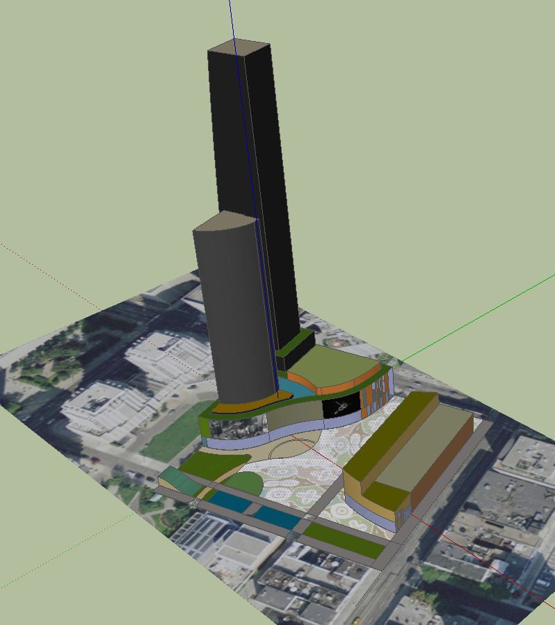
I am still working on the condo terraces--the TH is almost done minus some details. I'm starting to get into more details--making my massing studies more realistic. Youtube tutorials are amazing what can I say! No interiors on this project though.:(

I like the idea of a shared yet exclusive private interior courtyard. Like they do in some Montreal developments, or 75 Portland in Freedville.

20130104035501.jpg


The profile from the East:

20130104214618.jpg


More deets added and more arty screenshots (get the ref MOCCA condos?)

The Queen Street West facade--CRU (ideally would be MOCCA moving back into the space), 3s of condo lofts, a step back with a terrace, then angled facade stepping up to Mech PH also containing amenity space (as if that's needed at this location but whatever, it's a high end condo befitting the high end art patrons that frequent the 'hood.:D) Wood 'n glass at the retail level; middle is brick 'n glass with wood window frames; at the top again wood'n glass--gotta tie the top to the bottom to be a successful timeless design.
20130105041710.jpg


Gorgeous luxury townhouses on the alley side with an interior courtyard facing the condo/loft building. Crisp clean lines and pitched roof + PH level terraces with "lightwells" letting in light down the staircase (or private elevator!) shaft. Wood, brick and compared to most of today's Toronto developments, reduced glass area (means more energy efficient, also better looking imo!) Also as an art patron, you'll know too much light ruins your $100,000 Kim Dorland painting.... Each townhouse gets private parking garage entrance off the alley; condo parking entrance also off the rear alley. Parking stackers perhaps?
20130105041420.jpg


Homes around the corner are heading to $1+ million; Lighthaus also $$$$$ in a crappier locale beside the train tracks. So would you pay the bucks for either 2 or 4.5 floors of living space?
20130105041110.jpg


It's my most-detailed condo massing/rendering yet--and I'm not finished....:)
 
Last edited:
Colour! OMG colour in a Toronto art gallery-inspired condo? No, this is not going to work! Right, so we'll "grow up" and switch the sash to dark green or...the horror!...gun metal grey. (We're not as cool as Montreal ... yet.)

You are in the alley 'round back. Look up--which TH is your future home? (I have reserved the corner unit with amazing views of the Toronto skyline.:))

20130106010353.jpg


Or maybe you're interested in the condo/loft PH suite with NE exposure and an expansive northern terrace? You can look down on your lowly neighbours (nimbies?!) Remember those snotty Candy Factory lofters can always get out the binoculars:
20130106011700.jpg


Maybe you prefer to look towards the Wild West (Parkdale?)
20130106010933.jpg


The building's architecture is inspired by its immediate neighbours--that wood for example? Clint Roenisch's gallery right next door has similar gorgeous wood details at street level. The historic commercial buildings to the left and right of this "centrepiece" have inspired the window details, the proportions, and more to come.
20130106011902.jpg


What's next? More trimmings and perhaps a model suite!

(Nimbies, let this NimbyTect know what y'all think. Thanks.)
 
Last edited:
In the Berczy thread I've repeatedly said over the years that I loathe it, or at any rate, it could be improved upon. What have I meant? Maybe something like NimbyTect's latest massing study, "Kirk&" (Front) which indeed is designed around the existing conditions at Church and Front--taking cues from the historic row of commercial buildings on the south side of Front Street East, the red brick and setbacks of the Flatiron building, and the surrounding newer condo buildings. The facade varies slightly, suggesting 4 individual buildings along both Front & Church--note the effect via the window size. The dormers on the neighbours are mimicked via a stylized "false front" punching from the 3rd floor setback.

In google earth, some screen shots:

nimbytect8jan2013kirkan.png


In sketchup:

nimbytect8jan2013kirkan.png


nimbytect8jan2013kirkan.png


I am still working on the "tower"--haven't decided if the brick cladding should continue or if Toronto-the-Polite-glazing with stepped balconies rising towards a "steeple"--a modern version of the Flatiron's corner tower--should be it. The "tower" angles back as it rises.

nimbytect8jan2013kirkan.png


Would my proposal work in any other location around the downtown core? Speak up--'tis your Nimby right!;)

One more screenshot, this time showing off my new twitter handle :)
nimbytect8jan2013kirkan.png
 
Last edited:
Not crazy about the line of windows on the upper section. Looks chintzy, imo. And the almost non-existent setback makes it feel cramped, like you're forcing a facade on the exterior, while the inside wants to be a solid box.
 
^Agreed. Which is why this NimbyTect listens to the Nimbies and comes up with a creative design solution. In this version, I'm going more traditional here, continuing the red brick facade and setbacks.

nimbytect9jan2013kirkan.png


nimbytect9jan2013kirkan.png


In faster time than it takes an overpriced consultant to brush his/her teeth (j/k) this NimbyTect has revised the renderporn massing.

Most importantly, what do the nimbies think now?

Edit: Btw, I'd forgotten how nice a screenshot looks in sketchup vs taking a shot via my phone camera. So here's another look at NimbyTect's proposal for the MOCCA Condos site on Queen Street West. Because this proposal suggests a more intimate, boutique and upscale development comparable to the Candy Factory Lofts meets Edition/Richmond, total unit count would be around 80-90. Sadly using more components and greenery seen in this shot here is killing the memory on my laptop, so until I update the hardware it's back to the basics. :(

nimbytect9jan2013ripwqw.png


As you can see, the balcony railing doubles as a planter. Wood meets brick meets greens for your salad?

nimbytect9jan2013ripwqw.png
 
Last edited:
Let's step back a bit. NimbyTect's Kirk& proposal for 51 Front Street East --south east corner-- at Church Street Toronto. The best way to see a massing study (if you don't have access to a 3D printer) is in white. The basics. This version Kirky&i (meaning first edition) was my original vision before I got distracted by the "bling." While red brick would indeed look fantastic here I originally envisioned a white glossy concrete finish with the angled more minimally-designed "tower" (it's only 6s lol) rising above the neo-historic base. The idea would be a delicate embossed screen over a curtain wall glazing system. The "blind" dormers echoing the dormers on the flatiron and neighbouring buildings could either be monolithic as illustrated, punched out with negative space surrounding a frame, or again, intricate embossed metallic screen thus functioning as a sun shade to 4th floor residents. Again, all inspired by the details on its Victorian neighbours.

The first 7 storeys could also be clad in brick, stone, wood, concrete, zinc or ... use your imagination! A literal or pastiche-style copy does not interest me. Inspired by and respectful of its neighbours, not sleeping with them is the NimbyTect ethos!

nimbytect9jan2013kirkan.png


The setbacks mimic the massing of its surroundings. The Flatiron building is indeed the star here but why settle for the D List when the A List is attainable?! We should not be intimidated by history but inspired by it!

nimbytect9jan2013kirkan.png


So two directions: Historic style to the rooftop or modern tower on top? You tell me which one is best. (Or the third way...combine the two :))

Edit: One more (for the road;)
nimbytect10jan2013kirka.png


Do let me know if I'm on the right track or getting derailed. It takes time to dream up these studies so your thoughts are welcome!
 
Last edited:
Same block, but this time at the NW corner of Wolseley & Bathurst (opposite Origami Lofts.) WoRoBa (Wolseley/Robinson/Bathurst block.

nimbytect31jan2013worob.png


Again, just a quick sketch. Concrete, wood (Parklex panels perhaps?) and glass. Inspired by the Bay'n Gables of the 'hood.

nimbytect31jan2013worob.png
 
Last edited:
One month ago NimbyTect began the New Year on Yonge Street--Yongerr at Yonge & Gerrard. So it's fitting that February 2013 kicks off NimbyTect-style at Yonge & Gloucester--YongLOU. It's now under sketchup construction:

nimbytect1feb2013yonglo.png


Can you tell how much I love playing with dormers? The Victorian streetscape here is covered in 'em...why not continue a good thing?

More deets, more bling, more **** coming soon (I hope.)
 
Last edited:
There's no reason why you can't have density on the site and space.
Demolish the non-historical buildings at the south end and just in from the north end of the Yonge Street frontage. Pick up the historical corner building and move it southward against the others. The result? Two widened entrances off Yonge leading to the plaza.
Close Bredalbane and make it partly pedestrian. Group the towers up towards Wellesley and the existing Opera Place buildings. Refurbish the Yonge Street buildings and put a new low-rise on the back to access the plaza. Put a water feature in front of the Y's swimming entrance. Throw in a concert venue. Could work.


plaza1_zps31602751.jpg


plaza2_zps2fb94416.jpg


plaza3_zps31050f50.jpg


plaza4_zps4fd2a949.jpg


plaza5_zps0823dae2.jpg


plaza6_zps1b220c04.jpg
 
Last edited:

Back
Top