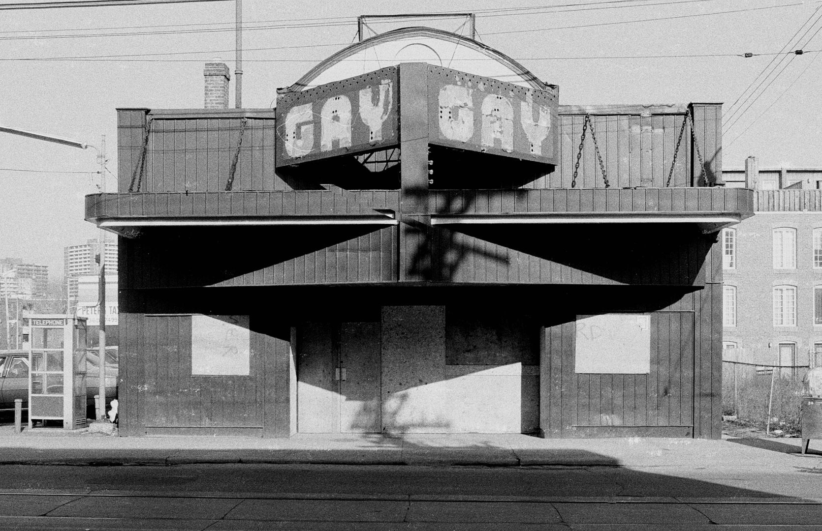
Those letterforms wouldn’t have had a name per se, as ‘fonts’ didn’t really exist in the way that we understand them today; they were rarely anyone’s intellectual property, and they weren’t licensed or distributed in any way because there was no way of doing so, or any need to.
Those letters would have been initially designed by, and drawn by hand and then scaled up, to be formed out of metal or possibly even cut out of wood. I suppose there is a possibility they could have been made out of an early plastic like Bakelite, but I’m not sure what kind of moulding technologies might have existed back then. the Yonge Street sign looks to be made out of plexiglass which is interesting, and poses a question as to whether this sign might be from a later date than the Albert Street one, because as far as i know plexiglass wasn't all that commercially available until after 1945.
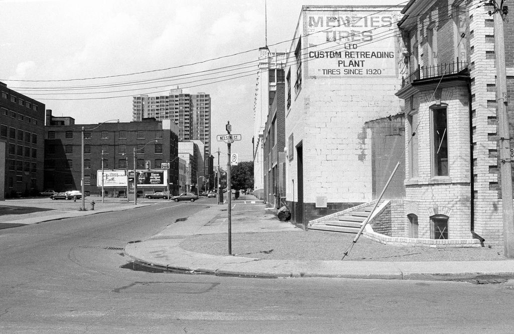
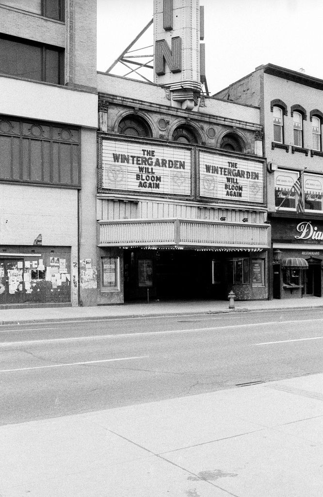
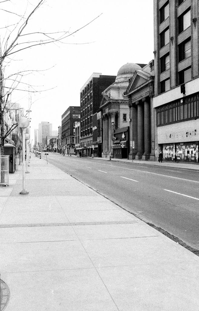
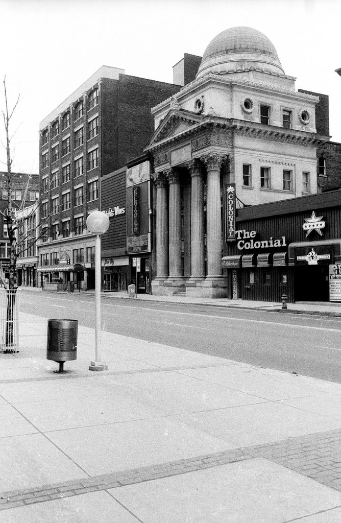
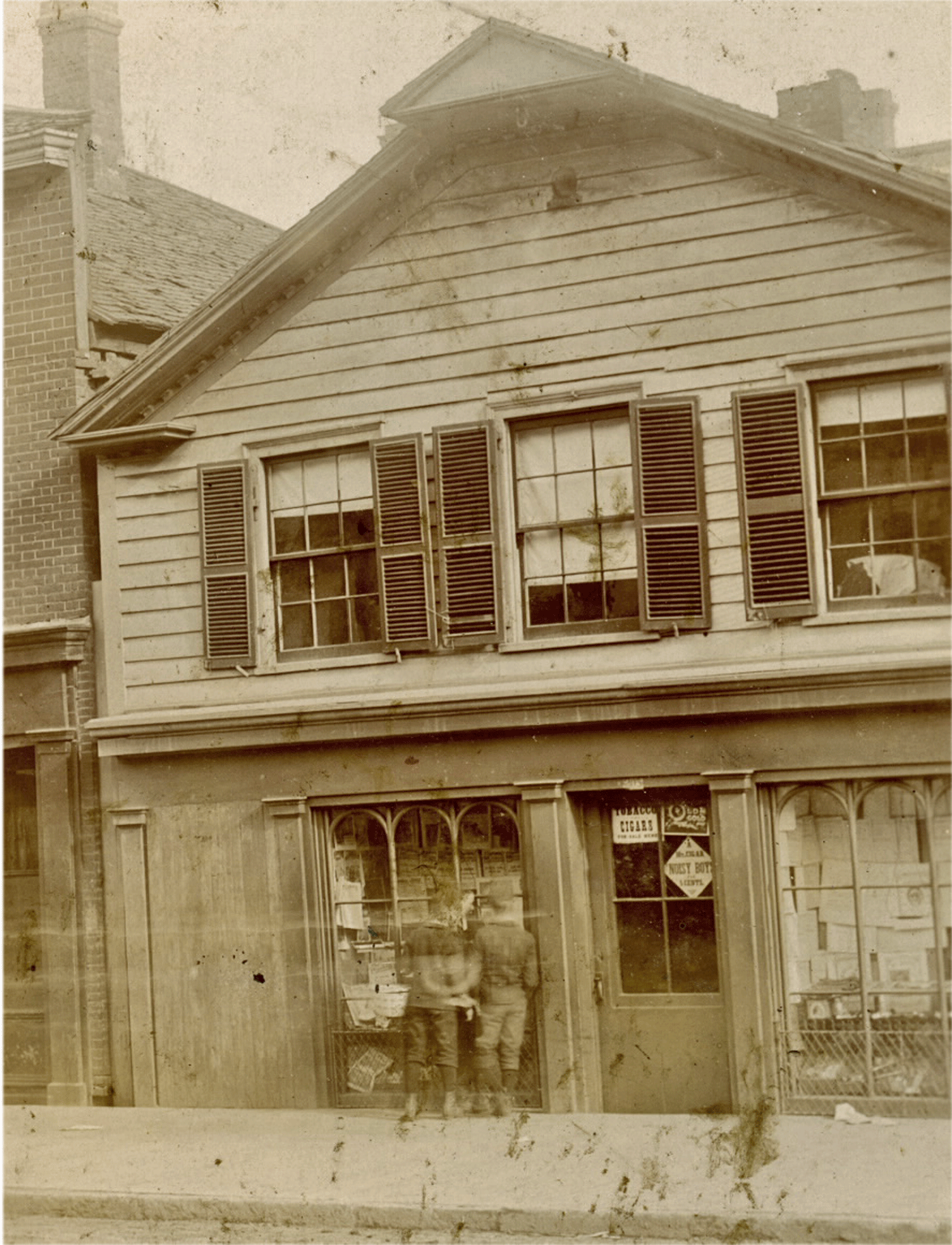
These particular letterforms are a beautiful example of the 'moderne' style that dominated in the later 1920’s-30’s; they pre-date the classic ‘high modern’ international-style forms of sans serif like Helvetica that began their ascendancy after WW2.
Anyway, it’s likely that these beautiful letters were a one-off, created out of whole cloth in Toronto by some anonymous talented long dead soul.