


MetroMan
Senior Member
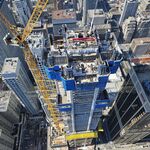
They don't seem to be in any rush to finish the exterior work. As I suspected, the vast majority of the budget was allocated to creating a first class tv station inside with a small budget for the exterior.
Rogers is signing off additions to the exterior one by one and is taking their time in between those.
Rogers is signing off additions to the exterior one by one and is taking their time in between those.


