News   Jun 25, 2024
 1.3K     1 
News   Jun 25, 2024
 999     0 
News   Jun 25, 2024
 1.7K     3 

City-TV & OMNI-TV's H.Q. (formerly Torch, Quadrangle)

"...sprucing up the exterior"?
"...good for the time when it was built"?
"...refresh the building's appearance"?

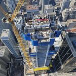
This was one of the worst buildings in the city, a Pen-Equity It didn't just need a refresh...it needed to be drastically altered.

It wasn't good for the time it was built. The building wasn't finished either - there was never supposed to be exposed concrete, which makes the idea that it was good for the time pretty laughable.

Remember when it was supposed to look like this?

http://www.youtube.com/watch?v=qPgkUmHzl98&feature=player_profilepage#

Too bad Rogers didn't bring it to something near that level.

I believe that they were referring to the SkyDome/Rogers Centre rather then the Torch.
 
Here is the final rendering!

305.jpg


http://dcnonl.com/article/id35892
 

Attachments

  • citytvrender2009.jpg
    citytvrender2009.jpg
    71.9 KB · Views: 223
Terrific, more gray aluminum panels around the base of the torch.
It looks like they've purposely softened that mess of HVAC on the roof for render purposes or perhaps the plan is to spray paint it with (hurray), more gray.
Thumbs down. Way down.
 
Last edited:
I find it very odd that the 'torch' still proudly announces that it is the "Olympic Spirit"; it looks to me that it would take someone with a screwdriver about 5 minutes to pry these letters off the concrete and it is strange they have not done this as their stunning plan to cover the (grey) concrete with (grey) siding seems to be moving ahead rather slowly.
 
Why did they even bother with changing the glass or anything else on this building if the finished product was going to look so much like the original? Over-all, this building looks basically the same, it was a waste of money.
 
Don't get me wrong this still pretty much looks like shite but at least shite with slightly nicer finishings. I'm disappointed in the grey, and in all that precast, and in the oversight of the tower. The rest is all pretty forgetable.
 
I swallowed the barf the original Torch building induced at the thought Rogers might redevelop it into something grand - and now, 2X the barf.

Two thumbs, down, way down.
 
I tend to stand on the side of reason: I realize that they were building a TV station from scratch out of a building that was very limited in many ways because it was originally designed specifically for a thematic museum. That was the goal: Mission accomplished. 10/10. Their new station is gorgeous, technically the best and most advanced money could buy and it functions perfectly on and off screen.

I'm willing to bet that 99.98% of the budget available went into creating the TV station first. Nothing -- not even a chair or desk -- was moved from 299 Queen West. EVERYTHING is brand new.

As for the exterior, the changes made are a reflection of those made inside, not many are deliberate exterior changes exclusively.

The need to redo the street level windows came from the requirement of having the street visible from within the studio on programs like BT without the unsightly mullions in the way.

The street presence has improved dramatically as a result. It's inviting and transparent. I love the stamped metal finishings along the bottom and the black windows.

The change of windows on the "bridge" came again from giving the camera a good view of the square from the newsroom without glare or overstated window borders.

From that we have a nicely framed newsroom window and one less mega-sized ad.

Exclusively exterior designs?
- The red ceiling under the streetcar turn is a nice touch as is the red trim around the main entrance.
- The ticker will finally come to life as it was never finished with the Olympic Spirit Centre. It'll give a sense of motion to the building and draw people's eyes to it from across the square.
- The tower's base will be rounded out. PenEquity deviated from the original plan and built in flat surfaces hoping the city would approve more signage. It didn't. We were stuck with corrugated walls that will now be rounded out.
- The white trim around the big window frames it nicely breaking up the flatness of Western face of the building while giving it some horizontal presence.

Planned exterior additions? Rogers execs -- even Ted Rogers himself -- discussed their desire to make this its showcase, its face to the city. Some ideas that didn't seem to make it (I'm guessing for budgetary reasons) but might come in another wave of renovations:
- The tower was to be replaced by a prism of displays. It's probably the most expensive of the original plans that didn't make it to the final design. It would have been the iconic piece on the building, drawing away from all the greyness of the cladding. Didn't happen. I don't see it happening any time soon.
- More likely is keeping the original "Torch" but illuminating it with coloured LEDs. This was talked about as late in construction as weeks before Citytv moved. I think it will happen.
- The concrete vertical section of the tower's base is/was to be covered in red trim with the Rogers logo lit up at the centre.
- The blank wall inside the streetcar turn is/was to be clad with displays showing Rogers' channels and news feeds. The intention was to get the problematic blank wall out of the BT background and turn the problem into an asset that would add dynamics to the background as well as draw people in from the square.

As we saw with 299 Queen West, Citytv is always changing to keep up with the city. Now in Rogers' hands, I don't think it will deviate much from that. They're a capable company who's managed to rise from a cable tv provider to a content provider, station owner and dominate the internet and mobile phone fields.

The money is there. I think it'll be spent.
 
Good points highlighting some of the improvements Metroman, and obviously budget restraints and priorities are part of any project. This is Roger's though and people had greater expectations. What's even more frustrating is that only a few more relatively simple alterations would have netted a much greater impact in transforming Olympic Spirit to the iconic face of Rogers...

Leaving the grey cladding was unfortunate. It renders the changes too subtle such that the memory of the sad olympic centre still lingers. In terms of context the colour blends in too much with the greyness of the square, and links it a little too closely to the tin pile across the square. As for the building itself the cladding has an unfortunate corrugated shack look to it that feels cheap and temporary. A bad choice all around and I can't help but wonder if it would have been so expensive to have gone with something different? The surfaces to clad that face into the square and Victoria Street are really not that big given the fairly small footprint of the building and given the number of windows and signage.

Also, leaving the tower as is was also a mistake. I do hope they proceed with covering some of the blank concrete walls but the crown of the tower simply looks like the cheap afterthought that it is. Again, how much would a new curved crown with screens have really cost given the impact and recognition it would have returned to Rogers??

I understand the importance and priority of getting it right on the inside first where the building functions but this building also sits in Dundas Square in the heart of the city. The exterior should be a priority too, or else why bother being in such a prominent location?
 

Back
Top