


PL1
Active Member
Speaking of T logos, I notice that Vancouver uses a T on Skytrain and bus stops. This was on Sea Island near YVR. Of course, TransLink does start with a T...


|
|
|
Underground IS one of thier their rapid transit mode. They also have all other roundels such as Overground's.Why? London has the roundel with the text underground over it, it doesn't have a rapid transit logo. Having the TTC logo, just bigger and more prominent, would be completely sufficient.
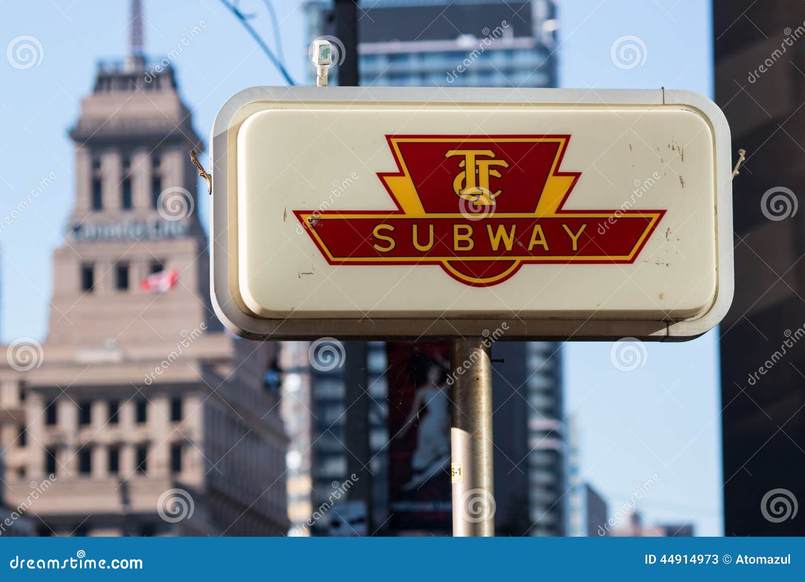
Metrolinx's T logo is a solution in search of a problem.
- I said nothing about the T logo.These points don't excuse Metrolinx or the TTC.
- The Metrolinx "T" logo is extremely generic.
- This logo will not be present at TTC owned stations which still use the TTC logo.
- There will still be a complete diffrent look between TTC and Metrolinx owned stations.
- Many stations, as seen above, have basically no modern signage.
- This is personal opinion, but I think adding the word "Station" to the end of the names would help.
- The line numbers are more relevant to Toronto because we have simple numbered lines and colours, and not very many interchange stations. Even still, some London Underground interchange stations try and advertise diffrent services in a messy way. If we have simple names, why not advertise this?
View attachment 474243
I don't even get caught up with the lack of number lines on the signs anymore. I would be willing to get rid of them if we made our signs a bolder colour then black.
Why don't we go back to red, and add station to the end. The most important thing is making the entrance obvious, not hidden in the grey nothingness of downtown buildings.
I don't see that legacy streetcars should be branded the same as subways. I don't think that helps.With SEPTA, any rail line or route is now a "METRO". Toronto should do the same. Whether they be the legacy streetcars, legacy heavy rail subway, new light rail, or new whatever the Ontario Line trains will be, ALL branded as "METRO". Along with the priorities they should have over the single-occupant, or 5 people inside them, motor vehicles.

 www.nicholasphilipson.com
They also need departures for the buses. Milton only has trains during rush hour and outside of that, wait, no, Milton doesn’t have many buses from Union anymore, just after midnight. But if/when they return, knowing when those buses are would be good. Shouldn’t have to schlep all the way to the Union bus terminal to find out when your bus is.Nicholas Philipson - Union Station: Good Enough?
January 25, 2024 - Arguably the most transformational infrastructure project currently under construction in Canada, GO Expansion is set to take a commuter focused rail system common to North American cities and retrofit it to become more akin to regional rail networks in Europe. Just a couple days
View attachment 535254