


wilson_wu
Active Member
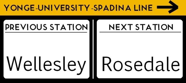
I thought I'd create a thread where you guys can post ideas / drawings to improves TTC signage.
What do you guys think of this? Concepts copied from Hong Kong") I found their wayfinding system absolutely easy to use. No useless logos of staircases when it was obvious there were stairs.
I found their wayfinding system absolutely easy to use. No useless logos of staircases when it was obvious there were stairs.
Features
-Get rid of Northbound/Southbound/Inbound/Eastbound directions. These are absolutely useless to tourists and those unfamiliar with the system. In many cities such as Montreal, Hong Kong directional signage refer to the last station of the line.
-Include wheelchair directions in signage information. Also label elevators with numbers so they are easier to find. Sometimes there are multiple elevators on the same level with different destinations and finding the right one can be a hassle.
-Declutter signage. By introducing these information boards to the system, the TTC can declutter some of it's directional signage. If someone is lost, they can consult the board and then follow the symbols.


EDIT: Nevermind. Now that I relook at my idea. It looks confusing -__-
What do you guys think of this? Concepts copied from Hong Kong
I found their wayfinding system absolutely easy to use. No useless logos of staircases when it was obvious there were stairs.Features
-Get rid of Northbound/Southbound/Inbound/Eastbound directions. These are absolutely useless to tourists and those unfamiliar with the system. In many cities such as Montreal, Hong Kong directional signage refer to the last station of the line.
-Include wheelchair directions in signage information. Also label elevators with numbers so they are easier to find. Sometimes there are multiple elevators on the same level with different destinations and finding the right one can be a hassle.
-Declutter signage. By introducing these information boards to the system, the TTC can declutter some of it's directional signage. If someone is lost, they can consult the board and then follow the symbols.
EDIT: Nevermind. Now that I relook at my idea. It looks confusing -__-
Last edited: