ganjavih
Senior Member
He's just saying it's ugly, and you want to fight with him as if he's spearheading its demolition.
On UT, you're asking for trouble if you call modernism ugly... even if they are.
He's just saying it's ugly, and you want to fight with him as if he's spearheading its demolition.
On UT, you're asking for trouble if you call modernism ugly... even if they are.
And pippypoo wraiths have existed since the world was in short pants.

He's just saying it's ugly, and you want to fight with him as if he's spearheading its demolition.
He's just saying it's ugly, and you want to fight with him as if he's spearheading its demolition.
I have a hard time believing that any of these are 'the ugliest building in the world.' The ugliest would probably be some unremarkable dilapidated box in Russia or something. Like this, or the thousands like it around the world:


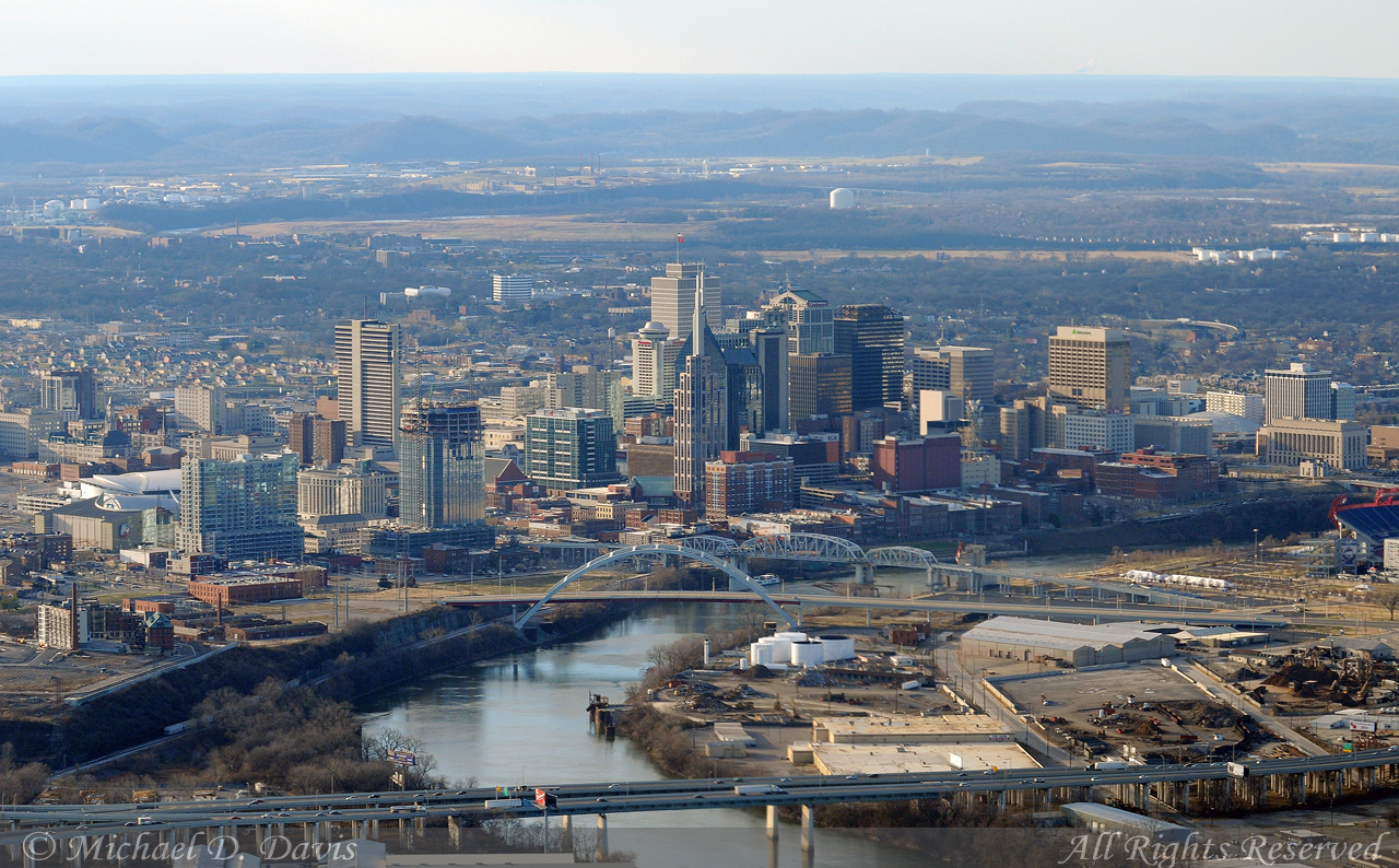
In relation to John Portman's blue space ship in Atlanta, the place I did grow up in has one of those nice space ship hotels with an atrium in the interior.
Here is the Nashville downtown Sheraton, 27 floors, 300ft. Smaller, and about 10 years younger than the Portman space ship in Atlanta. Since it lacks the cheap blue color and has a more appropriate texture, its much improved over Portman's bigger, yet more tragic design.
You can see it in the upper left middle, the only space ship available.

That AT&T building is quite ghastly. It's like they took the Nestle Building at Yonge & Sheppard and merged it with a couple of those Tridel Triomphe Buildings near Yonge & Finch, put a tunnel portal on top as a hat, then added a pair of 150 ft mini concrete Sears Towers to the top making it look like the worlds tallest field goal posts.
Or you can just face the fact that my opinion is that the blue dome is hideous, and this Sheraton (which is actually only 5 years its junior in design) has a much more refined, appropriate rotating space-ship restaurant.
