yrt+viva=1system
Senior Member
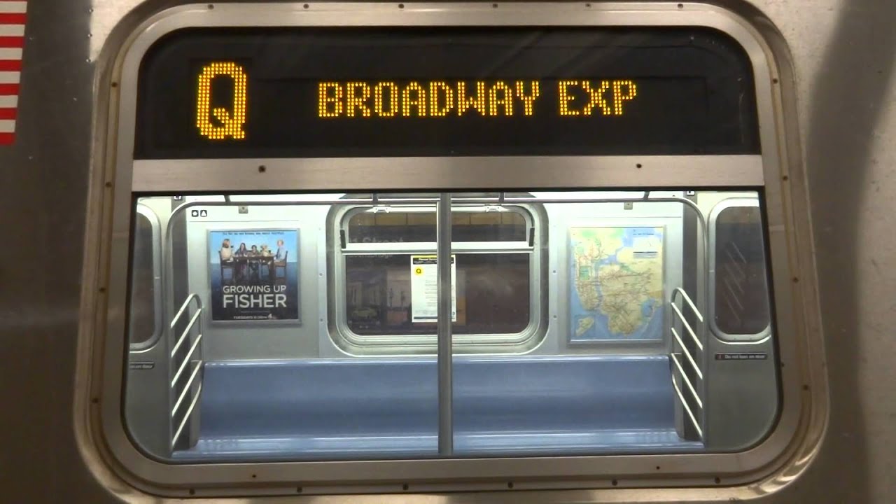
For the love of god why can they not just display "Sheppard West" on the destination sign?? Instead of making it so much more complicated to read and having it scroll? Since the TTC co-operates with MTA on somethings, couldn't they just take a page out of MTA's playbook when it comes to destination signage. Also make the text bold and larger. It should honestly take a split second to figure out where the train is destined.
No scroll, no complicated text; KISS 101:

No scroll, no complicated text; KISS 101:


