News   Jan 10, 2025
 1K     2 
News   Jan 10, 2025
 1.1K     0 
News   Jan 10, 2025
 572     0 

TTC: Other Items (catch all)

In hindsight, I wish work wouldve been done on the King/Queen/Roncesvalles intersection this summer. Because once it starts, the entire area is going to be a traffic disaster stretching for kilometres.

Also, almost a year and a half for this? C'mon now are we serious here.
 
In hindsight, I wish work wouldve been done on the King/Queen/Roncesvalles intersection this summer. Because once it starts, the entire area is going to be a traffic disaster stretching for kilometres.

Also, almost a year and a half for this? C'mon now are we serious here.

It's a joke really. Other cities build subway lines in that time. For a local example, if I recall correctly, the tracks at Lansdowne, College and Dundas were rebuilt a few years ago in 3 or 4 weeks. Not as complex at this one obviously, but still.
 
It's a joke really. Other cities build subway lines in that time. For a local example, if I recall correctly, the tracks at Lansdowne, College and Dundas were rebuilt a few years ago in 3 or 4 weeks. Not as complex at this one obviously, but still.
You forget that this area is not only for TTC, but for the city at all levels. Its Roncesvalles all over in all direction and look how long that took.

How many locations are going to be effected by this work???

If you look at Bathurst St and Bathurst Loop that TTC is rebuilding, look at how much work has been done since it started. Its one of the fastest work sites, if not the fastest when you compared it to past sites.
 
Screenshot_2020-07-05_092214.jpg
 

Not a fan.

This faux vitrolite treatment clashes with the rest of the station. Just as it does at it does w/stations on the University Line.

Mismatched styles and colours.

Oh and its just plain ugly.

The original vitrolite, apologies to those who like the vintage was just the public washroom, utilitarian choice of its era.

But at least, where its original, it matches the station's overall design and has some authentic history to it.

Not so here.

To spend money to make things look worse..............ugh.
 
^Eh i'm not a fan. I really liked the rustic, wall chipping look of Finch. The new wall just looks fake, and out of place.

View attachment 255668

Honestly, if they are going to put that metal cladding up they should at least match the colour of what was there before. The colour of the cladding is better suited for Osgoode where it matched the Vitrolite there.

They should have put grey on black up at Finch.
 
Some of our stations really need a reno. Are there any plans along these lines?

No.

There is money for partial finish replacement as seen here above at Finch; and some work paired with elevator and second exit projects or the like.

But there is no money for wholesale station renos in the current capital plan.

That's unfortunate as it leads both to deterioration and to incoherent partial fixes.

But the cost of of a proper station reno for a small station (say Museum) is ~ 10M just for finishes. If you do structural work, electrical modernization etc that could double it.

The cost for a large station (say Finch) would likely run in the range of 45M-85M for a gut-job.

That's staggering when you consider the number of stations in need of such work!

Its hard to believe when I was in my teens (late 80s/early 90s) that the TTC steadily renovated 2 stations at a time, all the time, with a general project span of about 2 years.

Some of those were done poorly ( not too many people like Dundas ); others were pretty good (I think Davisville was nice, and I'm one of those who like Rosedale too).

Though all were beset by budget issues in one form or another.

All took some shortcuts; notably many of the stations had their new tile placed directly over their old tile, without any bracket-system either.

The problem, you see, is that 10-15 years on the new walls (tiles) were starting to fall off the old ones, coming unglued (in large chunks).

Sigh, for bigger budgets and more attention to detail.
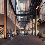
 
Christ what happened here. They really should have kept the Black, Grey, White colour scheme. This imo is Dundas levels of bad.

Ignoring whether or not this was a good idea, I assume this came about because those are the colours of an actual Finch.
But it would look much better broken up with some white panels.

124706471-480px.jpg
 
Ignoring whether or not this was a good idea, I assume this came about because those are the colours of an actual Finch.
But it would look much better broken up with some white panels.

124706471-480px.jpg

Actually... that's blue not black. This may have been what they had in storage given that Osgoode looks exactly the same.
 

Back
Top