


TheTigerMaster
Superstar
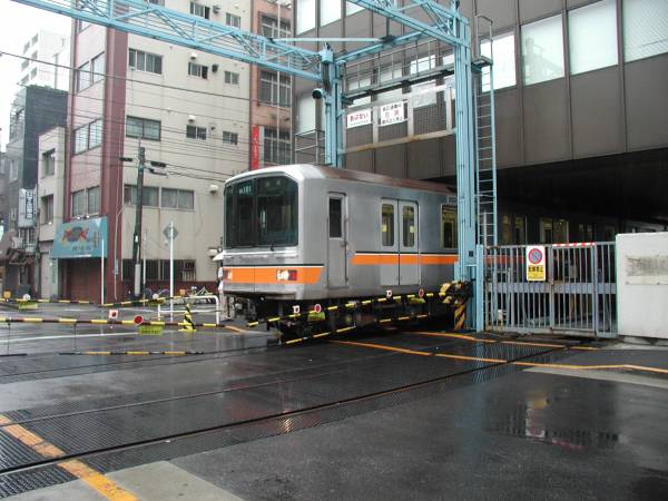
The definition of RT has always been somewhat misleading. There's nothing inherently rapid about it. "Protected mass transit" would be an accurate name.
|
|
|
The definition of RT has always been somewhat misleading. There's nothing inherently rapid about it. "Protected mass transit" would be an accurate name.

The definition of RT has always been somewhat misleading. There's nothing inherently rapid about it. "Protected mass transit" would be an accurate name.

I mean Yonge is 601, and BD is 602, and the RT is 603, and Sheppard is 604. So maybe Eglinton will be 605, or maybe 701.
The 60x numbers haven't existed in over 13 years.
Dan
Toronto, Ont.
PATH trains are rated to travel 70 mph but they apparently never exceed 55 mph, and they only go that fast in the 5-mile stretch between Journal Square and Harrison. New York subway trains can reach 55 mph as well, but rarely get over 30 mph.
The average speed of the PATH (excluding the five mile stretch between Journal Square and Harrison) is just over 18 mph. The average speed of the NY Subway is the same.
From this link on
Train speeds: Do PATH and NY Subway measure up?
18 mph is about 28 km/h.
The Toronto subway and LRTs will go faster. I've been on the PATH and NYC subway trains, and the Toronto subway trains go faster than that in the Union Station loop.
Until recently? I believe the 1, 2, 3, and 4 have been shown on the legend of the Ride Guide for years (long enough, that I think it only used to be 1, 2, and 3). And the 1 and 2 signs have been at St. George station at the Bedford entrance for nearly 20 years.If I'm remembering correctly, our rapid transit routes are numbered 1,2,3 and 4. Until recently the Commission only used the RT route numbers for internal use. This is why there are no bus routes with those numbers.
")
If the Paul Arthur signs were used, I always wondered what would the pictogram for Bessarion station be.Oh wow. You're correct. I've never studied the Ride Guide before
The use of the numbers at St. George station can likely be attributed to the TTC's trial of the Paul Arthur signage in the 1990s.
Speaking of that... Any thoughts on how our new signage compares to the Paul Arthur design? The station pictograms from the Authur design were a nice touch, but our new signs are far more readable.