


salsa
Senior Member
Of course the TTC will update this tile every so often. Naaa just kidding, they wont.
|
|
|
Those coloured tiles rock. Well done.
this isn't 8 bit, more like 2 bit.
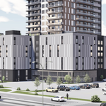
architecture is lacking because it was designed by engineers.
")
If that gets updated, then the subway map and lake tile should get updated as well once the extension to VMC is open.Of course the TTC will update this tile every so often. Naaa just kidding, they wont.
Damn you ehlow, you beat me to it.
But yes, 2 bits means that the colour information is held in 2 bits of data. So for example, if colour information is encoded with 0 and 1, with each number being one bit in size:
00 = black
01 = light grey
10 = dark grey
11 = white
Or something like that
Glad to see they've added yet another variant of their totem sign to the mix, now with a stupid handicap symbol added to it.
So, to go along with the front page story, here's a reasonably thorough tour of Dufferin Station, but even more photos will be up on my Flickr page soon.
42