News   May 24, 2024
 83     0 
News   May 24, 2024
 648     2 
News   May 24, 2024
 232     0 

Toronto ugliest highrise building

Thanks for the explanation of "TV ugly", guys.

I guess everyone has a different definition of ugly. Glamorous and flashy don't equal pretty or beautiful, or even necessarily the attempt thereto. I don't see any ambition or beauty at all in something like NY Towers, just the laziness of unabashedly blatant plagiarism and cheapo-looking materials. To me, a utilitarian building is much less of an eyesore than something that tries to stand out but is a conceptual and actual disaster.
Translating to buildings, everything on the internet is black or white, and since one shade below perfect must, therefore, be ugly, you end up with people calling Pei's Commerce Court ugly which is, of course, ridiculous, unless you think all boxes are automatically ugly, in which case your opinion doesn't matter.
I find Commerce Court very elegant. In fact, I love all of Toronto's bank towers, as well as buildings like Manulife and Sheraton. I'm a box junkie as it relates to architecture, but I recognize many, if not most, folks are not.
Saying RoCP or Sheraton or NY Towers or even the Holiday Inn is ugly is saying it's the ugliest celebrity building
I don't understand the hatred of ROCP. The design, at least, is one of the nicest ones this city has seen in recent years, I think. ROCP 1 looks much taller than 500 ft. I haven't actually viewed it up close in person, though. Is it cheap materials and finishing that have been raising everyone's hackles?
 
Dundas and Bloor surely is filled with some beasts--Crossways, and especially, that tower across the street. Lansdowne and Dupont have yet more eyesores.

As towers and skyline-markers go, Crossways isn't bad--it certainly has more pretension (in the good sense) than most 70s rental towers out there...
 
I don't understand the hatred of ROCP. The design, at least, is one of the nicest ones this city has seen in recent years, I think. ROCP 1 looks much taller than 500 ft. I haven't actually viewed it up close in person, though. Is it cheap materials and finishing that have been raising everyone's hackles?

Clash of styles
Alluminum-like facade
Appalling stone-brick base
Resemblance to a squating elderly gentleman
 
Generally, think of it as a Downtown Mississauga architectural sensibility translated into Downtown Toronto terms...
 
I don't understand the hatred of ROCP. The design, at least, is one of the nicest ones this city has seen in recent years, I think. ROCP 1 looks much taller than 500 ft. I haven't actually viewed it up close in person, though. Is it cheap materials and finishing that have been raising everyone's hackles?

Retro-historicism is not an architectural crime per se, but doing it half assed probably is.

Ignoring the dinky base, if you look at it from far away it has a certain exuberance to it until you get to the top - where it suddenly stops! The "crown" (if you can call it that) is such an afterthought, an exposed concrete toupee that suggests that the developers decided to cut and run when they couldn't sell any more penthouses.

At least in Atlanta, where these kind of PoMo castles roam the earth, you get a sense that the architects of these monsters weren't so chickenshit. That if you're going to go gaudy, go all the freakin' way and nail that giant wedding cake spire to the top like it's nobody's business. It might be crass, but at least it's assertive. George Carlin once said "I could never trust a pimp who drives a Toyota Corolla". Among buildings, RoCP is the pimp that drives the Toyota Corolla.
 
In defence of 60 Niagara, below is Hume's full assessment, published last week. I would tend to agree with this as being a building that represents a thoughtful addition to the city, but not reward-inducing architecture. Those who find it cringe worthy must do an awful lot of cringeing in this city, and indeed in all cities, at just about everything. I always find myself amused at the delicateness of the sensitivities so expressed. One pictures someone fanning themselves as they pass by, "well mah goodness sakes land o' livin', look at that horrid, simply horrid 60 Niagara, whah, the-uy should not be allowed to put such a powsitive mownstrositee raight wheh ladies might wawk bah".

Hume, the Star.
(B+)
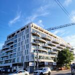
This is a complex so large it could easily have overwhelmed the street. Though at 10 storeys, it's not overly tall, the sheer bulk could have been enough to suck the life from the surroundings. But by breaking the main building, which faces east onto Bathurst, north of Niagara, into three segments, the designers have succeeded in reducing the scale of the development into something appropriate. The second element, which extends west from Bathurst along the north side of Niagara, has been restricted to 4 1/2 storeys. In this way, it mediates between the taller structure on one side and smaller ones on the other.

The big building is already a local landmark. The addition of red to its glass-and-grey-steel exterior means it is hard to ignore. Built out to the sidewalk, the slab sits atop a single-storey podium, just enough to situate within the streetscape. The two entrances from Bathurst to the laneway that runs along the back also help make it feel less monolithic, more permeable and integrated. The same lane separates the Niagara component from the Bathurst slab, further enhancing pedestrian and vehicular access.

The Niagara building, with its windows and bays, has an almost retro aesthetic. Architecturally, it's not wildly exciting, but on the other hand, it's well situated and does its job.
 
My vote is for the Sears building on Jarvis...

Upside down brown pyramid...nasty...

And since we're on Jarvis, the courthouse is horrid as well...
 
...those who find it cringe worthy must do an awful lot of cringeing in this city, and indeed in all cities, at just about everything. I always find myself amused at the delicateness of the sensitivities so expressed. One pictures someone fanning themselves as they pass by, "well mah goodness sakes land o' livin', look at that horrid, simply horrid 60 Niagara, whah, the-uy should not be allowed to put such a powsitive mownstrositee raight wheh ladies might wawk bah".

Some people just have higher standards than others. Speaking of sensitive, why do you keep bringing this building up to defend? It's Sixty Lofts FFS, even the people building it hardly cared about it. For evidence, check out that south facade. Let it go, old man - go have a relaxing sitz bath and calm those nerves.


I really like the Sears Pyramid :) The bricks are gorgeous.
 
Last edited:
My vote is for the Sears building on Jarvis...

Upside down brown pyramid...nasty...

And since we're on Jarvis, the courthouse is horrid as well...


one of the more interesting buildings in the city imo.

there's definietly no way i can hate on it. now the courthouse...
 
there is one fleeting glimpse where ROCP looks good. i think it's coming east on college at university.
for a brief instant they flash into view and look just a bit manhattan-like before sinking behind other, smaller blocks.
but from every other angle, yikes.
but then, i have looked for any angle which becomes the BA centre and haven't found it yet.
dull, fat and squat.
the stump that grew and grew until it was a bigger, shinier stump.
 
8 April 2009 photo update

v2.0 of Toronto's ugliest highrise looks like it may be starting construction soon: I believe the construction trailer is a recent addition to the site:

(Mods, I can't find a thread for this pos project.)

dsc01345.jpg
 
I know it was mentioned, but a photo does so much more to horrify...

77elmstb5ds.jpg


Has the person responsible ever been found... and hurt?
 

Back
Top