
christiesplits
Senior Member
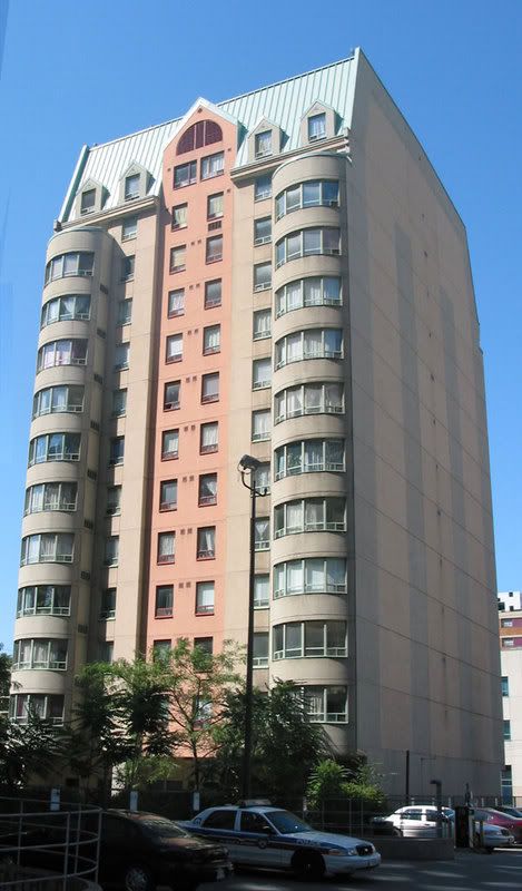
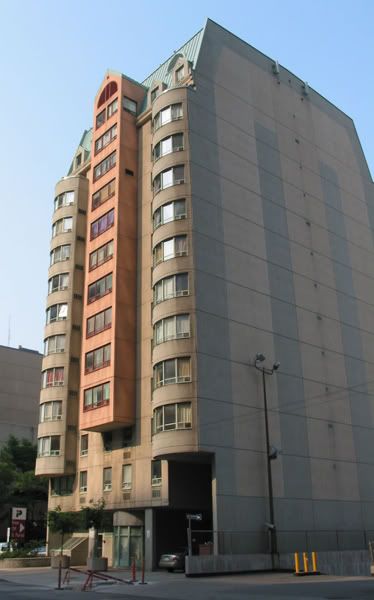
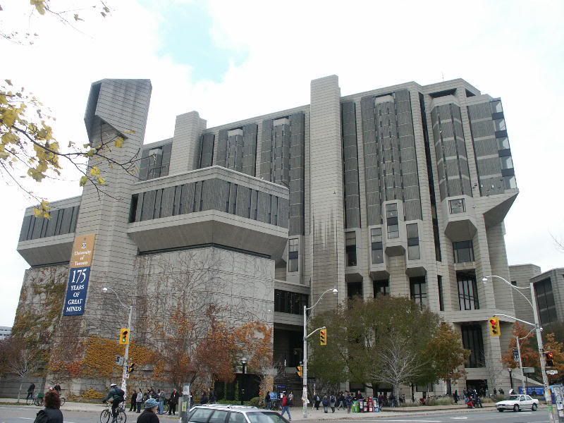
The Senator David Croll Apartment on Bloor West @ St. George. It actually makes the Holiday Inn across the street look welcoming.
|
|
|
The Senator David Croll Apartment on Bloor West @ St. George. It actually makes the Holiday Inn across the street look welcoming.
There used to be a trophy-engraving store at the base of that building (which was replaced by a computer repair store a few years back) that had a neon sign in the window reading "Tropies" (sic). My undergrad cronies and I always found it hilarious that something as relatively expensive and elaborate as a neon sign could have such a glaring typographical error on it (and surely it would undermine their reputation for engraving said "tropies")
I like viewing the Sheraton from the side, Tall and slender, but the front is just awful with all those white curtains at the windows and the back is even worse.

")
I personally love buildings like this, that are SUPPOSED to be brutal and powerful and overpowering and in a sense ugly--- and succeed.
i get the sense that developers simply used the brutalist fashion to build on the cheap. that's the statement they make.
slap it up. slab it up.
i get the sense that developers simply used the brutalist fashion to build on the cheap. that's the statement they make.
slap it up. slab it up.