You are using an out of date browser. It may not display this or other websites correctly.
You should upgrade or use an alternative browser.
You should upgrade or use an alternative browser.
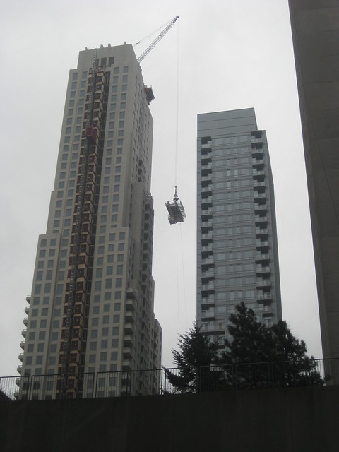
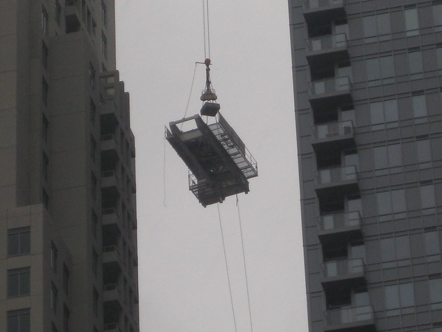
Toronto The Uptown Residences | ?m | 48s | Pemberton | Burka


urbandreamer
recession proof
15 December 2010: Taken just before eating at one of my favourite (cheap) restaurants.")


greenleaf
Senior Member
From Dec 10:
drum118
Superstar
Shot Jan 26
The base of this tower sucks and has never impress me from day one. The tower is so so, but better than the one next to it.

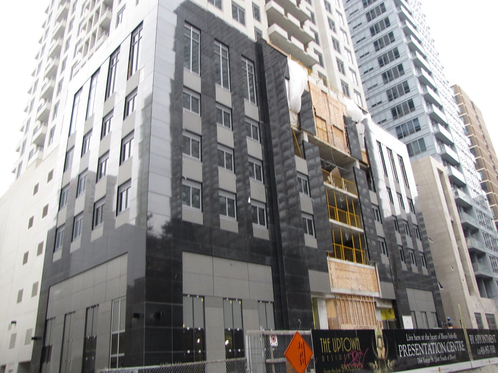


The base of this tower sucks and has never impress me from day one. The tower is so so, but better than the one next to it.
JayBee
Senior Member
^^^ Thanks for the pic update.
Both Crystal Blu and Uptown are huge disappointments.
Both Crystal Blu and Uptown are huge disappointments.
Red October
Senior Member
Could be worse. Much worse.
Tulse
Senior Member
I'll take the Uptown over the plethora of green-glassed generic boxes in this city.
Traynor
Senior Member
The upside to Uptown is: In five years, just blink and you'll miss it, with all that is coming to that area.
JayBee
Senior Member
I think it's the windows that I don't like....they just look so dull. Would be great if they stood out more. Maybe a different color. The podium's a complete mess. They actually pay people big bucks do design crap like this?
steveve
Senior Member
wow. it's been a while since this thread was updated! lol
in that 5th shot. uptown ain't look too bad. i'm sure once this tower ages/gets dirty, it'll look a bit better.
in that 5th shot. uptown ain't look too bad. i'm sure once this tower ages/gets dirty, it'll look a bit better.
DC83
Senior Member
When I first saw this proposal in the Condo Guide YEARS ago (idk, maybe like 5-6 years?), I LOVED it! Today.. walking past it.. Not-So-Much :s
Thank God for 1 Bloor to steal away the attention of this and Crystal Blah!
Thank God for 1 Bloor to steal away the attention of this and Crystal Blah!
to-enthusiast
Banned
For some reason the damn thing just doesn't look finished. Those huge expanses of untouched, uninspired precast on the top half of the building are particularly disappointing. It looks untended to - certainly not designed. Kind of like they forgot to add the finishing touches. Not that I'd hold out any hope that they would actually be able to effectively dress this thing up, considering the actual finishing touches they clumsily stuck on at the top.
Automation Gallery
Superstar
Thank God for 1 Bloor to steal away the attention of this and Crystal Blah!
Thank god for what does not exist and what might yet exist in 5 years..hopefully there will be others.
dt_toronto_geek
Superstar
I think it's the windows that I don't like....they just look so dull. Would be great if they stood out more. Maybe a different color. The podium's a complete mess. They actually pay people big bucks do design crap like this?
That's been my beef too, if the windows had have been framed with black instead of grey I think it would have been much more dramatic. The scaled down size of the roof elements really ticked me off too.
Once blinds & curtains go up as people move in perhaps that will help.
HHC
Active Member
It looks as if it's made of paper mache. The entrance looks so intimidating and uninviting.