Toronto The Residences of 488 University Avenue | 206.95m | 55s | Amexon | Core Architects

Am I the only one who thinks the updated design isn't that bad? The updated base fits much more with the building atop and at street level. Also, the darker glass and details don't make it look as much as a four seasons look-a-like now. It's kinda a cross breed of four seasons, hallmark centre, X condo, and Murano which isn't all that bad.
On a side note, does the upper part of the tower (residential portion) feature a deliberate randomized pattern of glass? or is this the first render i've seen that actually shows the effects that white blinds have on a building once residents move in?
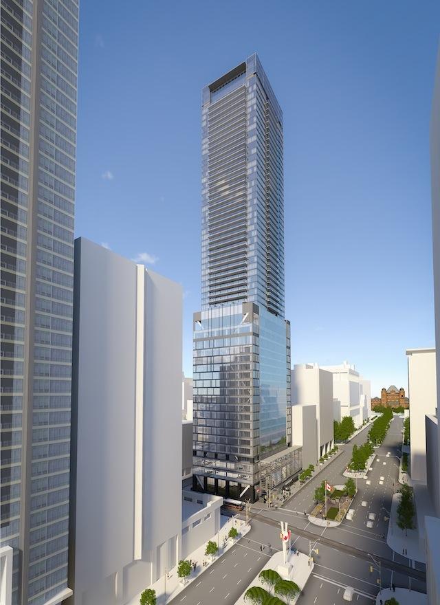
 
Is it just me or does the old design look less bulky than the new design? I'm kinda not happy with any of the changes they've made.
 
I loved the forest base. It made a statement and felt creative. This new podium looks incoherent and lacking in vision. The office tower and residential portions look better to me though.
 
Huge snore fest. Toronto doing what it does best, sucking creativity out of every design. This one went from mildly interesting to completely boring and sterile.
 
Last edited:
You are right, it has a sort of "Toronto Handsome" feel to it. I like it more than the previous one, though I still really liked the old first floor.
 
My criticism of the protruding balconies and transparent glass aside, I do like this design better over all. One thing no one has commented on yet which I really like is the cross-bracing in the office portion of the tower. It's easy to miss so look closely at the facade of the office portion facing Dundas:


urbantoronto-9040-30996.jpg

http://urbantoronto.ca/news/2013/10/plans-evolve-55-storey-tower-480-university-and-dundas
 
Personally I believe the panel should stay out of the minutiae of the project and should be commenting on the glaring design or engineering issues or problems with how they affect the public realm (such as sidewalk width). It seems as many like the old design as prefer the new one. Balconies here or there, tone or reflectivity of glass, like or hate of "flair" elements...had this project been built as originally envisioned, it would have been far from remarkable and now it is no less so. I can't help but think if a different set of individuals been sitting on the board (as I expect will occur in years to come), the resulting criticisms and comments would somewhat different and the outcome would be a slightly different looking project. Not better in everyones opinion but certainly different from the present result.

designreviewpanel
The Panel's goal is to improve people's quality of life by promoting design excellence within the public realm, including the pursuit of high quality architecture, landscape architecture, urban design and environmental sustainability.

Was there any real improvement in the public's quality of life by the panel imposed changes? I find that to be a very dubious claim.
 
the new ground floor looks like something out of city place. if the drp had their way the whole city would be one big city place.
 

Back
Top