Toronto The King East | ?m | 15s | Lamb Dev Corp | Core Architects

Pictures taken 6 December 2012

IMG_1605_1-XL.jpg
 
Yea what's up with the sidewalks they generally re-do them during construction.
 
I've walked past this a few times now and I hate to say but I've had to re-evaluate my stance on the project. As appropriate it is for its location in many ways, its ground level feels oppressive to me: flat, blank, unarticulated, and overbearing on the small sidewalk.
 
Yeah when I wrote in the Berczy thread about "softening" edges this is a good example of where it would work. The hard edges of contemporary buildings, I believe, are alienating to the general public.

This project does have a sort of c.2002 Griffintown Montreal feel to it. Are they lofts? (It has a very industrial utilitarian look to it. Like there ought to be a sweat shop operating out of one of the units, perhaps several live/work creative types doing their thing.)
 
Yeah when I wrote in the Berczy thread about "softening" edges this is a good example of where it would work. )

You were suggesting softening the corners of the upper floors in that thread. The Berczy's lower floors already have a softened corner. ;)

Regardless, I don't think 90-degree angles are the issue here so much as the flat, unarticulated glazing of the ground level. Regardless of what people feel about its architectural motif, First Gulf's development in Uptown Waterloo has some great ground-level articulation with facades projecting and receding to create an illusion of numerous different shops. On buildings like The King East, all you get is a smooth, blank glass ground-level, which LOOKS sleek, but performs poorly as a streetscape.
 
I still like it. I suspect it might feel less imposing/more imposing but in an acceptably urban sense when the corner lot across the street is redeveloped. It feels too big here for the moment and that makes it seem more imposing to me.
 
It's not the size that makes it imposing though. It's the way the ground level is handled.
 
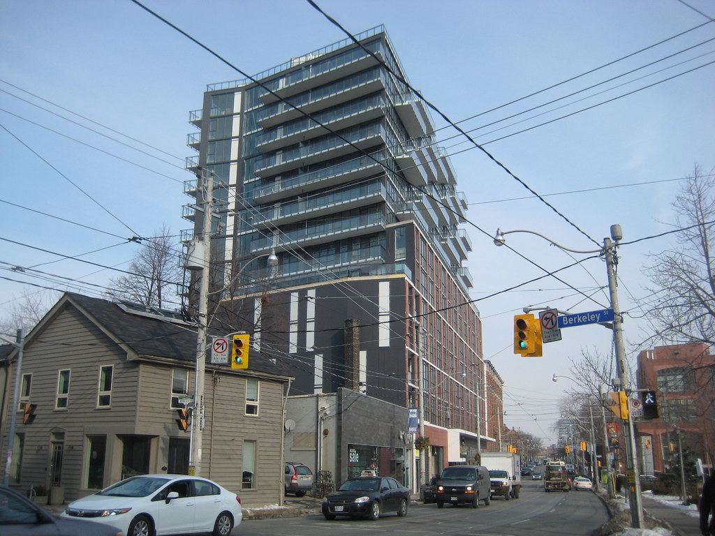
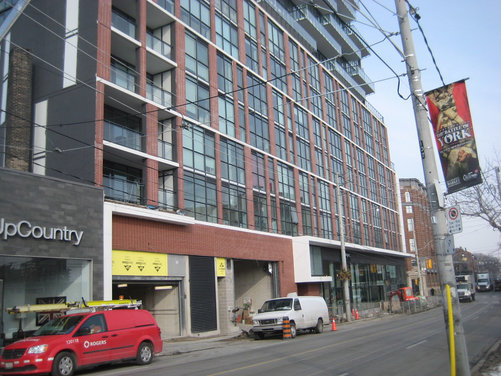
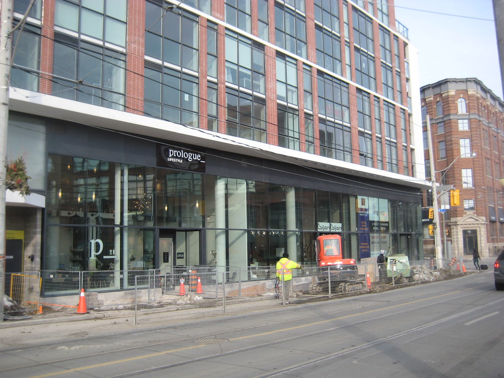
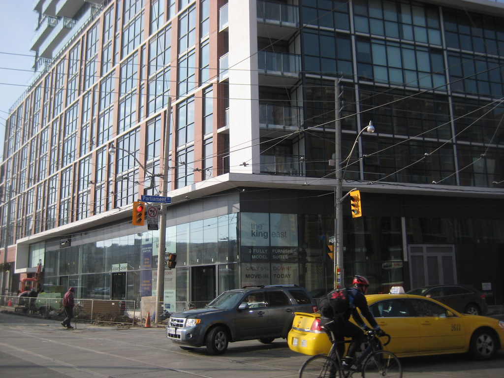
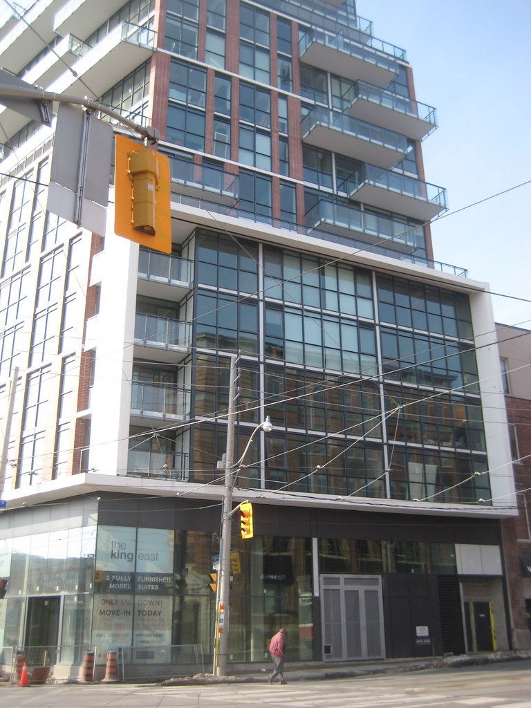
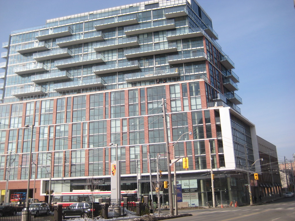
Almost all new condos are doing the same thing, which is a wall of glass, with no decoration at all. It wouldn't be so bad if it was only a few buildings, here and there but it seems to be the way retail is done in Toronto. I wish that these buildings would at least use the brick from the buildings, to frame the windows but few are doing that. I hope this trend is short lived because if our retail strips become just walls of glass, that would be terrible. It's so cold and lacks creativity.
 
Torontovibe, I believe you'll love the direction I'm taking with my fantasy renderings. Like you, I am tired of the 100% glass look and believe there's other solutions that don't break the budget. I have many ideas, most of them I haven't rendered yet due to hardware restrictions--hope to solve this problem soon so I can show y'all what I mean.
 
That sidewalk is brutal, especially with the way the ground-level of this project was designed. :/
 
Ok, that has to be the stupidest sidewalk design ever. Why would they make the concrete surrounding the trees SO big? It doesn't need to extend out that much. People will literally have to squeeze over to avoid it. Plus, when the retail windows are being washed for example, that'll leave space for one person to walk by, single file.
It's just so weird and clearly not thought out.
 

Back
Top