Toronto TeaHouse 501 Yonge Condominiums | 170.98m | 52s | Lanterra | a—A

yeah...the project wreeks of 'maximum profit, minimum cost'. Damn ugly, and not to mention a WALL of east view blockage for many of the buildings on the other side of Yonge street.
 
I already stated my opinion when the home made red line drawing was posted and funnily enough the actual elevations match it exactly! what a stinking pile of crap! there is literally no thought or subtlety to it at it all. reminds one of what a budding 10 year old architect wanna-be would likely come up with. It's simply a cruder version of Murano with both towers being the same height in this case. Where is that Brad Lamb editorial about the deadening effect of podiums when we need it? I am slowly but surely falling out of love with Toronto. We can do better than this, many lesser cities seem to.
 
Last edited:
I already stated my opinion when the home made red line drawing was posted and funnily enough the actual elevations match it exactly! what a stinking pile of crap! there is literally no thought or subtlety to it at it all. reminds one of what a budding 10 year old architect wanna-be would likely come up with. It's simply a cruder version of Murano with both towers being the same height in this case. Where is that Brad Lamb editorial about the deadening effect of podiums when we need it? I am slowly but surely falling out of love with Toronto. We can do better than this, many lesser cities seem to.

Am I missing something or is almost all the criticisms of this (aside from opinions about aA) based on simple renders done by one of the board members meant purely to show height comparisons.

You DO know that they are not "official renders" right?

If Official Renders have been released and I've missed something, I'm sorry... but if not then MOST of you need to start paying attention. The renders are just to show height and massing - NOT actual design or materials.
 
The fact that aA would produce this, even as a "first go around", has severely diminished my respect for them and their artistic integrity. I don't need to see the renderings. I'm done with aA in this town. I hope they get sent out to pasture (along with Concord, Pinnacle, Pemberton and Lanterra). These days, Wallman is far superior.

I'm normally ardently anti-NIMBY, but I hope they bring this beast down. I'd prefer what's on site now over this commie slab re-hash.
Maybe they produced something nicer but it was more expensive and the developer didn't want it. I think the onus is on the developer to build something nice...since they're the ones that make the final decision.

For all we know, Aa designed what Lanterra asked them. You don't think Aa would produce a non-glass box if a developer asked them to?
 
^^ They are close enough to official to demonstrate the proposed massing - which is genuinely awful. Who cares what the materials are when they propose a wall of flat, non-descript building with an equally, actually worse, display of a massive blank podium wall. Even if this is the starting point it is horrendous.

Frankly a better proposal would be to build one very tall building - it would reduce the massing and make the project more appealing.
 
Last edited:
Fuel for Fires....

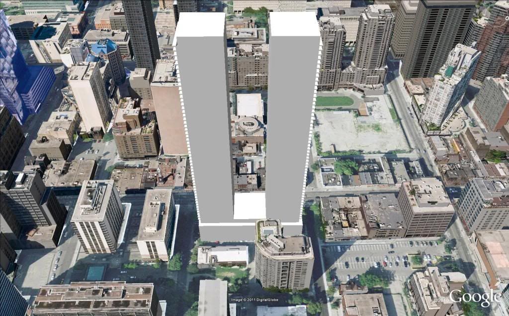
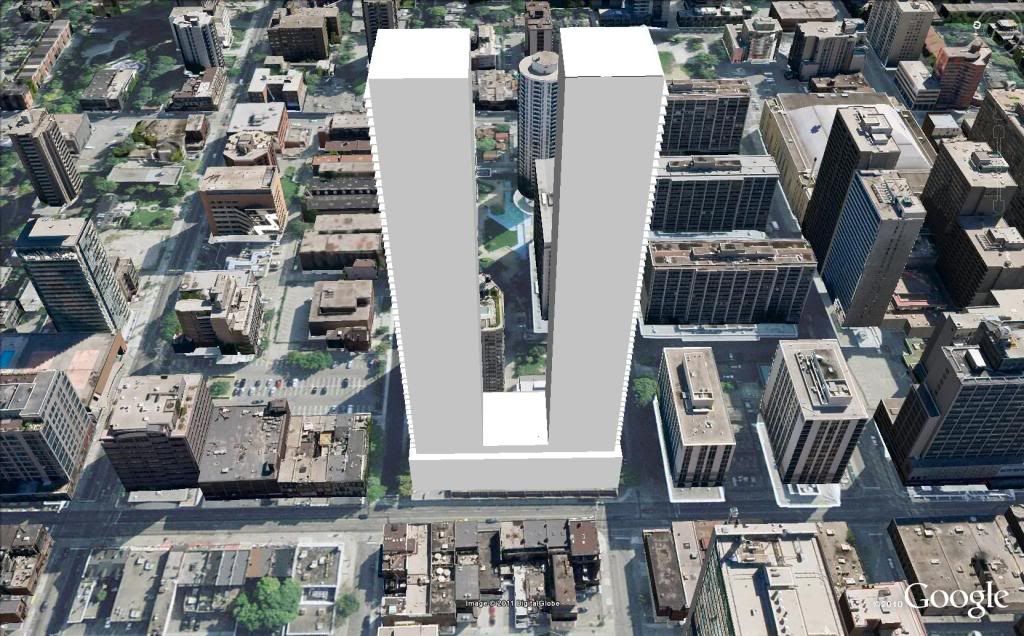
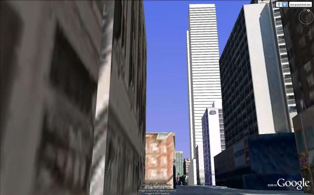
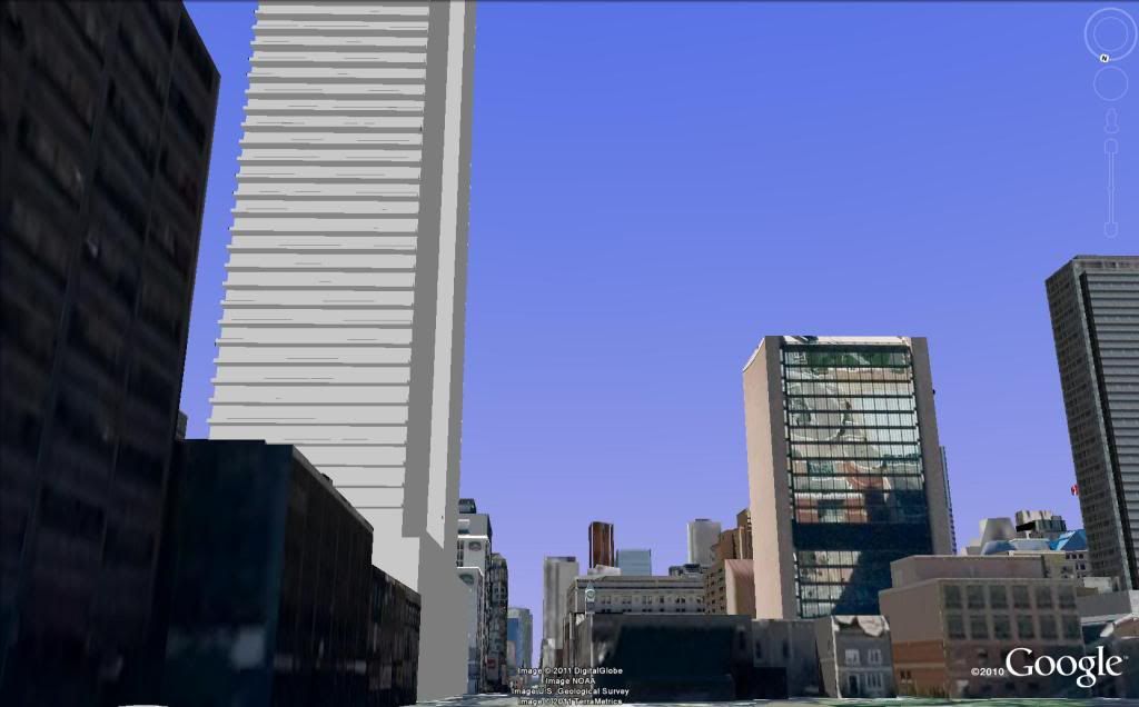
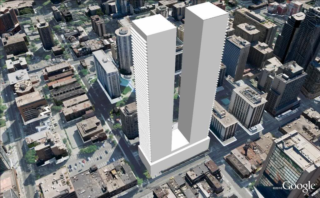
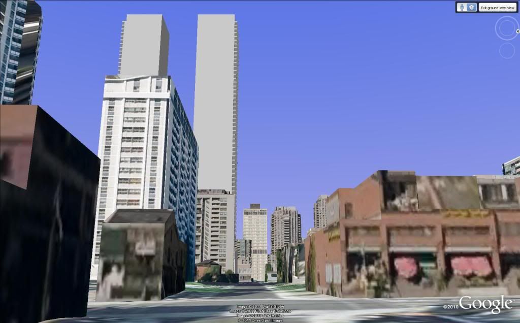
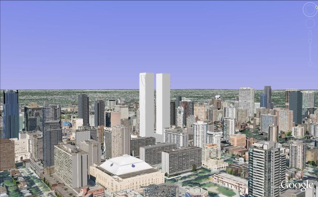
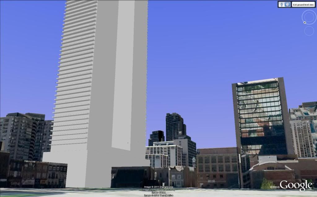
OK. Based on the elevation drawing goes, here's some vistas.

Model from elevation drawing. Top at 600'
501_1.jpg


From Wellesley and Bay:
501i.jpg


Overhead looking west:
501h.jpg


Overhead looking east:
501g.jpg


North up Yonge, from College Park
501f.jpg


South down Yonge, from Yonge and Wellesley
501d.jpg


501c.jpg


From Church and Maitland:
501b.jpg


501a.jpg
 
Maybe they produced something nicer but it was more expensive and the developer didn't want it. I think the onus is on the developer to build something nice...since they're the ones that make the final decision.

For all we know, Aa designed what Lanterra asked them. You don't think Aa would produce a non-glass box if a developer asked them to?

I agree that Lanterra deserves most of the derision here, but I don't really expect much from them anyway, as they are businessmen out to make a buck and always have been.

aA, while being commissioned by Lanterra to create art, is nevertheless a group of artists, and they must be held accountable for the art that they create, or agree to create. The fact that they will readily create whatever piece of crap the developer wants, and proudly affix their names to it, indicates to me that their artistic integrity is less important to them than making a buck. That's perfectly understandable, and I won't fault them for it, but that doesn't mean that I have to like the so-called "art" that they're producing, especially when I know that they're capable of so much more. I'm also not going to excuse aA by just assuming that Lanterra demanded this minimalistic design, as Lanterra had no problem allowing aA to get creative with ICE.

If this were a one-off, I'd be more forgiving, but they've been going down this path for a while now. Almost every design that they've released in the past year has been achingly bland and barely distinguishable from the last. Is every developer demanding the same cut-and-paste design from aA? Why is aA the only firm that seems to have trouble designing something internally original?
 
Last edited:
Not much art visible in this one. Only standarized technical tricks on a maximized zoning envelope.

If a massing drawing has been presented anywhere in any official capability, it's probable that whoever is presenting it is hoping that the final result is not going to get pared down too much. Sure, some refinements here and there, but not to too much change from the basic gamble presented.

This building will be about the height of two Four Seasons, or two Maple Leaf Square's towers, or two Casa's plus.
The height is an issue. But a big part of the problem lies in the artless boneheadedness of this drawing.
Also weighing in is the narrowness of Yonge Street and it's sidewalks here, shadowing (is only Nathan Philips Square the only precinct really protected?) and the possible precedent for blockbusting being set.

I want to see Yonge revitalized badly. But I don't want to see it badly revitalized.
 
Last edited:
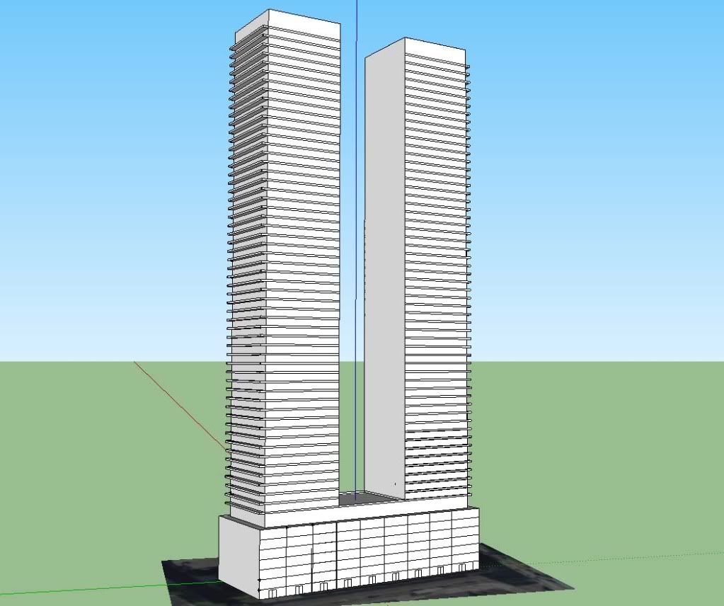
Scroll down the page loozrboy and you'll see CN's Sketchup's pretty much match my feeble illustrate some scale here.

I get that you were (obviously) just trying to give a sense of the scale, and you did a bang-up job of it. I meant that I doubt the final building design will consist of a 58-storey red outline in the sky, and I hope it's also not a pair of monotonous boxes like the ones depicted in the preliminary elevation sketch.
 
Is anyone else getting a mini-World Trade Center vibe from those renders?

No, I did too and I don't care how inappropriate my next comment is.... I am revving up the engines on my 767's to rid Toronto of these when they are built.
 
I agree that Lanterra deserves most of the derision here, but I don't really expect much from them anyway, as they are businessmen out to make a buck and always have been.

aA, while being commissioned by Lanterra to create art, is nevertheless a group of artists, and they must be held accountable for the art that they create, or agree to create. The fact that they will readily create whatever piece of crap the developer wants, and proudly affix their names to it, indicates to me that their artistic integrity is less important to them than making a buck. That's perfectly understandable, and I won't fault them for it, but that doesn't mean that I have to like the so-called "art" that they're producing, especially when I know that they're capable of so much more. I'm also not going to excuse aA by just assuming that Lanterra demanded this minimalistic design, as Lanterra had no problem allowing aA to get creative with ICE.

If this were a one-off, I'd be more forgiving, but they've been going down this path for a while now. Almost every design that they've released in the past year has been achingly bland and barely distinguishable from the last. Is every developer demanding the same cut-and-paste design from aA? Why is aA the only firm that seems to have trouble designing something internally original?

What about Pier 21, their proposal for the Greyhound site, Market Wharf, or Ice (as you mentioned). All of those projects are quite unique, and show more variety than Toronto's more concerning architectural offenders (think Kirkor or Page and Steele). And again, we've still only seen elevations which may not even be final. Besides, I'd rather two "boring" aA boxes than two Uptowns or something like that monstrosity planned for 40 Scott St. At least at this height something so restrained is far less offensive than a failure of historical pastiche.
 
Spire and Casa are some excellent glass boxes though. I wouldn't mind seeing something similar at this location. The main concern from my vantage is the podium. 7 stories seems huge.

But I don't get the thrashing AA is getting. Looking at some of the newer buildings (yea, most are glass boxes, but they look good)

Pier 27
Market Wharf
Parc
U Condos
X
Ice
Four Seasons

All fabulous additions to the core.
 

Back
Top